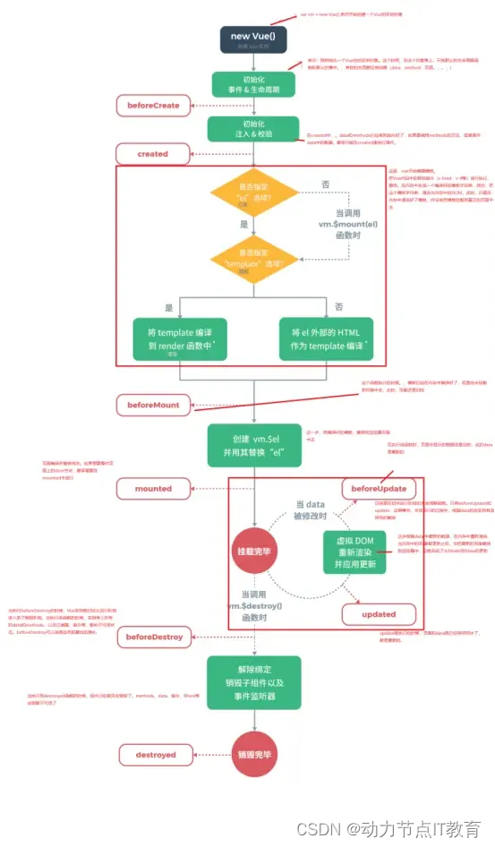
css2d转换
- 1. 移动
- 2. 旋转
- 3. 缩放
- 4. 组合转换
- 5. 设置原点
1. 移动
translate() :参照元素原位置,在X轴和Y轴方向上移动。
<html><style>.container1:hover {width: 200px;height: 200px;background-color: red;/* 在X轴方向移动50px */transform: translateX(50px);}.container1 {width: 200px;height: 200px;background-color: red;}.container2:hover {width: 200px;height: 200px;background-color: green;/* 在Y轴方向移动50px */transform: translateY(50px);}.container2 {width: 200px;height: 200px;background-color: green;}.container3:hover {width: 200px;height: 200px;background-color: blue;/* 在Y轴方向移动50px */transform: translate(50px, 50px);}.container3 {width: 200px;height: 200px;background-color: blue;}</style><div class="container1"></div><div class="container2"></div><div class="container3"></div>
</html>
在设置移动量时,除了用像素外,还可以使用百分比。X轴上的百分比是相对于了自身元素的宽,Y轴上的百分比是相对于自身元素的高。
2. 旋转
rotateZ():根据指定角度旋转元素。2D旋转就是绕着Z轴旋转。
<html><style>.container1:hover {width: 200px;height: 200px;background-color: red;/* 旋转20deg */transform: rotateZ(20deg)}.container1 {width: 200px;height: 200px;background-color: red;}</style><div class="container1"></div>
</html>
3. 缩放
scale() :根据指定的倍数在X轴和Y轴缩放元素。
<html><style>.container1:hover {width: 200px;height: 200px;background-color: red;/* X轴上缩小为原来的0.5倍 */transform: scaleX(0.5)}.container1 {width: 200px;height: 200px;background-color: red;}.container2:hover {width: 200px;height: 200px;background-color: green;/* Y轴上缩小为原来的0.5倍 */transform: scaleY(0.5)}.container2 {width: 200px;height: 200px;background-color: green;}.container3:hover {width: 200px;height: 200px;background-color: blue;/* 在X轴和Y轴上放大为原来的1.5倍 */transform: scale(1.5, 1.5)}.container3 {width: 200px;height: 200px;background-color: blue;}</style><div class="container1"></div><div class="container2"></div><div class="container3"></div>
</html>
4. 组合转换
<html><style>.container1:hover {width: 200px;height: 200px;background-color: red;/* 先移动,再旋转*//* 注意:旋转后坐标系也会旋转  */transform: translate(50px, 50px) rotateZ(30deg);}.container1 {width: 200px;height: 200px;background-color: red;}</style><div class="container1"></div>
</html>
5. 设置原点
上述的变化都是基于默认的原点,默认的原点是元素的中心点。
transform-origin 设置原点在X轴的位置和Y轴的位置。
<html><style>.container1:hover {width: 200px;height: 200px;background-color: red;/* 旋转20deg */transform: rotateZ(20deg);/* 设置原点在元素的左上角,元素绕着左上角旋转 */transform-origin: left top;}.container1 {width: 200px;height: 200px;background-color: red;}.container2:hover {width: 200px;height: 200px;background-color: green;/* 旋转20deg */transform: rotateZ(20deg);/* 设置原点在元素的左下角 */transform-origin: 0 200px;}.container2 {width: 200px;height: 200px;background-color: green;}.container3:hover {width: 200px;height: 200px;background-color: blue;/* 旋转20deg */transform: rotateZ(20deg);/* 设置原点在元素的中心点,也是默认值 */transform-origin: 50% 50%;}.container3 {width: 200px;height: 200px;background-color: blue;}</style><div class="container1"></div><div class="container2"></div><div class="container3"></div>
</html>
ps:上述所有代码执行后,需要鼠标悬停在元素上查看转换的效果。