转载说明:Get Elastic是关注于电子商务的设计网站,访问速度有点慢,有些经典文章转载到这里,方便查阅
原文链接:
http://www.getelastic.com/mobile-home-page-navigation/
While most retailers have enough challenge optimizing for the Web, along comes the mobile Web with its own demands, usability challenges and opportunity. Websites designed specifically for mobile devices are not new, but are few and far between when it comes to online retail. And if serving customers wherever they are is important to your e-biz strategy, you can’t rely on smartphones to translate your Web store into a Mini-Me mobile version and expect it to be usable. The difference between optimized and non-optimized sites is night and day.
Consider the WWW’s usability hiccups of the late 90′s — some which are still problematic today:
1. Scrolling, horizontal scrolling
2. Small fonts, unfriendly Web fonts
3. Broken images, incompatible plugins
4. Links that don’t appear clickable
5. Slow loading pages (remember “World Wide Wait?”)
6. Complicated navigation, poor labeling
7. Search tools that can’t handle synonyms and misspellings
8. “Banner blindness” – if something looks too much like an ad, it’s ignored
9. Complicated form fields
10. Required registration before checkout
11. Unclear information, site instructions
The list goes on.
Add to these plagues the problems of tiny screens, slow and flaky network connections, lack of support for rich media, cost for data and short battery lives of mobile devices — and the headaches of the Web become migraines on mobile.
Yet the industry’s bracing for an explosion of mobile commerce – up to $2 Billion by 2010? Are you kidding me?
True, a large chunk of this activity could be for digital downloads like ringtones and wallpapers, but there’s a lot of potential for mobile shopping of retail sites if only the experience was tailored to the tiny screen.
There are a handful of retailers who’ve taken the lead and developed mobile sites. Some are good, some are great, all are better than a non-optimized version. Here are my notes and mobile usability recommendations based on a review of Best Buy, Target, Sephora, Moosejaw, Barnes and Noble, Amazon, Sears2Go, Ralph Lauren and Tickets.com. (Links point to mobile versions of each site)
This is the first of a 4 part series on mobile commerce design and usability:
Part 1: Home Pages and Navigation
Part 2: Search and Category Pages
Part 3: Product Pages and Cart Summary
Part 4: Forms and Checkout
Note: After my research, Moosejaw re-launched it’s mobile site on a new platform with a new smokin’ design. I’ve included shots from both the old site and new in this series.
Consider Search Engines
Choosing a URL
Because input is harder on mobile devices than on the web (especially with the deadly combination of long fingernails and iPhone – I speak from experience), long URLs are a nightmare to type. Though there’s no rule for what URL your mobile site will live on, m.site.com is easiest for users to access (easy to remember, least number of characters to key in). Sears is the only site I’ve seen so far that has it’s own branded .com site – Sears2Go.com – which is fine as long as you evangelize the domain name well.
If possible, try to register m.yourdomain.com, yourdomain.mobi and mobile.yourdomain.com and redirect them all to one version. This will help customers find you when they guess your mobile URL.
Meta Descriptions
Here’s a mashup of a few meta descriptions and how they appear in search results. It’s a good idea to include an explanation of the mobile site’s features and functionality in the snippet:

For more information on search engines and mobile websites, check out Should You Have a Mobile Version of Your Ecommerce Website?
Home Page Design
Layout
Regular sites are often graphic heavy with multiple merchandising zones, Flash banners, AJAX features, multiple styled navigation menus and many calls to action. Regular sites require zooming in on a smartphone, which makes viewing them like looking at a map through a peephole. They may also take a long time to load.
Check out Sephora and Target’s regular home pages viewed on the iPhone:


Now see the difference between Tickets.com and Barnes and Noble’s Web home pages and their optimized mobile home pages:


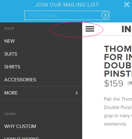
To improve usability on a small screen, you’ll notice most mobile home pages are stripped of graphics and may or may not include regular navigation menus. Best Buy avoids navigation completely, offering just a search box, store locator and customer service number:

Barnes and Noble’s mobile home page also features search and store locators without category navigation, but offers links to customer service items and Top 10 lists. The rationale is mobile surfers are “hunters” rather than “browsers”, and hunters prefer a search box. But is this a fair assumption – especially on a device where input is more difficult, and for products that may have very long titles and author names?
Another approach is to use “stacked” navigation menus (rather than horizontal) like Moosejaw’s old site and Sephora:


Rarely you’ll find merchandising on a mobile home page. Amazon and Moosejaw’s new site do so, but the images are small and layout still simple:


Moosejaw’s original home page was pretty bland and utilitarian — not a match to Moosejaw’s wild and crazy website. The new mobile design incorporates more personality, featuring more entertaining content than just a product catalog, like “In Case You’re Bored” – which Moosejaw’s high school and college age customer probably is.

There’s no hard-and-fast rule on what direction to take with your home page (just search and essential customer service links, just menus or merchandising with images etc. But make sure your home page has clear links to essential information and tools that support research, product location and customer service features you deem important to you mobile strategy.
Font / Style Considerations
Many mobile devices have poor color contrast and can be hard to see in the glare of daylight or in dark venues, cars and other areas with poor lighting. Be very careful when designing with low contrast colors, and avoid light text on dark backgrounds. Especially white underlined text.
LINKS AND OTHER TEXT WITH ALL CAPS IS HARD TO READ. EVEN WORSE WHEN IT’S IN SERIF FONT.
Mobile browsers handle style sheets in different ways. They may or may not cache external style sheets or support the style element and some don’t support style sheets at all. If you have mobile specific style sheets, there’s no guarantee a given device will pull the right one. It’s best to give every non-text element a text equivalent like you would when designing emails for image-off clients.
Navigation
Menus
The best way to show menus on mobile phones is with a vertical stack, rather than horizontal menu bars. Only use the top-level categories on the home page. You’ll have to decide whether to show expanded categories and sub-categories in the second level of navigation (after the user has selected a top-level category) or use a linear drill-down, examples:
Sears2Go shows top level categories on the home page (bonus points for promoting its mobile application in the menu):

And chooses to use expanded categories after the first category selection:

Others like Sephora and Moosejaw’s old version opt to drill-down level by level:


Both methods have their advantage and disadvantage. An expanded menu takes longer to load and requires more scrolling, while drill downs require more page loads with every selection. If you’re designing for phones that use numeric keypad input to select, drill-downs are easier to manage – you’ll need less corresponding numbers.
No matter what you choose, make sure links are large (unlike Moosejaw’s old site or Target, below) for touch screen users. When links or buttons are too small or too close together it’s easy to touch the wrong one. Numbered menus are helpful for phones that navigate through a numeric keypad.

It’s helpful to have “Up” or “Top” links at the end of menus to quickly return to the top of the page, especially for expanded menus with many items.
Image Navigation
I don’t recommend image navigation for categories. It can be confusing because images don’t necessarily look like links unless they’re product thumbnails or buttons. Graphics add to page load time, and their labels can be hard to read – as with Ralph Lauren’s “Shop” label (can you find it?). And tiny hero shots add no value, only eye strain.

Labeling
Clarity is so important when naming calls to action, categories and links. Because each page may load slow or cost money, you want to minimize ambiguity about where a link leads. Ralph Lauren’s “Entertainment” (above) is an example of an unclear label.
Breadcrumbs
Remember the old advice “make links look like links?” Breadcrumbs are links, and they should look like breadcrumbs. Common mistakes I found were hiding the breadcrumbs in the header, too close to the logo, and using ALL CAPS with no underline. Sephora’s breadcrumbs are easy to overlook, and it’s confusing whether “Mobile Reviews” is a tagline or a link (it’s not a link).

Moosejaw’s old breadcrumbs were camouflaged in the brown bar, in all caps, not underlined. Easy to overlook. Especially when they are centered (see Moosejaw screenshot above).
Tickets.com does a nice job with breadcrumbs at the top, and large, clear links at the bottom, “Back to Reggae,” “Back to Concerts” and “Home.”

Because not all devices have a back button, mobile sites don’t have room for sidebar navigation on product pages. Breadcrumbs are more important on mobile sites than regular ecommerce sites, especially when your categories and sub-categories/filters drill-down 2 or 3 levels. Remember to make breadcrumbs look like breadcrumbs (underline and use > to separate) and consider placing them at the top and bottom of each page.
Access Keys
For handsets without a pointing device, providing a keyboard short cut (access key) for links that are repeated across pages makes it easier to navigate quickly.