2019网页设计趋势
重点 (Top highlight)
It doesn’t look like this whole website thing is a fad. In fact, I think it might be here to stay! So with that in mind, I’d like to explore how you can get a little extra value out of your website in 2020.
看起来整个网站看起来不是一时的流行。 实际上,我认为它可能会留下来! 因此,考虑到这一点,我想探讨一下如何在2020年从您的网站中获得一些额外的价值。
I’m always a little bit at pain to create some sort of “OMG, YOU WON’T BELIEVE WHAT THE WEB TRENDS FOR 2020 ARE!” article, so I thought I’d approach the subject a little differently. I want to present the things you should consider for your website with one eye on the trends and how they could help add value to your brand or product. Let’s delve in, shall we?
创建某种“ OMG,您将不会相信2020年的网络趋势是什么!”我总是有点痛苦。 文章,所以我认为我会以不同的方式处理该主题。 我想用一种趋势来介绍您应该为您的网站考虑的事情,以及它们如何帮助您的品牌或产品增加价值。 让我们深入研究,对吧?
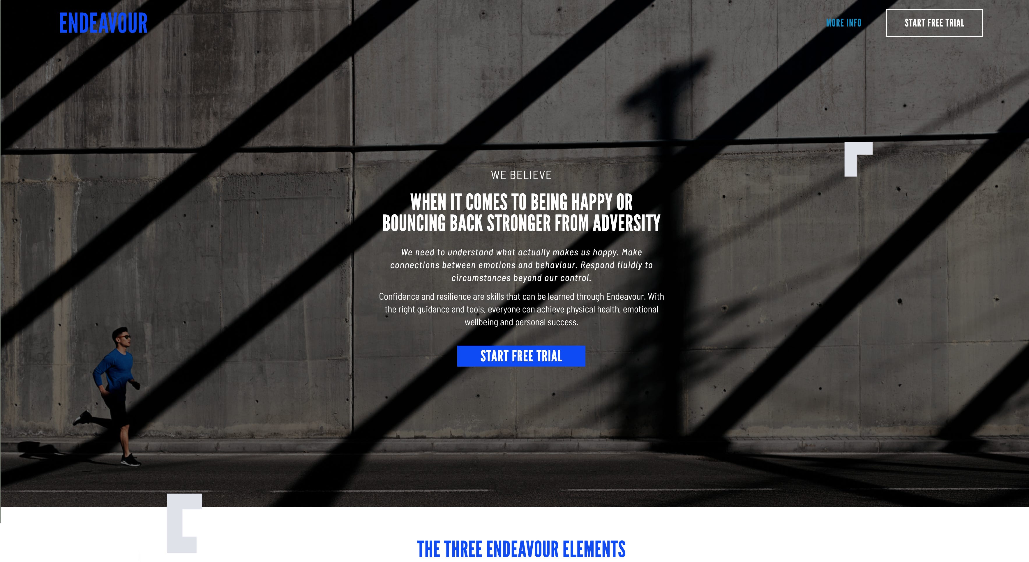
趋势:黑暗模式。 (The Trend: Dark Mode.)
We’ve seen it steadily popping up in apps, UI and now the web for a little while; the infamous “Dark Mode”. The concept is simple: a little toggle or some such button that allows you to switch between your standard site and a “dark” (i.e. black version) of the site.
我们已经看到它稳定地在应用程序,UI和现在的网络中弹出了一会儿。 臭名昭著的“黑暗模式”。 这个概念很简单:只需切换一下按钮或类似的按钮,即可在标准网站和网站的“深色”(即黑色版本)之间进行切换。
A common response to this is “but why?” Well, there are actually some pretty big benefits.
对此的常见回答是“但是为什么?” 好吧,实际上有一些很大的好处。
First and foremost, it’s excellent for saving battery life on OLED screens. On an OLED device (which encompasses most of the recent smartphones), the black pixel draws no power, so the potential battery saving by using a dark theme is massive.
首先,它非常适合节省OLED屏幕的电池寿命。 在OLED设备(包括大多数最新的智能手机)上,黑色像素不消耗功率,因此通过使用深色主题可以节省大量电池。
Alongside this, the darkness of the site will cause the screen to adjust its brightness to the users current lighting conditions and really help to reduce eye strain. Offering someone a break from the retina-burning whiteness could be a very welcome sight/site indeed.
除此之外,现场的黑暗会导致屏幕根据用户当前的照明条件调整其亮度,并确实有助于减轻眼睛疲劳。 确实,让某人摆脱灼热的视网膜白皙可能是非常受欢迎的景点。
It also provides improved contrast, which is awesome news for universal accessibility. Any users with impaired vision or colour blindness will immediately receive a huge boost to the usability of your site. This will increase the chances of achieving an AA rating with the Web Content Accessibility Guidelines (WCAG), which is no joke for the public sector and educational services.
它还提供了改进的对比度,这对于实现通用性来说是个了不起的消息。 任何视力或色盲受损的用户都将立即获得极大的站点可用性提升。 这将增加通过《 Web内容可访问性指南》 (WCAG)获得AA评级的机会,这对公共部门和教育服务而言并不是开玩笑。
Outside of that purely from a branding perspective, this extra contrast can also benefit by strengthening your brand. Your accent colours are likely to pop more and potentially create more impact on your page.
纯粹从品牌角度来看,这种额外的对比也可以通过增强您的品牌而受益。 您的强调色可能会弹出更多,并可能对您的页面产生更大的影响。
Value Summary:
值摘要:
- It already slots so neatly in the current trend of dark and moody websites 在黑暗和喜怒无常的网站的当前趋势中,它已经整齐地投放了
- Improved battery life for users to browse on your site for longer 延长了电池寿命,使用户可以在您的网站上浏览更长的时间
- Reduced eye strain 减轻眼睛疲劳
- Better contrast for branding and accessibility 更好的品牌和可及性对比
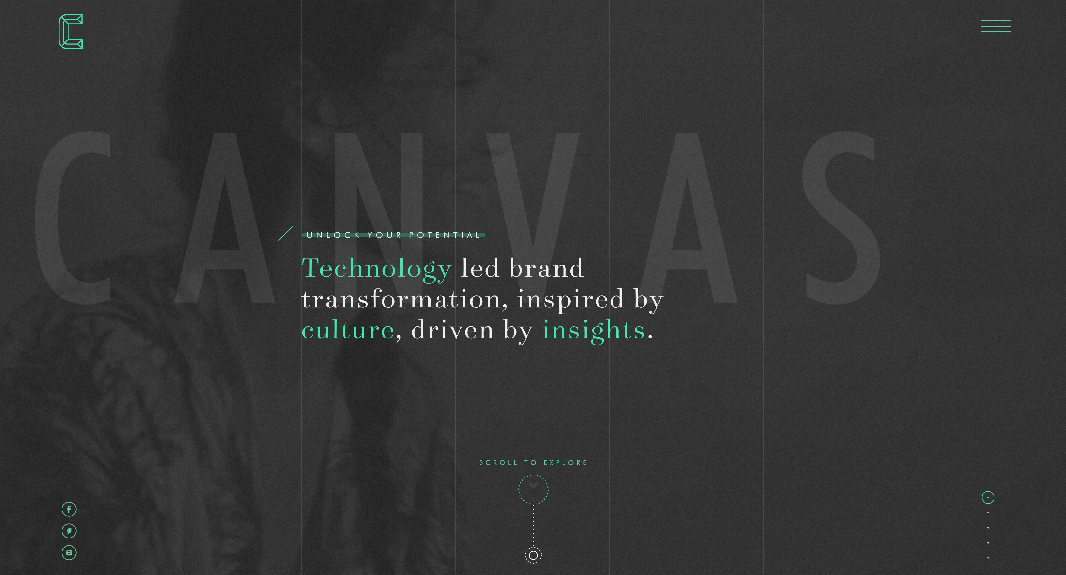
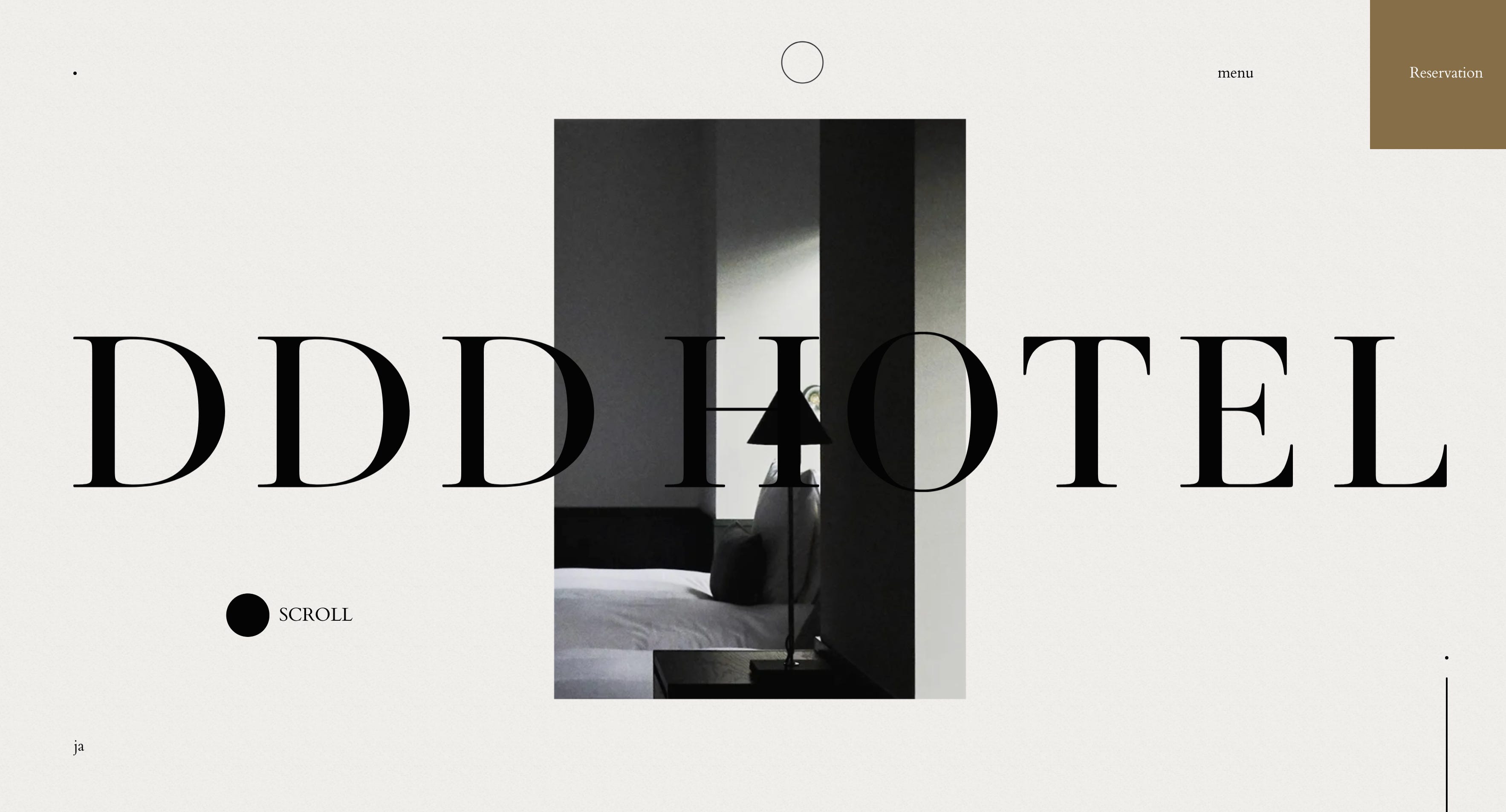
趋势:空白与框架。 (The Trend: White Space & Frames.)
Ok, I know I just waxed lyrical about the virtues of “Dark Mode” but that doesn’t mean its white counterpart doesn’t still hold value. It might not seem like anything new to you as the use of blank space far predates Taylor Swift. But using a white border within your website offers tremendous flexibility and freedom.
好的,我知道我只是对“黑暗模式”的美感进行了抒情,但这并不意味着它的白色模式仍然没有价值。 在您看来,这似乎不是什么新鲜事物,因为使用空格早于Taylor Swift。 但是,在网站内使用白色边框可提供极大的灵活性和自由度。
As screens improve and screen resolutions have the potential to get larger and larger, we start to run into the dilemma caused by standard full-bleed websites. Our content gets stretched and spaced out in ways we hadn’t necessarily envisioned and controlling the huge swathes of negative space and gigantic images that can occur can become frustrating.
随着屏幕的改进和屏幕分辨率有可能变得越来越大,我们开始遇到标准的全出血网站所造成的困境。 我们的内容以我们未曾想到的方式被拉伸和间隔开,并且控制大量的负空间和可能出现的巨大图像可能会令人沮丧。
Harnessing the use of white borders allows us to regain some of that structure and order in our designs. It allows us to be considered with how our elements fit within a generous amount of space. It helps us build a stable and clean canvas for our content to jump out from in a way that full-bleed can sometimes hinder.
利用白色边框可以使我们在设计中重新获得某些结构和顺序。 它使我们可以考虑元素在足够大的空间中的适合程度。 它可以帮助我们构建稳定,干净的画布,以使内容有时以完全流血的方式跳出。
Obviously I’m not being so reductive as to suggest that you must ONLY use white — it will honestly work with any background colour. The focus of this message is to use the negative space as a method of framing your content.
显然,我并不是在简化,以为您建议您只能使用白色-它将完全适用于任何背景色。 此消息的重点是使用负空格作为框架内容的方法。
Value Summary:
值摘要:
- This method works nicely as part of the current minimalist & monochromatic trends 这种方法很好地作为当前极简主义和单色趋势的一部分
- Thinking outside of the “full-bleed” box gives our designs new possibilities 在“全血”盒子之外思考,为我们的设计提供了新的可能性
- Allows structure that we can control more easily 允许我们更容易控制的结构
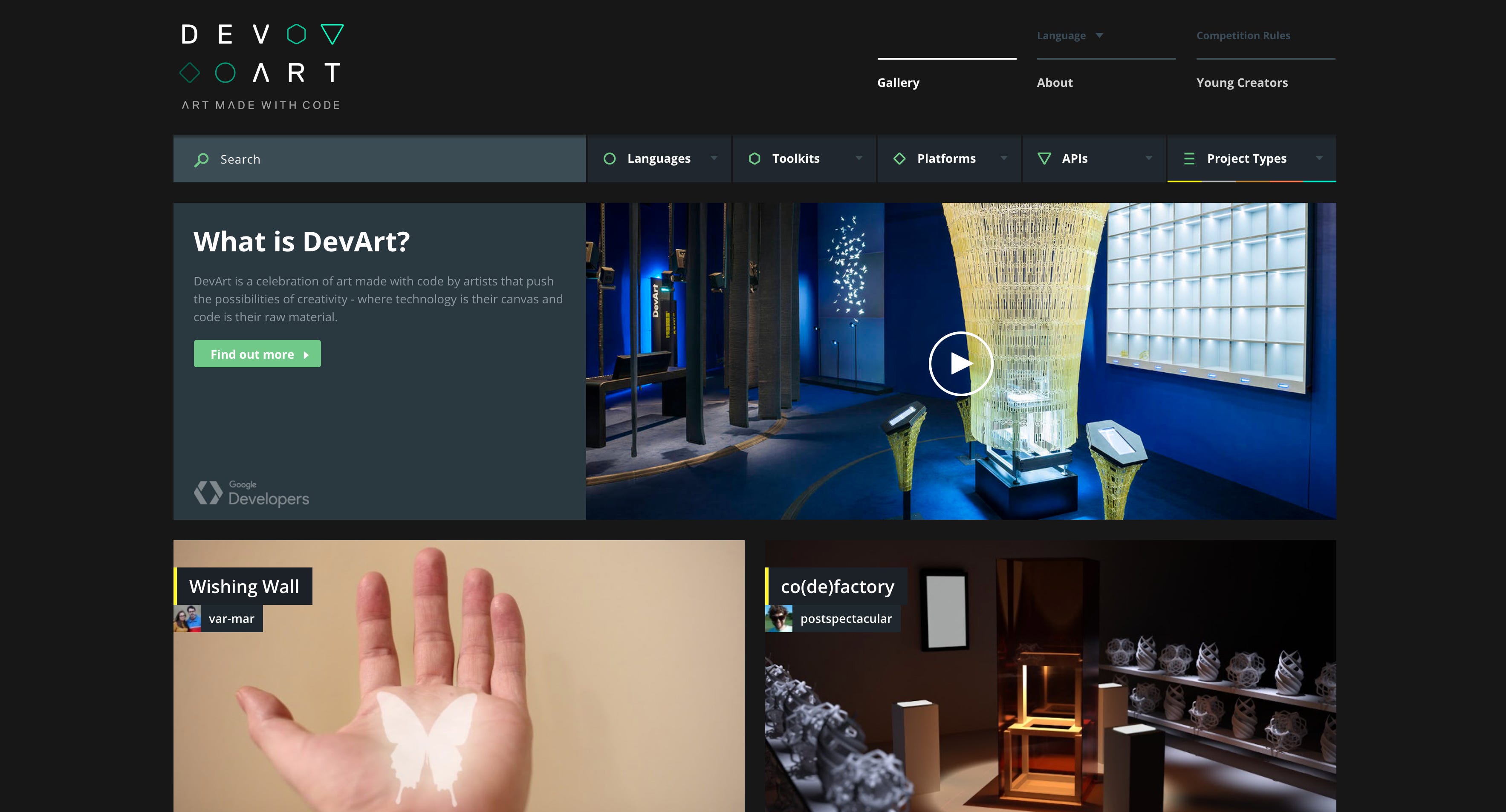
趋势:简化的导航 (The Trend: Streamlined Navigation)
The landscape of our devices is constantly shifting into new and unexpected sizes (I’m looking at you Apple Watch). This takes a huge toll on our navigation. Pair this with the ever-changing face of UI, especially with the prevalence of voice recognition and we start to see that users are becoming more primed towards a less descriptive form of navigation.
我们设备的领域正在不断转变为新的和意外的尺寸(我在看您的Apple Watch)。 这对我们的导航造成了巨大损失。 将此与UI不断变化的面相结合,尤其是与语音识别的流行相结合,我们开始看到用户越来越倾向于使用描述性较低的导航形式。
Enter stage left: stream-lined navigation. More and more brands are moving towards a significantly simplified form of navigation that puts meganavs out to pasture — the idea being that a handful of unobtrusive links is enough to do the task. Moreover, many brands are switching to uniform navigation across all devices — usually through a hamburger menu or something similar. But why?
输入左级:流线型导航。 越来越多的品牌正朝着简化导航的方向发展,这种导航将meganavs带到了牧场—想法是,几个通俗易懂的链接足以完成任务。 此外,许多品牌都转向在所有设备上进行统一导航-通常是通过汉堡菜单或类似菜单。 但为什么?
Let’s face it, attention spans are definitely getting shorter. Gone are the days of where your only entertainment whilst sat on a bus was looking out of the window — we have a device with us at all times and are distracted about every 8 seconds (according to research by Microsoft). So this means we need our websites to be as easy to use as possible, now more than ever. A streamlined nav helps users get to grips with moving around our site quickly and clear signposts help keep them focused on their journey.
面对现实吧,注意力的跨度肯定会越来越短。 您坐在公共汽车上的唯一娱乐机会一直望向窗外的日子已经一去不复返了-我们一直都随身携带一台设备,大约每8秒就会分心(根据Microsoft的研究)。 因此,这意味着我们需要我们的网站现在变得比以往任何时候都更加易于使用。 简化的导航有助于用户快速熟悉我们的网站,清晰的路标有助于他们专注于自己的旅程。
Purely from the design space, it also helps us display our content more cleanly so that our hero messages can breathe and our content is less likely to be pushed further below the fold line of doom!
纯粹从设计空间来看,它还可以帮助我们更清晰地显示我们的内容,从而使我们的英雄信息得以呼吸,并且我们的内容不太可能被推到厄运的折线之下!
Admittedly, this method may require a re-jig of your site map or restructure your hierarchies — but who doesn’t love a challenge?
诚然,此方法可能需要重新调整站点地图或重组层次结构,但是谁不喜欢挑战呢?
Value Summary:
值摘要:
- A more accessible and straight-forward customer path 更便捷,更直接的客户路径
- A weapon in the fight against dwindling attention… spans 对抗注意力下降的武器……跨越
- An opportunity to analyse the structure of your website to make it cleaner 分析网站结构以使其更整洁的机会
- The ability to have one single navigation across all devices 能够在所有设备上进行一次导航
趋势:互动越来越多 (The Trend: More & More Interaction)
Fine. You’ve caught me out. Interactions are hardly a trend as they’re basically the expected norm at this point. Microinteractions are EVERYWHERE. However, there are plenty of trends within this sphere that are well worth evaluating. So if you’ll indulge me…
精细。 你抓到我了 交互几乎不是趋势,因为它们基本上是此时的预期规范。 微交互无处不在。 但是,在这个领域中有很多趋势值得评估。 所以,如果你沉迷于我……
As 2020 is trending heavily towards illustration playing a large part in the web, hand-drawn pictures and type are expected to help add a human element that can often get lost in the clinical world of grid layouts. So taking that up a notch with a little animation could be just the trick to help lift the uniqueness and personality of your site. If you’re unfamiliar, check out Airbnb’s open-source animation tool, Lottie. It could be a real game-changer for you.
随着2020年在网页上占很大比例的插图越来越趋向于趋势化,手绘图片和字体有望帮助添加人为元素,而这些元素通常会在网格布局的临床世界中迷失。 因此,通过添加一些动画来弥补这一缺陷可能只是提高网站唯一性和个性的窍门。 如果您不熟悉,请查看Airbnb的开源动画工具Lottie。 对于您来说,这可能是一个真正的游戏规则改变者。
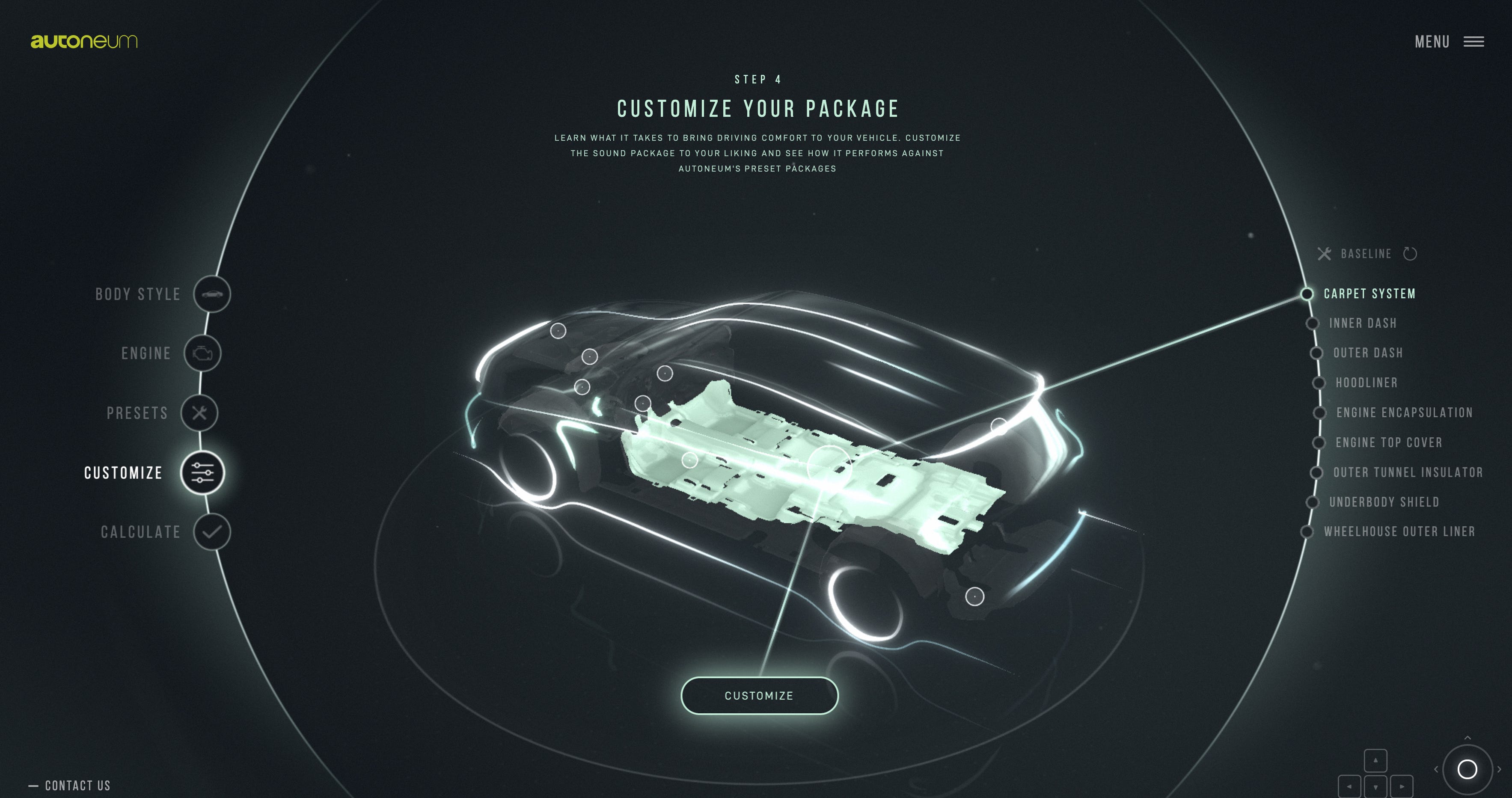
On a similar track, as browser capabilities continually improve, you can expect to see more 3D interactions enter our life. That’s right, they’re no longer purely just for mobile apps and eye candy reserved for Dribbble portfolios. 3D interfaces are popping up with more and more frequency and if you’ll excuse the pun, they offer a whole new dimension of design.
在类似的轨道上,随着浏览器功能的不断提高,您可以期望看到更多3D交互进入我们的生活。 没错,它们不再仅仅是用于移动应用程序和为Dribbble产品组合保留的眼神。 3D界面的出现频率越来越高,如果您介意双关语,它们会提供全新的设计维度。
Finally, I’d like to give a special mention to Neumorphism. This has the potential to be very exciting in the UI space during 2020. Thanks to the continued popularity of VR & AR, we’re seeing a return of designers trying to create interfaces to look as if they were a real object. You’re gonna need a picture for this, right?
最后,我要特别提及“同态”。 到2020年,这在UI领域中可能会非常令人兴奋。由于VR和AR的持续流行,我们看到设计师重新尝试创建看起来像真实对象的界面。 您将需要一张照片,对不对?
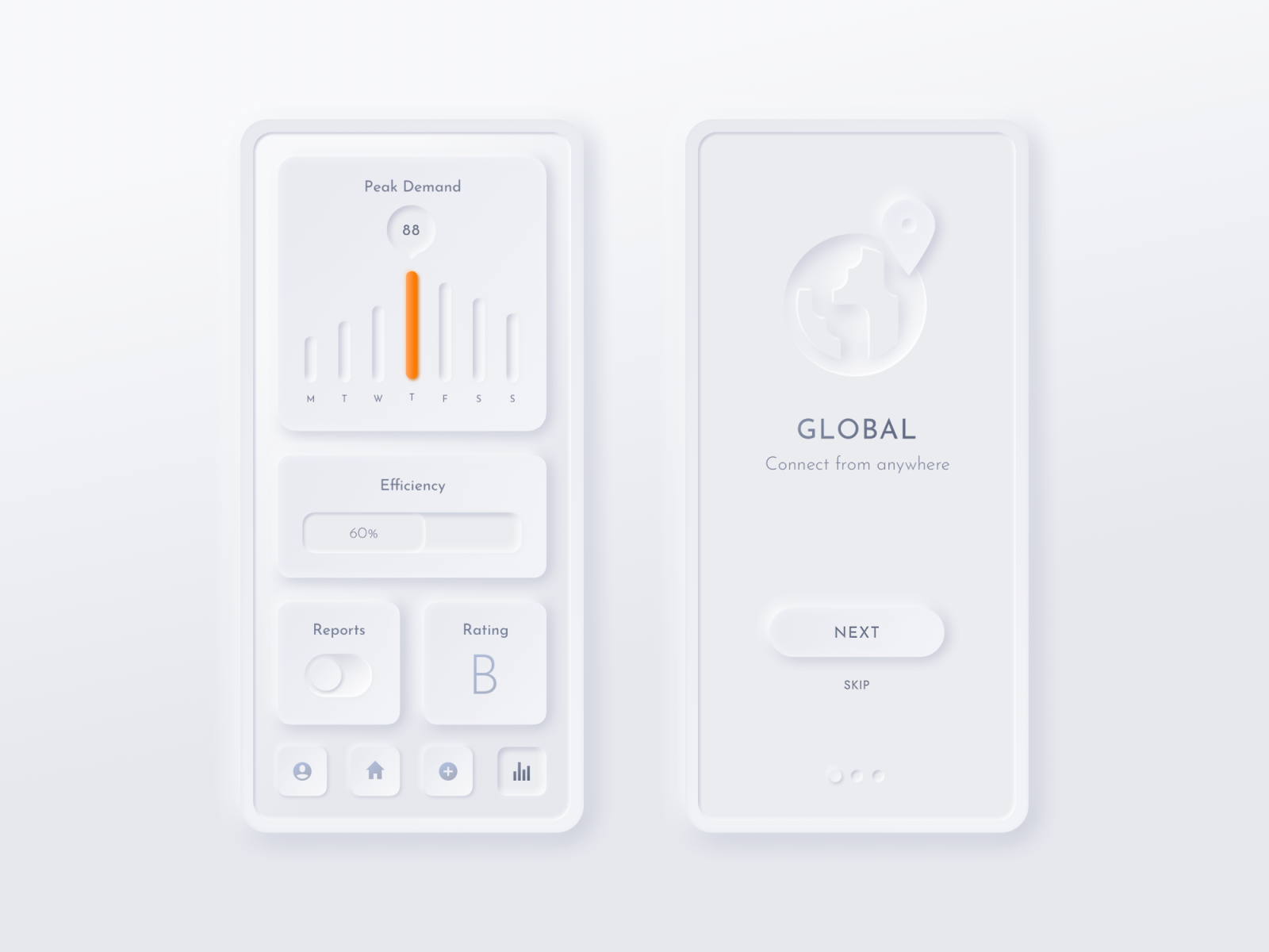
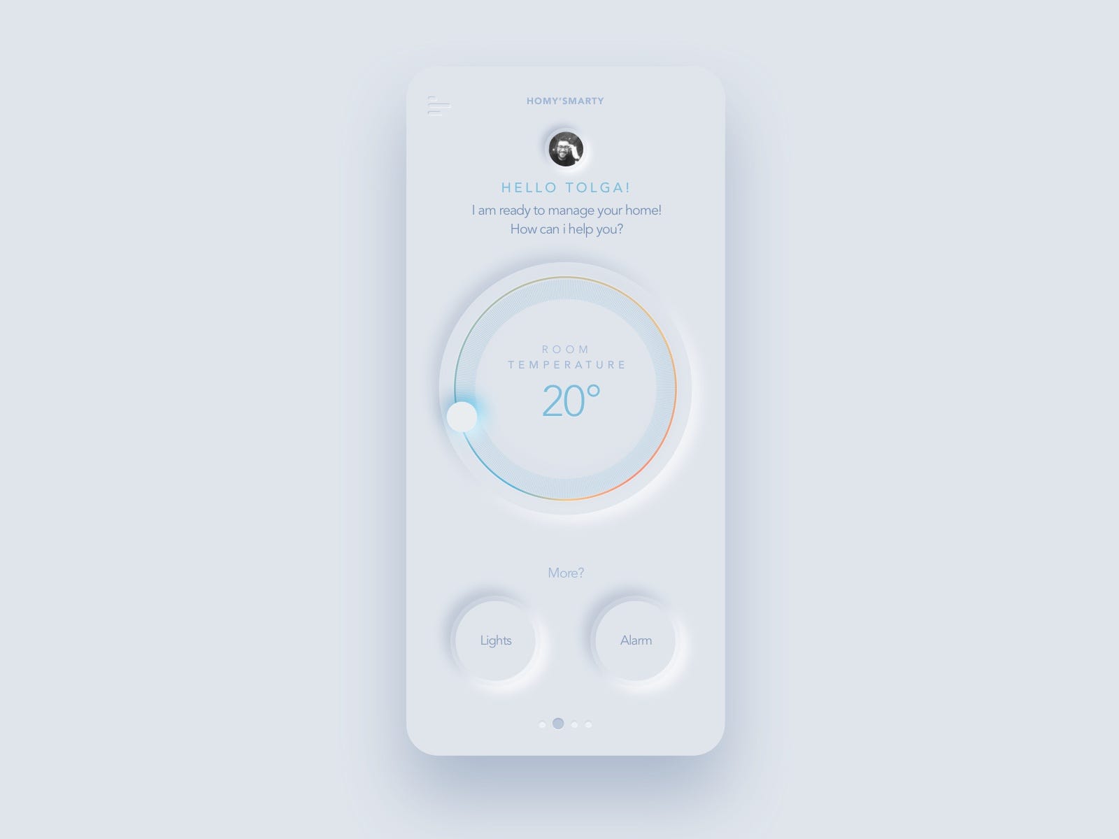
As you can see, it’s all about trying to mimic the real world through highlights, shadows, glows, etc. It’s visually very striking and encourages us as users to want to interact in an incredibly instinctive and natural way.
如您所见,这都是通过模仿高光,阴影,辉光等来模拟现实世界。这在视觉上非常引人注目,并鼓励我们作为用户的用户以一种难以置信的本能和自然方式进行交互。
Value Summary:
值摘要:
- Interactions are solidified within web design, so this is an opportunity to push further. 交互在Web设计中得到巩固,因此这是一个进一步推进的机会。
- New styles and methodologies ofter new and unique experiences to our users. 新的样式和方法为我们的用户带来了新的独特体验。
- The more tools for interaction that we have, the better our capabilities as storytellers. 我们拥有的互动工具越多,讲故事者的能力就越强。
- Continues to add quality and fun to the user experience (just don’t go overboard and make people sea-sick). 继续为用户体验增加质量和乐趣(只是不要落伍,使人晕船)。
Let’s not forget, trends are trends for a reason and we shouldn’t necessarily change everything based on what could be passing fads. However, I hope I’ve managed to shine a light on some of the tangible value we can draw from these trends even if we don’t fully adopt them.
我们不要忘记,趋势是趋势,这是有原因的,我们不必一定基于可能流行的潮流来改变一切。 但是,我希望我能阐明一些我们可以从这些趋势中获得的切实价值,即使我们没有完全采用它们。
需要您自己的Web项目的支持? (Need support with your own web projects?)
If you need a new website or support with your UX, you can find me on my personal website.
如果您需要新的网站或用户体验的支持,可以在我的个人网站上找到我。
翻译自: https://medium.com/swlh/4-web-design-trends-that-could-help-improve-your-site-ad7af45e9a18
2019网页设计趋势
本文来自互联网用户投稿,该文观点仅代表作者本人,不代表本站立场。本站仅提供信息存储空间服务,不拥有所有权,不承担相关法律责任。如若转载,请注明出处:http://www.luyixian.cn/news_show_809869.aspx
如若内容造成侵权/违法违规/事实不符,请联系dt猫网进行投诉反馈email:809451989@qq.com,一经查实,立即删除!相关文章

soup ui使用指南_如何为D2C网站现代化ui快速指南

如何使用AI轻松构建您的网站
cnn 分层 可视化 网站_如何可视化分层数据以显示整体关系
facebook 五维设计_重新设计Facebook网站的入职和菜单
代码创建布局_自网站创建以来网站布局发生变化的9种方式
用树莓派构建一台服务器,永久运行网站
建议收藏:2020年,给你8个程序员接私活的网站
别总写代码,这 130个网站比涨工资都重要
jwt单点登录_了解前端,爱上前端 | 网站各种登录方式对比
这么多编程学习网站,总有一个适合你吧
近期你已经授权登录过_原来你的qq授权登录过这么多的网站 一键查出撤销了吧...

用 Nginx 禁止国外 IP 访问我的网站..

怎样给一个php网站搬家
洛奇英雄传老福单机版服务器不显示,洛奇英雄传:永恒官方网站-这一次让经典成为永恒...
基于django的视频点播网站开发-step14-数据总览功能
小浩算法网站上线啦!
全宇宙著名网站中使用的编程语言

如何制作出吸引潜在用户的网站?
网站软件开发规范(某门户网站的)
