代码创建布局
Website layouts change all the time, and there are more ways than ever to style a layout, with many frameworks available to help simplify the code, whilst keeping sites looking fancy.
网站布局一直在变化,并且有比以往更多的方式来设计布局样式,提供了许多框架来简化代码,同时保持网站的美观。
1.第一个网站(1991年) (1. The first website (1991))
Back in August 1991, the first website was a simple text-based page with a few links. The first ever webpage served only to tell people what the World Wide Web was all about.
1991年8月,第一个网站是一个简单的基于文本的页面,带有一些链接。 有史以来第一个网页只能告诉人们万维网的含义。
Web pages that followed after this were very similar, and were entirely text based, with links to other pages and always featured single column designs. A basic version of html was born, but was not very widely used.
之后的网页非常相似,并且完全基于文本,带有指向其他页面的链接,并且始终具有单列设计。 html的基本版本诞生了,但没有得到广泛使用。
The single column was popular for the next few years. At this point, the web was just used for sharing information, and styling was not even a thought. As long as the content was readable and accessible it was deemed quality.
单列在接下来的几年中很受欢迎。 在这一点上,网络仅用于共享信息,而样式甚至都不是一个想法。 只要内容可读且可访问,就被认为是质量。
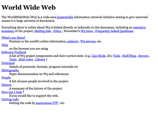
Here is a sample of what the html looked like, you can really see how things have come since the beginning!
这是html外观的示例,您可以真正了解自开始以来的情况!
You can view the original page here
您可以在这里查看原始页面
<HEADER>
  <TITLE>The World Wide Web project</TITLE>
  <NEXTID N="55">
</HEADER>
<BODY>
    <H1>World Wide Web</H1>The WorldWideWeb (W3) is a wide-area
    <A NAME=0 HREF="WhatIs.html">hypermedia</A> information retrieval initiative aiming to give universal access to a large universe of documents.
    <P>
        Everything there is online about W3 is linked directly or indirectly to this document, including an <A NAME=24 HREF="Summary.html">executive summary</A> of the project, <A NAME=29 HREF="Administration/Mailing/Overview.html">Mailing lists</A> ,<A NAME=30 HREF="Policy.html">Policy</A> , November's <A NAME=34 HREF="News/9211.html">W3  news</A>
2. HTML标准(1994年) (2. Html standard (1994))
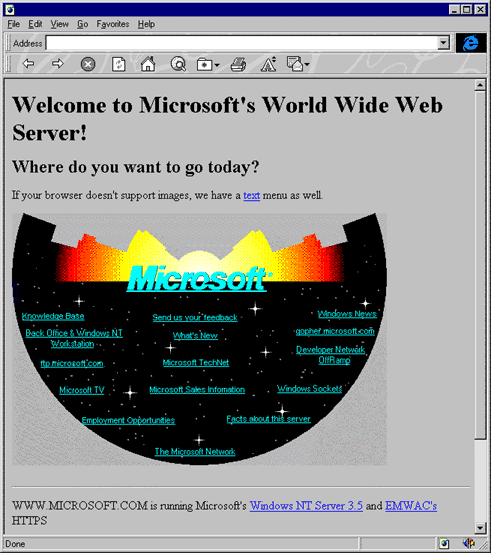
In 1994, when the World Wide Web Consortium was established, html was declared as the standard for marking up web pages.
1994年,万维网联盟成立时,html被宣布为标记网页的标准。
There was a general worry, as the web gained popularity, that companies would create their own versions of browsers, and languages to describe web content, and it would be non standard and difficult to evolve, which is one of the main reasons the html spec was created.
随着Web的普及,人们普遍担心公司会创建自己的浏览器版本和描述Web内容的语言,而且这将是非标准且难以发展的,这是html规范的主要原因之一已创建。
Html back then was not very advanced and featured elements such as anchors, images and headers. Tables came later on, but were not there from the start.
当时HTML并不是很先进,并且具有诸如锚点,图像和标题之类的元素。 桌子后来出现了,但从一开始就没有。
Unfortunately I am not able to find the original source code for the site, but I was really interested to see how they aligned the links within the image!
不幸的是,我找不到该网站的原始源代码,但是我很感兴趣地看到它们如何对齐图像中的链接!
3.基于表的设计(1995年) (3. Table based design (1995))
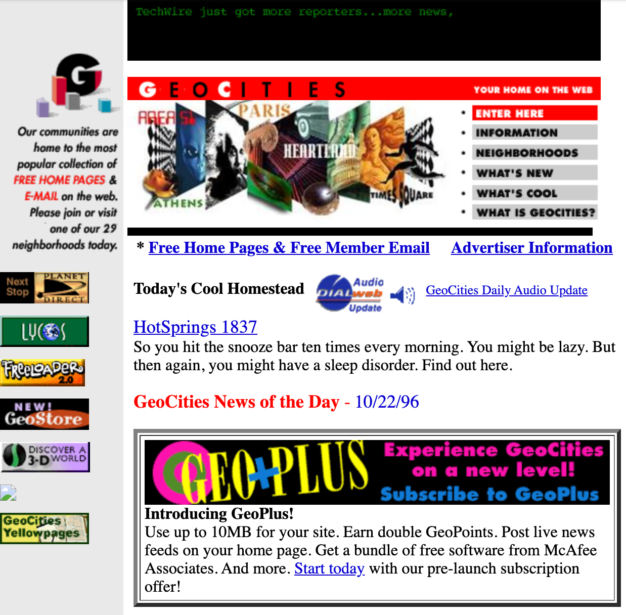
In 1995, table-based layouts became popular and gave web designers more options for creating websites. Table markup was, and still is meant for tabular data, but designers quickly realised they could utilise it to give structure to their designs, and create more complicated, multi-column layouts.
1995年,基于表格的布局开始流行,并为Web设计师提供了更多创建网站的选择。 表标记曾经是,现在仍然是用于表格数据的,但是设计人员很快意识到,他们可以利用它为设计提供结构,并创建更复杂的多列布局。
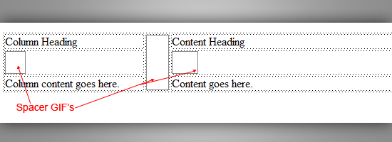
These designs grew in complexity, incorporating background images to give the impression of simpler structures than the actual table being used when looking at the code. People also used spacer gifs to control whitespace of web layouts.
这些设计变得越来越复杂,并结合了背景图片,给人以比查看代码时使用的实际表更简单的结构印象。 人们还使用spacer gifs控制Web布局的空白。
It wasn’t much later that WYSIWYG applications were started to be made (I remember how horrible dreamweaver was!!), which used table-based layouts, and increased the amount of tables used in the web.
不久之后,就开始制作所见即所得的应用程序(我记得Dreamweaver多么可怕!!),它使用基于表的布局,并增加了Web中使用的表的数量。
WYSIWYG editors often created tables so complex that they were very difficult to interpret the actual layout, such as tables with rows only 1-pixel high and hundreds of cells). Tables were the only real way to create more complex designs, such as multi column layouts, and they certainly evolved web page designs!
所见即所得(WYSIWYG)编辑器通常创建的表是如此复杂,以至于很难解释实际的布局,例如,行仅高1像素且具有数百个单元的表。 表格是创建更复杂的设计(例如多列布局)的唯一实际方法,并且它们肯定会演变为网页设计!
Here is some of the source from the above page, notice the heavy use of tables
这是上一页的一些资源,请注意表格的大量使用
<td width="480" align="left" valign="top">
<!-- -->
<a href="/web/19961022173245/http://www.geocities.com/cgi-bin/click_through/http://www.techweb.com/wire;techwire4.gif" target="_top">
<img src="/web/19961022173245im_/http://www.geocities.com/pictures/sponsor/techwire4.gif" alt="Click Me!">
<br> </a>
<p>
<a href="/web/19961022173245/http://www.geocities.com/">
<img src="/web/19961022173245im_/http://www.geocities.com/pictures/new/home_bar1.gif" border="0"></a>
<img src="/web/19961022173245im_/http://www.geocities.com/pictures/new/home_mast2.jpg" alt="Home Mast Image - See footer for links" border="0">
<map name="mastmap">
<area shape="rect" coords="0,0,142,19" href="/web/19961022173245/http://www.geocities.com/homestead/" target="_parent">
<area shape="rect" coords="17,24,141,38" href="/web/19961022173245/http://www.geocities.com/BHI/inform.html" target="_parent">
<area shape="rect" coords="21,45,141,58" href="/web/19961022173245/http://www.geocities.com/homestead/homedir.html" target="_parent">
<area shape="rect" coords="18,65,141,77" href="/web/19961022173245/http://www.geocities.com/BHI/new.html" target="_parent">
<area shape="rect" coords="17,84,141,98" href="/web/19961022173245/http://www.geocities.com/homestead/homeday.html" target="_parent">
<area shape="rect" coords="19,103,142,117" href="/web/19961022173245/http://www.geocities.com/BHI/about.html" target="_parent">
</map>
<img src="/web/19961022173245im_/http://www.geocities.com/pictures/new/home_buttons.gif" usemap="#mastmap" alt="Home Buttons -
See footer for links" border="0">
<br>
<img src="/web/19961022173245im_/http://www.geocities.com/pictures/new/hbar_blk.gif"><table width="100%"><tr valign="top" align="center"><td width="300">
<b>* <a href="/web/19961022173245/http://www.geocities.com/homestead/" target="_parent">
Free Home Pages & Free Member Email</b></a></td><td width="180">
<a href="/web/19961022173245/http://www.geocities.com/BHI/ad_info.html" target="_parent"><b>Advertiser Information</b></a>
<spacer size="8" type="horizontal">
</td>
</tr></table>
</center></td>
</tr>4. Flash网站(1996) (4. Flash sites (1996))
In 1996, the first flash sites started to appear. It started with very basic tools and a timeline, and progressed to have powerful tools to develop entire sites.
1996年,第一个Flash网站开始出现。 它以非常基本的工具和时间表开始,后来发展为拥有强大的工具来开发整个网站。
Flash presented a ton of options beyond what was possible with html. Flash also used actionscript, which is based on ecmascript.
Flash提供了很多html所没有的选择。 Flash还使用了基于ecmascript的actionscript。
To create complex designs in flash, you didn’t have to rely on very complex table structures or use spacer images. It made it possible to create complex and interactive sites with animated features.
要在Flash中创建复杂的设计,您不必依赖非常复杂的表结构或使用间隔图像。 它使创建具有动画功能的复杂的交互式站点成为可能。
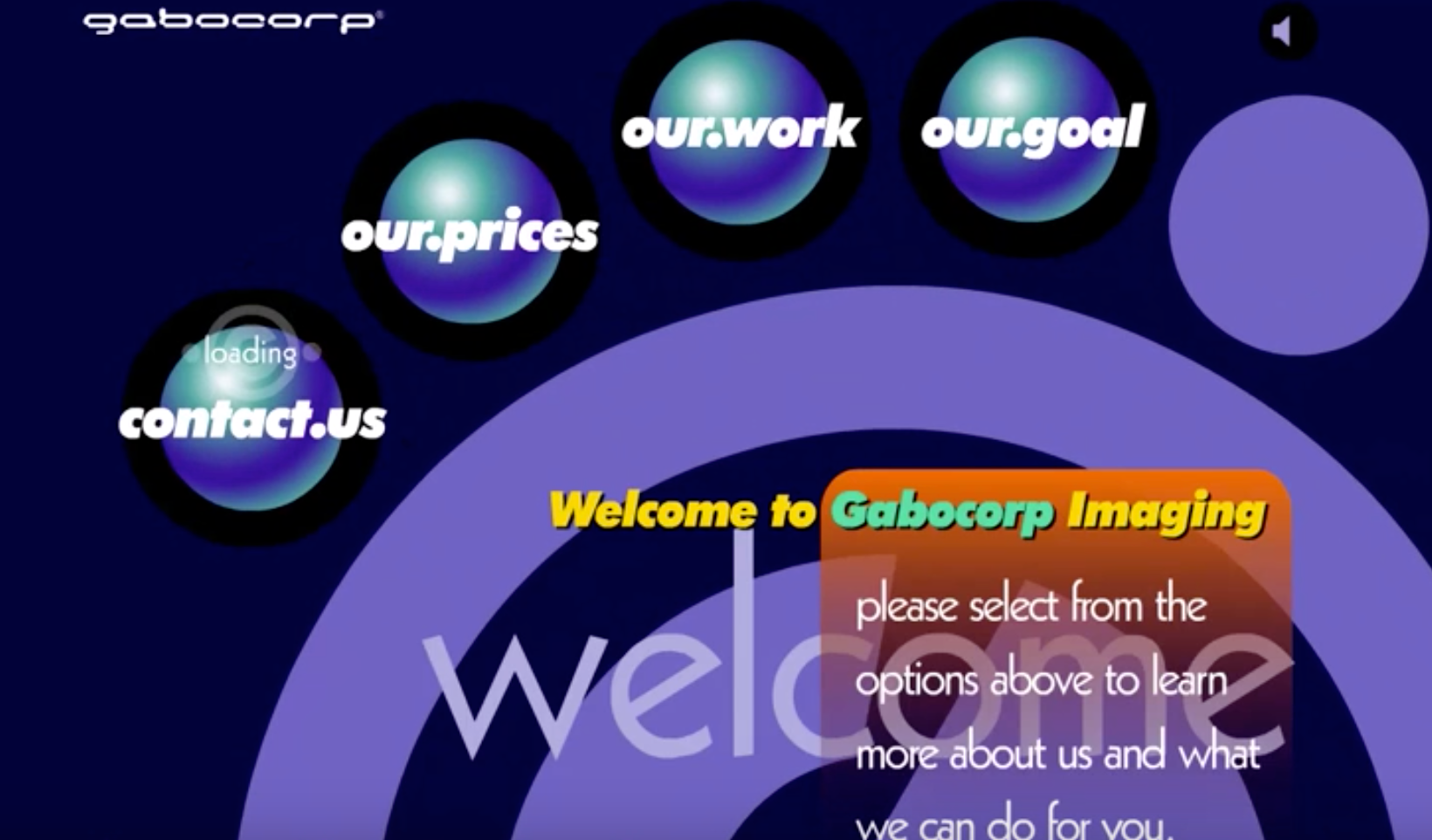
It felt like there was a massive jump at this point because the change was so drastic, websites finally started to look awesome!
感觉到现在有了巨大的飞跃,因为变化是如此之大,网站终于开始看起来很棒!
Flash started to decline over the years, and last year, just under 7% of websites were using the technology and, back in 2011, 28.5% of websites used some form of flash component. Flash was ditched mainly because of security issues which led to cross site scripting attacks
Flash多年来开始下降,去年,只有不到7%的网站正在使用该技术,而在2011年,有28.5%的网站使用了某种形式的Flash组件。 放弃Flash主要是因为安全问题导致跨站点脚本攻击
5.动态HTML(1999) (5. Dynamic html (1999))
Towards the end of the 90s, came the popularisation of dhtml techniques. This consisted of several web technologies such as JavaScript and server-side scripting such as classic asp and php.
到90年代末,dhtml技术开始普及。 它由多种Web技术(例如JavaScript)和服务器端脚本(例如经典的asp和php)组成。
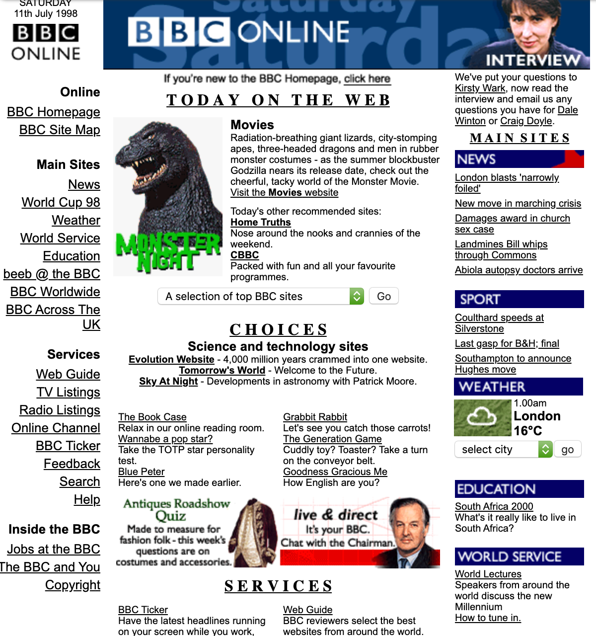
During this time interactive web pages started to appear, that allow users to not only read static content, but also to interact with web content.
在此期间,交互式网页开始出现,使用户不仅可以阅读静态内容,而且可以与Web内容进行交互。
<a href="https://web.archive.org/web/19980711005941/http://www.bbc.co.uk/radio4/hometruths/">Home Truths</a></b><br>Nose around the nooks and crannies of the weekend.<br>
<b><a href="https://web.archive.org/web/19980711005941/http://www.bbc.co.uk/cbbc/">CBBC</a></b><br>Packed with fun and all your favourite programmes.</font></td></tr></table><form name="Bbcone" method="post" action="https://web.archive.org/web/19980711005941/http://www.bbc.co.uk/cgi-bin/openurl.pl"><select name="link"><option value="http://www.bbc.co.uk/home/today/">A selection of top BBC sites<option value="http://www.bbc.co.uk/animalzone/">Animal Zone<option value="http://www.bbc.co.uk/antiques/">Antiques<option value="http://www.bbc.co.uk/radio4/anyqa/">Any Questions<option value="http://www.bbc.co.uk/radio4/archers/">The Archers<option value="http://www.bbc.co.uk/bluepeter/">Blue Peter<option value="http://www.bbc.co.uk/bugs/">Bugs<option value="http://www.bbc.co.uk/cbbc/">CBBC<option value="http://www.bbc.co.uk/crimewatch/">Crimewatch<option value="http://www.bbc.co.uk/cult/">Cult TV<option value="http://www.bbc.co.uk/digital/">BBC Digital<option value="http://www.bbc.co.uk/eastenders/">EastEnders<option value="http://www.beeb.com/cgi-bin/beeb.cgi?location=www.france98.beeb.com/">France 98<option value="http://www.bbc.co.uk/fullybooked/">Fully Booked<option value="http://www.bbc.co.uk/education/health/">Health vs Health<option value="http://www.bbc.co.uk/radio4/hometruths/">Home Truths<option value="http://www.bbc.co.uk/movies/">Movies
You can start to see that developers started using forms, which would post back to the server (in this case calling a .pl script) to dynamically change the content returned to the user.
您可以开始看到开发人员开始使用表单,这些表单将回发到服务器(在本例中为.pl脚本),以动态更改返回给用户的内容。
6. CSS开始腾飞(2000年) (6. CSS starts to take off (2000))
In the early 2000s, css designs started gaining popularity. While css had been available long before then, there was limited support for it in major browsers and many designers were unfamiliar with it.
在2000年代初期,css设计开始流行。 尽管css早在那时就已经可用,但是在主要的浏览器中对css的支持有限,而且许多设计人员都不熟悉css。
There were many benefits of using css based designs over table-based or flash designs. The first being it separates design elements from content, which ultimately meant that there would be greater distinction from the visual aspect of a web layout and its content. Css was, and still is the best practice for laying out a web page, where table-based layouts are not.
与基于表或闪存的设计相比,使用基于CSS的设计有很多好处。 首先是它将设计元素与内容分开,这最终意味着与Web布局及其内容的视觉方面会有更大的区别。 Css过去是,现在仍然是布局网页的最佳实践,而基于网页的布局则不是。
Using css reduced markup clutter, and made for cleaner code in web layouts. Css also makes it easier to maintain sites because the content and design elements are separated.
使用css可以减少标记的混乱情况,并且可以使Web布局中的代码更简洁。 由于内容和设计元素是分开的,因此CSS还使维护站点变得更加容易。
You can change the entire look of a css-based site without ever having to touch the content. Document sizes of CSS designs are generally smaller than the alternatives, which translated to an improvement in page response times. This is also helped by the fact that css is cached by the user’s browser so that subsequent page views would be faster-loading.
您可以更改基于CSS的网站的整体外观,而无需触摸内容。 CSS设计的文档大小通常小于其他设计,这意味着页面响应时间得到了改善。 事实是,css会被用户的浏览器缓存,从而可以更快地加载后续的页面视图,这也有所帮助。
<table width="100%" cellpadding="0" cellspacing="0" border="0" id="srch-form-shop" class="srch_form">
<tr><td>
<table width="100%" cellpadding="0" cellspacing="0" border="0" class="srch_form_bgcolor">
<tr>
<td>
<table border="0" cellpadding="0" cellspacing="0" class="srchActiveBg" width="100%" height="7">
<tr>
<td width="7" align="left" valign="top" class="srchCornerBg"><img src="https://web.archive.org/web/20060429185821im_/http://ly.lygo.com/ly/srch/tl_blue.gif" width="7" height="7" /></td>
<td width="100%"><img width="1" height="1" /></td>
<td width="7" align="right" valign="top" class="srchCornerBg"><img src="https://web.archive.org/web/20060429185821im_/http://ly.lygo.com/ly/srch/tr_blue.gif" width="7" height="7" /></td>
</tr></table>
</td>
</tr>
<tr>
<td style="padding-left: 7px;">
<form class="srch_form" id="form-shop" method="get" action="https://web.archive.org/web/20060429185821/http://r.lycos.com/r/bizrate_tab_product/http://bizrate.lycos.com/buy/superfind.xpml">
<input type="hidden" name="rf" value="lys302" />
<input type="hidden" name="query" id="query" />
<input class="textbox" type="text" name="keyword" size="55" id="query_shop" />  <select class="select" name="cat_id" id="cat_id">
<option value="1" selected>All Departments</option>
<option value="10000000">Apparel</option>Developers suddenly started to include more and more css, although this started mostly inline, it eventually became more accepted that css should be derived by classes, and the bulk of the styling should be loaded in via stylesheets.
开发人员突然开始包括越来越多的css,尽管这大多是内联的,但最终变得越来越被人们接受,css应该由类派生,大部分样式应通过样式表加载。
7.手机的普及度(2007年) (7. Popularity of mobile phones (2007))
As mobile phones accessing websites became more popular, in 2007 there was a rise in using grids and frameworks because all the different layouts for different devices caused content-parity problems.
随着手机访问网站的普及,2007年使用网格和框架的情况有所增加,因为不同设备的所有不同布局都导致内容奇偶校验问题。
Speed was also an issue, as loading a lot of content uses up a lot of mobile internet data. The first step was an idea of column grids.
速度也是一个问题,因为加载大量内容会占用大量移动互联网数据。 第一步是列网格的想法。
The outcome was the 960 grid system, and the 12-column division. Twitter bootstrap seemed to win the battle of the frameworks, but the downside was that web page designs often looked the same, or very similar (basically most websites had a look and feel of twitter). The upside to this was that suddenly building a layout for a page became much simpler!
结果是960网格系统和12列的分区。 Twitter引导似乎赢得了框架之战,但缺点是网页设计通常看起来相同或非常相似(基本上,大多数网站都具有Twitter的外观)。 这样做的好处是,突然为页面建立布局变得更加简单!
<form action="/web/20150610151816/https://www.instacart.com/check_zip_availability" class="zip-check-form" method="post">
<p class="message"></p>
<input autocomplete="off" class="check-zip-code" id="zip-code" maxlength="5" name="zip_code" pattern="[0-9]*" placeholder="Enter your zip code" type="text">
<button class="btn btn-warning btn-large" id="zip-code-button">Start Shopping</button>
</form>
<p>
Already have an account?
<a href="#login">Sign in</a>
</p>
</div>
<div class="step hide" id="signup-step">
<div class="the-eye-catcher" id="presignup">
<h1></h1>
<p></p>
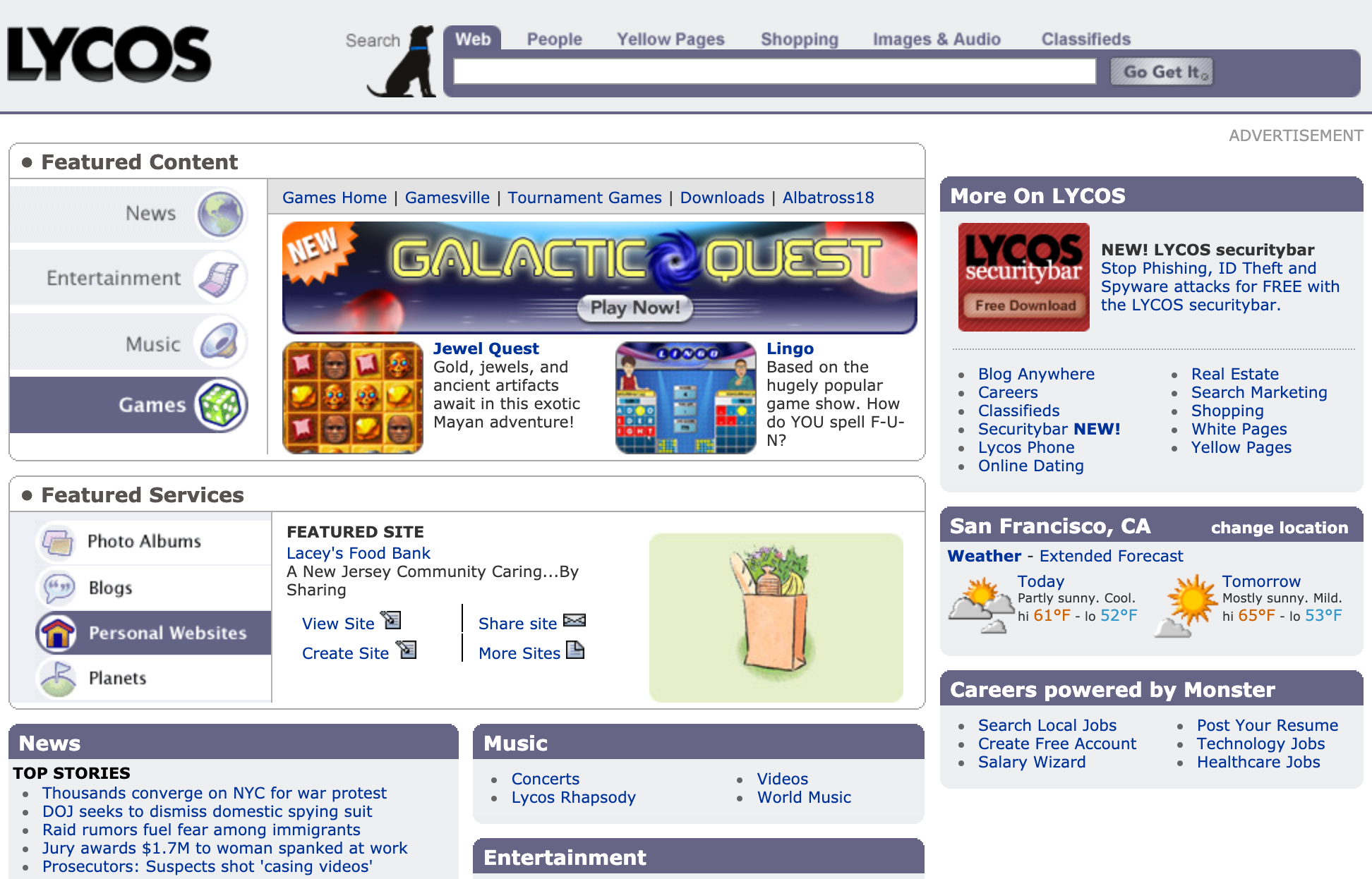
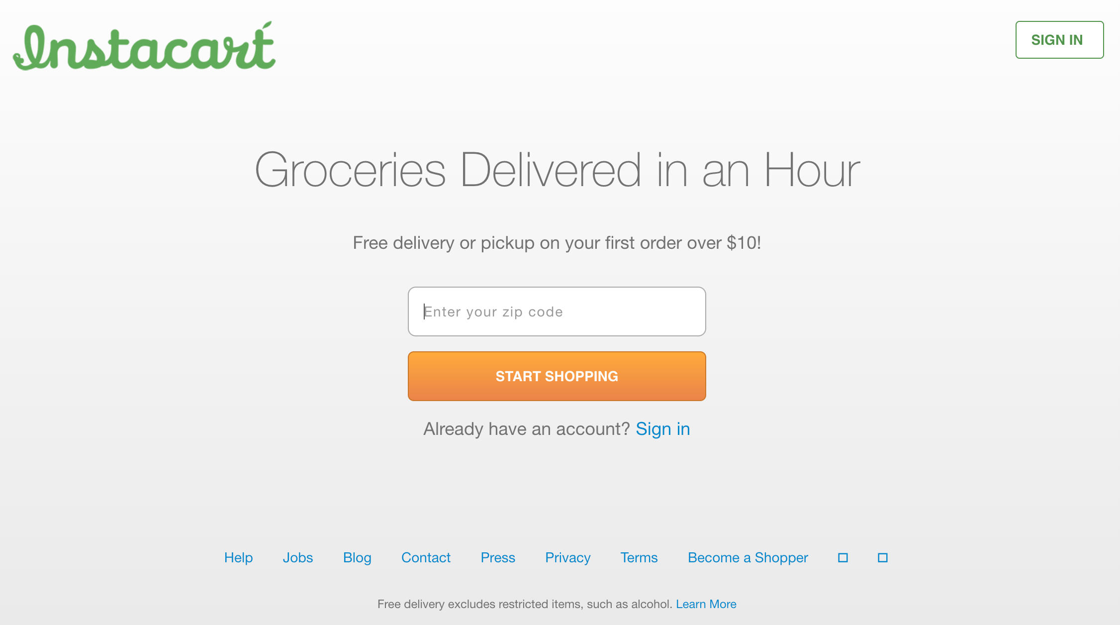
</div>Here is an example of the site above, notice the grid layout that was popular for a few years.
这是上面站点的示例,请注意流行了几年的网格布局。
Other very similar sites worth a mention
其他非常相似的网站值得一提

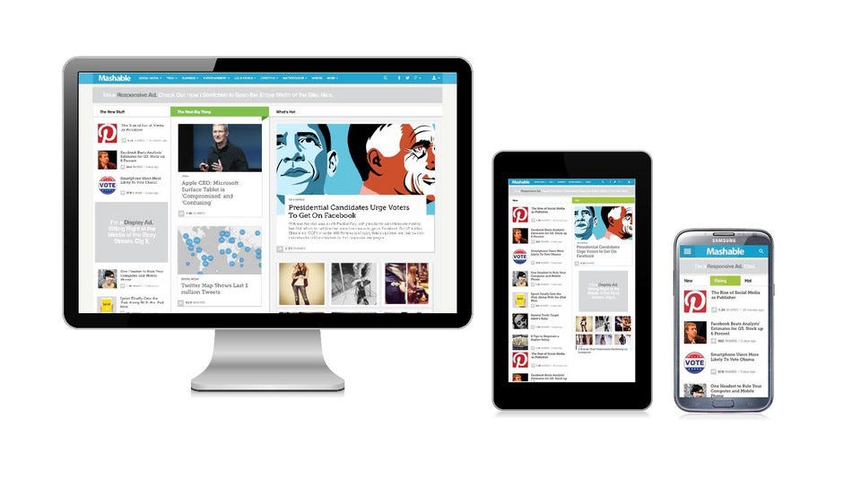
8.响应式设计的诞生(2010年) (8. Birth of responsive design (2010))
Towards 2010, a movement happened that challenged the existing approach, by using the same content, but different layouts for the design.
到2010年,发生了一场运动,通过使用相同的内容但设计不同的布局,挑战了现有方法。
This was called responsive web design. The main benefit here is the content parity, meaning that it’s the same website that works everywhere, on all devices, with a similar look and feel. Frameworks evolved and started to be able to specify the layout at different view ports (col-4-medium etc.).
这就是所谓的响应式网页设计。 这里的主要好处是内容奇偶校验,这意味着它是一个可以在所有设备上无处不在且外观相似的相同网站。 框架不断发展,并开始能够指定不同视图端口(col-4-medium等)的布局。
Media queries also helped to hide and show various parts of a page or change the way it looks on a mobile, tablet and desktop.
媒体查询还有助于隐藏和显示页面的各个部分,或更改页面在移动设备,平板电脑和台式机上的显示方式。
9.现在和将来(现在和将来) (9. Present and future (now and future))
Although not much has changed in the last few years, new css measurement units exist, like vh, vw (viewport height and width), which allow much greater flexibility to position elements.
尽管在最近几年中变化不大,但仍存在新CSS测量单位,例如vh,vw(视口高度和宽度),这使元素定位具有更大的灵活性。
Flexbox is another concept which is part of CSS, and it allows you to create layouts and modify them with a single property instead of writing lots of code and hopefully soon the css built in grid system will become more widely used, and revolutionise the way we create layouts overall!
Flexbox是CSS中的另一个概念,它使您可以创建布局并使用单个属性修改它们,而无需编写大量代码,并且希望很快内置于网格系统中CSS会得到更广泛的使用,并彻底改变我们的方式整体创建布局!
One other thing to mention is the introduction of web components. Web components are a set of elements bundled together, and introduce an easier workflow, where elements become building blocks that can be reused and updated separately.
要提及的另一件事是Web组件的引入。 Web组件是捆绑在一起的一组元素,并引入了更简单的工作流程,其中元素成为可单独重用和更新的构建块。
A good example of this, is react. Web components usually have custom elements, work with a shadow dom, use html templates, rather than combining design and functionality, and imports which allow components to be easily separated
一个很好的例子就是React。 Web组件通常具有自定义元素,可以与影子dom配合使用,使用html模板,而不是将设计和功能结合在一起,并且导入可以使组件易于分离
Website layout and styling has changed a lot over the years!
多年来,网站布局和样式已发生了很大变化!
翻译自: https://medium.com/@craig.beardy.digital/9-ways-that-website-layouts-have-changed-since-the-web-was-created-36cad6d62541
代码创建布局
本文来自互联网用户投稿,该文观点仅代表作者本人,不代表本站立场。本站仅提供信息存储空间服务,不拥有所有权,不承担相关法律责任。如若转载,请注明出处:http://www.luyixian.cn/news_show_809863.aspx
如若内容造成侵权/违法违规/事实不符,请联系dt猫网进行投诉反馈email:809451989@qq.com,一经查实,立即删除!相关文章
用树莓派构建一台服务器,永久运行网站
建议收藏:2020年,给你8个程序员接私活的网站
别总写代码,这 130个网站比涨工资都重要
jwt单点登录_了解前端,爱上前端 | 网站各种登录方式对比
这么多编程学习网站,总有一个适合你吧
近期你已经授权登录过_原来你的qq授权登录过这么多的网站 一键查出撤销了吧...

用 Nginx 禁止国外 IP 访问我的网站..

怎样给一个php网站搬家
洛奇英雄传老福单机版服务器不显示,洛奇英雄传:永恒官方网站-这一次让经典成为永恒...
基于django的视频点播网站开发-step14-数据总览功能
小浩算法网站上线啦!
全宇宙著名网站中使用的编程语言

如何制作出吸引潜在用户的网站?
网站软件开发规范(某门户网站的)

【前端】低版本IE浏览器访问网站一片空白
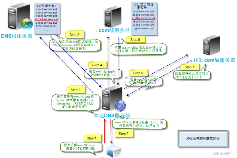
DNS与网站访问流程
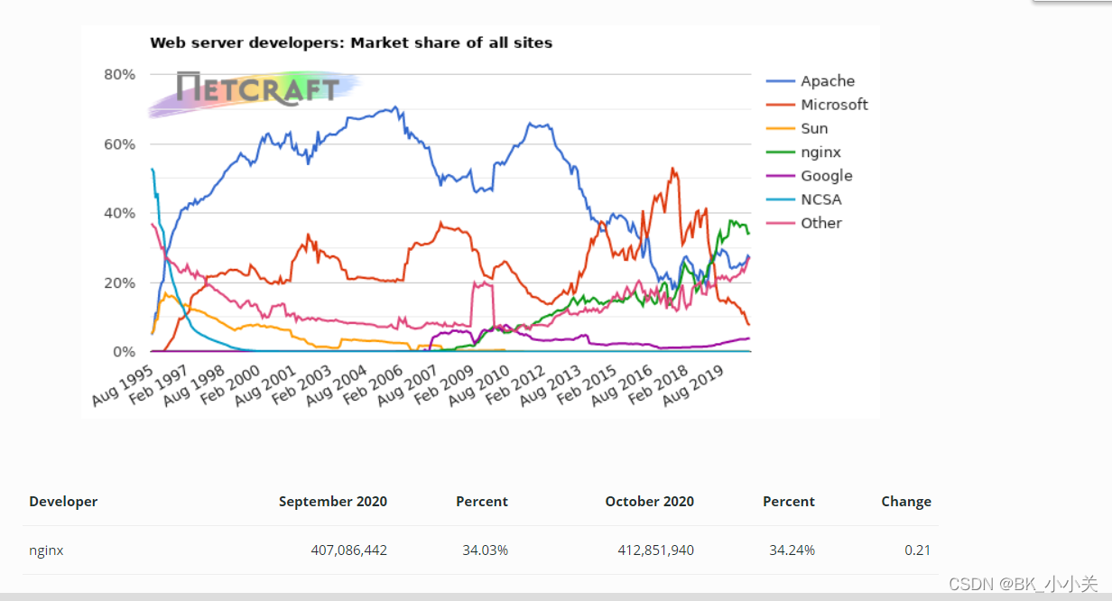
Apache网站的概述
Apache网站的部署
