页面布局的三大核心:
- 盒子模型
- 浮动
- 定位
1、盒子模型
1.1 盒子模型组成
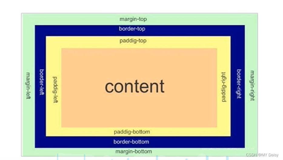
盒子模型本质还是一个盒子,包括边框border、外边距margin、内边距padding和实际内容content
1.1.1 边框border
组成
组成:颜色border-color、边框宽度border-width、样式(实线、虚线)border-style
| 属性 | 作用 |
|---|---|
| border-width | 边框粗细,单位px |
| border-style | 边框样式,none\solid\dashed\dotted |
| border-color | 边框颜色 |
边框的复合写法:
没有先后顺序
border:1px solid red;
<!DOCTYPE html>
<html lang="en">
<head><meta charset="UTF-8"><meta http-equiv="X-UA-Compatible" content="IE=edge"><meta name="viewport" content="width=device-width, initial-scale=1.0"><title>Document</title><style>div{width: 100px;height: 100px;}.div1{border-width: 2px;border-color: red;border-style: dashed;}.div2{border:2px green solid;}</style>
</head>
<body><div class="div1"></div><div class="div2"></div>
</body>
</html>
按照盒子四条边分别设置边框属性
top\left\right\bottom
border-top:1px solid red;//只设置上边框
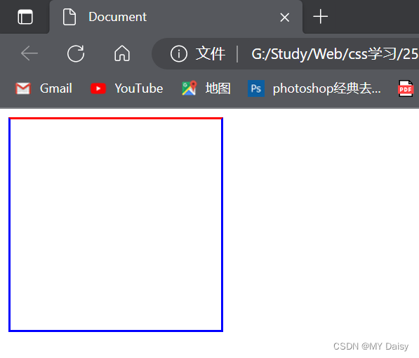
练习:
给一个200*200的盒子,设置上边框为红色,其余边框为蓝色
<!DOCTYPE html>
<html lang="en">
<head><meta charset="UTF-8"><meta http-equiv="X-UA-Compatible" content="IE=edge"><meta name="viewport" content="width=device-width, initial-scale=1.0"><title>Document</title><style>div{width: 200px;height: 200px;}.div2{border:2px blue solid;border-top:red 2px solid;}</style>
</head>
<body><div class="div2"></div>
</body>
</html>
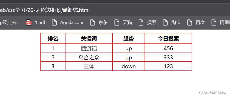
表格细线边框
border-collapse:collapse;//表示相邻边框合并在一起
练习:
<!DOCTYPE html>
<html lang="en"><head><meta charset="UTF-8"><meta http-equiv="X-UA-Compatible" content="IE=edge"><meta name="viewport" content="width=device-width, initial-scale=1.0"><title>Document</title><style>table{width: 400px;height: 100px;}th{height: 25px;}table,td,th {border: 1px red solid;border-collapse: collapse;font-size: 14px;text-align: center;}</style>
</head><body><table align="center" cellspacing="0"><thead><tr><th>排名</th><th>关键词</th><th>趋势</th><th>今日搜索</th></tr></thead><tbody><tr><td>1</td><td>西游记</td><td>up</td><td>456</td></tr><tr><td>2</td><td>乌合之众</td><td>up</td><td>333</td></tr><tr><td>3</td><td>三体</td><td>down</td><td>123</td></tr></tbody></table>
</body></html>
边框会影响盒子的实际大小
因此要保证盒子实际做出来的效果与效果图一致:
测量效果图边框时,不量边框。或者加上边框减去边框的距离
1.1.2 内边距padding
用来设置内边距,即边框与内容之间的距离
padding-top:上内边距
padding-bottom:下内边距
padding-left:左内边距
padding-right:右内边距
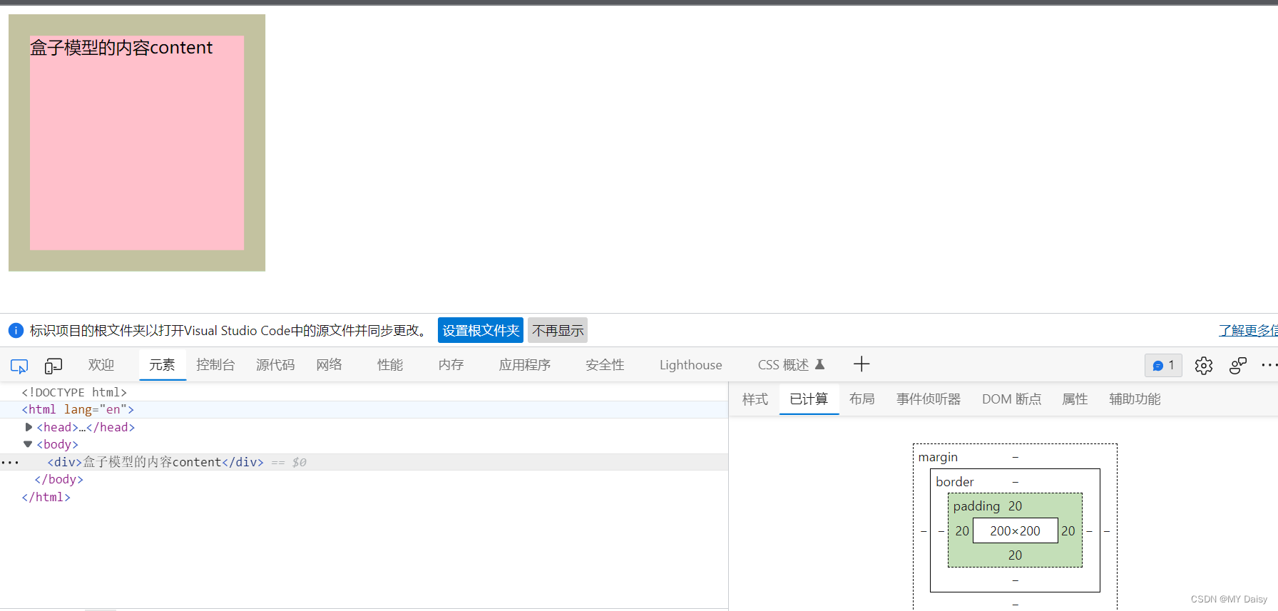
练习:
<!DOCTYPE html>
<html lang="en">
<head><meta charset="UTF-8"><meta http-equiv="X-UA-Compatible" content="IE=edge"><meta name="viewport" content="width=device-width, initial-scale=1.0"><title>Document</title><style>div{width: 200px;height: 200px;background-color: pink;padding-top: 20px;padding-left: 20px;padding-bottom: 20px;padding-right: 20px;}</style>
</head>
<body><div>盒子模型的内容content</div>
</body>
</html>
padding复合属性写法
顺序:上右下左
padding:5px;//上下左右
padding:5px 10px;//上下是5,左右是10px
padding:5px 10px 20px;//上-5,左右-10,下-20
padding:5px 10px 20px 30px;//上-5,右-10,下-20 左30
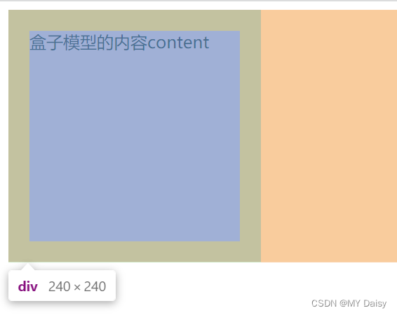
padding会影响盒子实际大小
如果盒子已经有了宽度和高度设置,指定padding内边距时,会撑大盒子
因此要保证盒子实际做出来的效果与效果图一致,需要让width、height减去多出来的内边距
<!DOCTYPE html>
<html lang="en">
<head><meta charset="UTF-8"><meta http-equiv="X-UA-Compatible" content="IE=edge"><meta name="viewport" content="width=device-width, initial-scale=1.0"><title>Document</title><style>div{width: 200px;height: 200px;background-color: pink;padding-top: 20px;padding-left: 20px;padding-bottom: 20px;padding-right: 20px;}</style>
</head>
<body><div>盒子模型的内容content</div>
</body>
</html>
应用:
导航栏里字数不一样多,如果给每个盒子设置一样的宽度,就会导致相邻两个盒子中内容之间的距离可能有的大有的小,看起来不美观。可以采用padding
给盒子设置相同宽度:
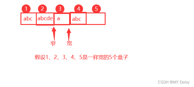
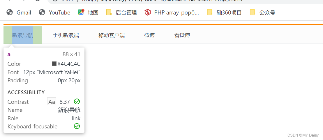
练习:新浪导航
<!DOCTYPE html>
<html lang="en"><head><meta charset="UTF-8"><meta http-equiv="X-UA-Compatible" content="IE=edge"><meta name="viewport" content="width=device-width, initial-scale=1.0"><title>Document</title><style>.nav {border-top: 3px solid #ff8500;border-bottom: 1px solid #edeef0;height: 41px;background-color: #fcfcfc;line-height: 41px;}.nav a{display: inline-block;height: 41px;padding: 0 20px;font-size: 12px;text-decoration: none;color:#4c4c4c;}.nav a:hover{color: #ff8500;background-color: #eee;}</style></head><body><div class="nav"><a href="#">新浪导航</a><a href="#">手机新浪端</a><a href="#">移动客户端</a><a href="#">微博</a><a href="#">看微博</a></div>
</body></html>
padding使用的特殊场景
如果盒子本身没有指定width/height属性,padding可以改变元素的宽度和高度
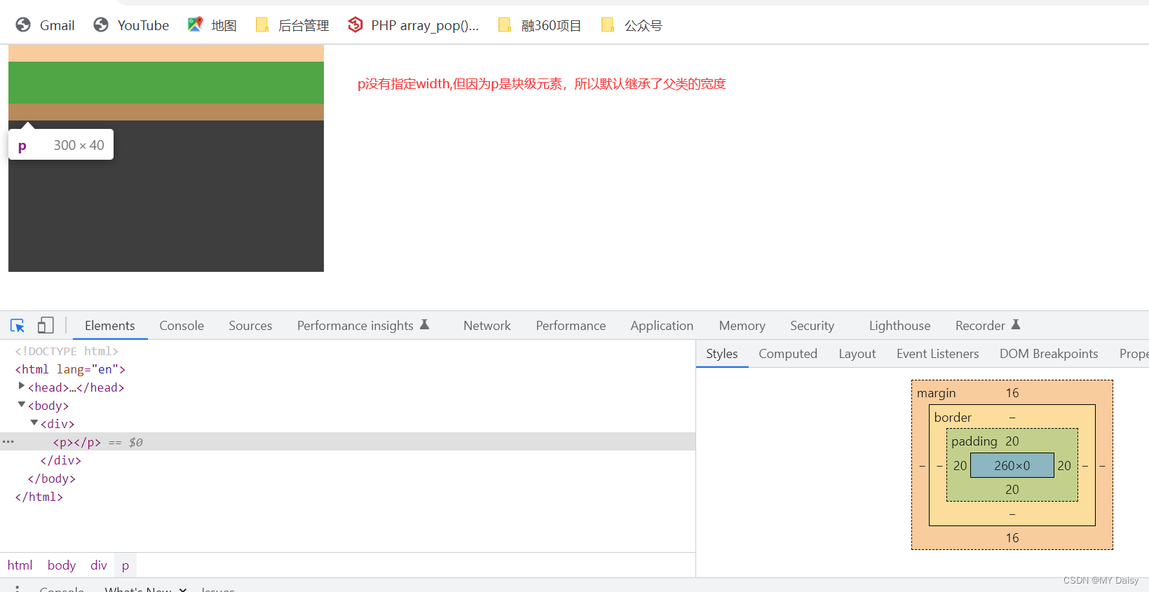
块级元素:
1、
宽度:没有设置时,可以继承父类的宽度(不受padding影响)
高度:不能继承父类高度(由padding控制)
父类设置宽度300,高度200。
子类没有设置宽高,设置了padding,宽度是300,高度=padding*2
<!DOCTYPE html>
<html lang="en">
<head><meta charset="UTF-8"><meta http-equiv="X-UA-Compatible" content="IE=edge"><meta name="viewport" content="width=device-width, initial-scale=1.0"><title>Document</title><style>div{width: 300px;height: 200px;background-color: #3e3e3e;}p{background-color: green;/* height:100px;width: 100%; */padding: 20px;}</style>
</head>
<body><div><p></p></div>
</body>
</html>
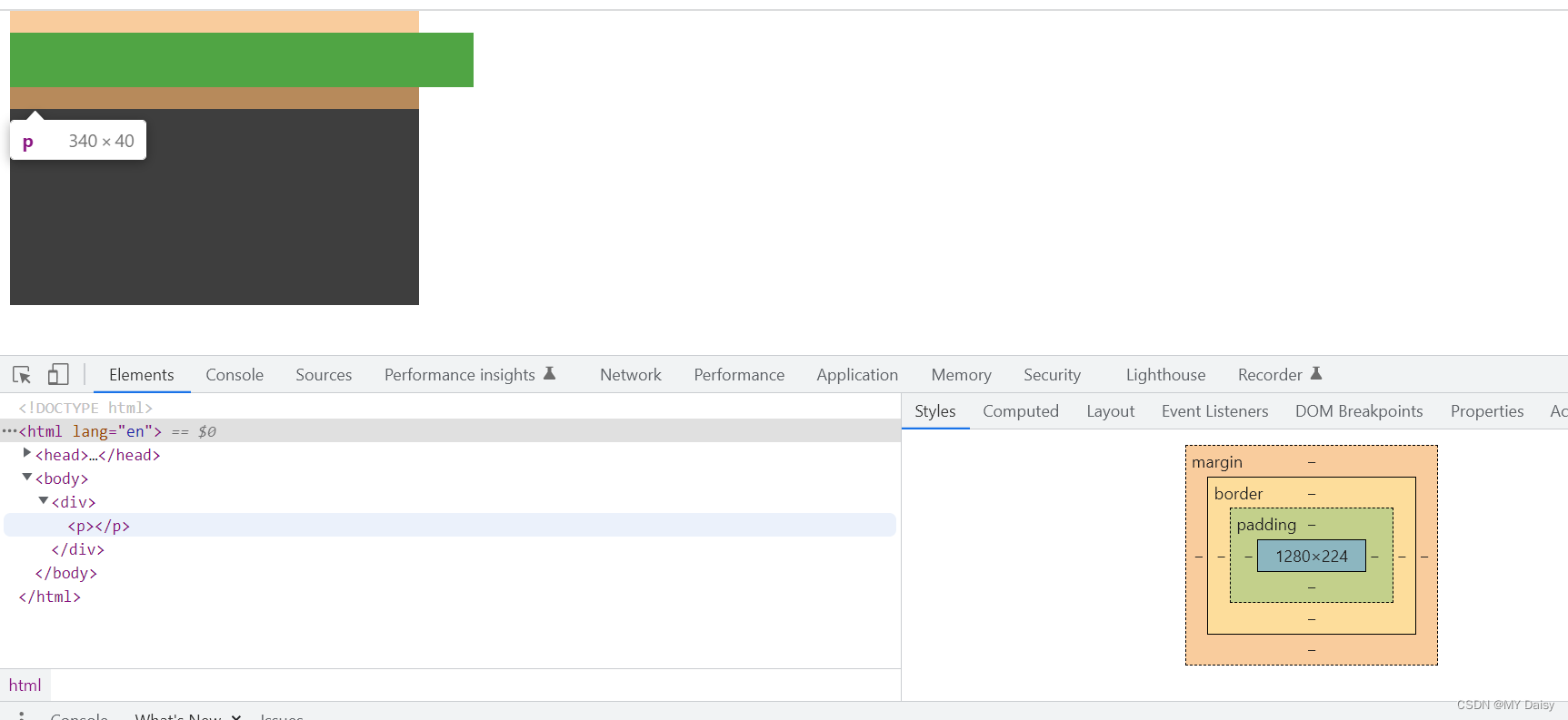
2、
宽度:子类设置宽度时,取设置的宽度+padding2(受padding影响)
高度:子类设置高度,取设置的高度+padding2
父类设置宽度300,高度200。
子类没有设置宽高,设置了padding,宽度是300,高度=padding*2
<!DOCTYPE html>
<html lang="en">
<head><meta charset="UTF-8"><meta http-equiv="X-UA-Compatible" content="IE=edge"><meta name="viewport" content="width=device-width, initial-scale=1.0"><title>Document</title><style>div{width: 300px;height: 200px;background-color: #3e3e3e;}p{background-color: green;width: 100%;padding: 20px;}</style>
</head>
<body><div><p></p></div>
</body>
</html>
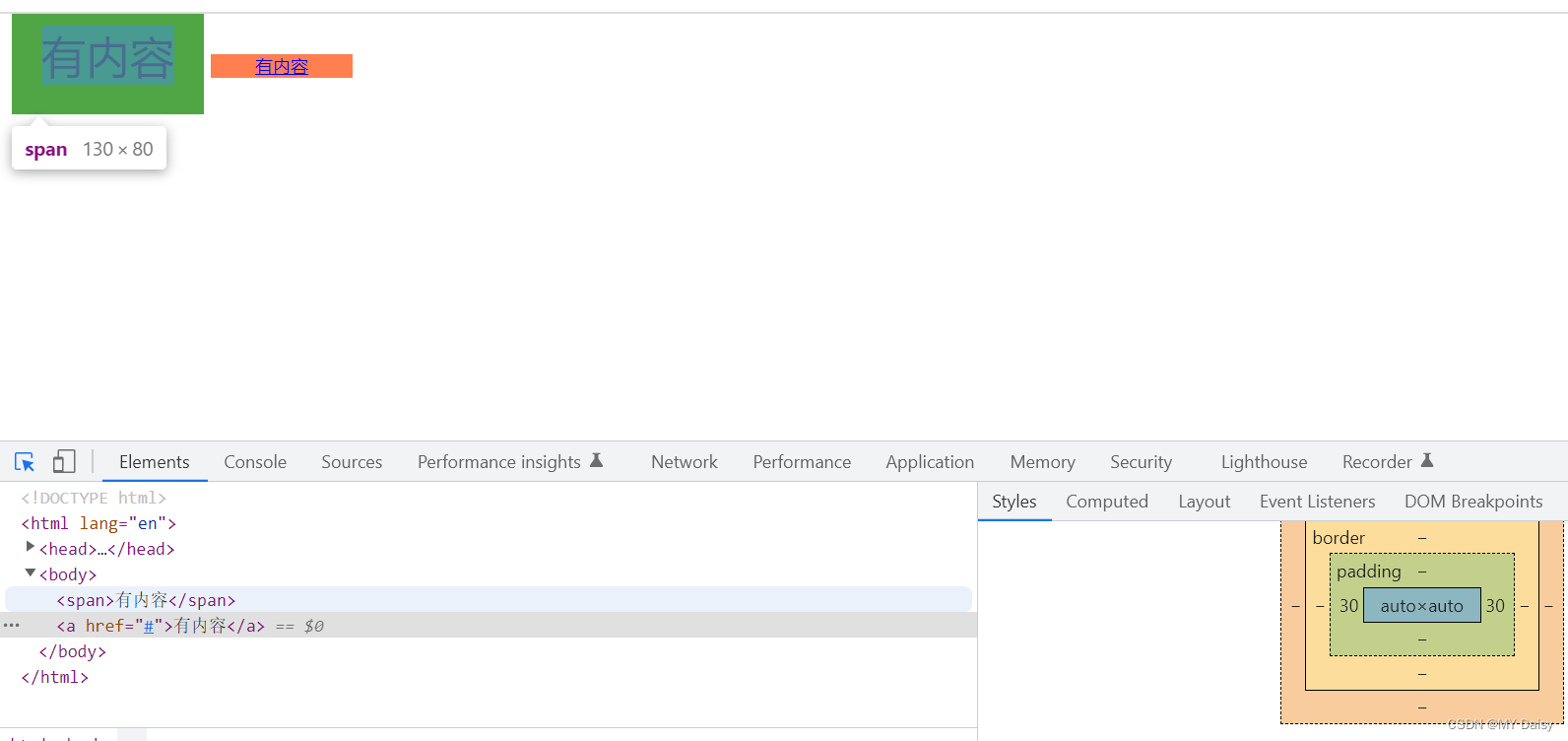
行内元素
有内容:
宽度:不受width属性的限制,宽度由行内元素内容和padding决定。宽度=行内元素宽度+padding*2
高度:不受height属性的限制,有默认高度,且可以由line-height和font-size改变高度
<!DOCTYPE html>
<html lang="en">
<head><meta charset="UTF-8"><meta http-equiv="X-UA-Compatible" content="IE=edge"><meta name="viewport" content="width=device-width, initial-scale=1.0"><title>Document</title><style>body{width: 500px;height: 500px;}span{padding: 20px;background-color: green;font-size: 30px;}a{background-color: coral;padding: 0px 30px;font-size: 10px;}</style>
</head>
<body><span>有内容</span><a href="#">有内容</a>
</body>
</html>
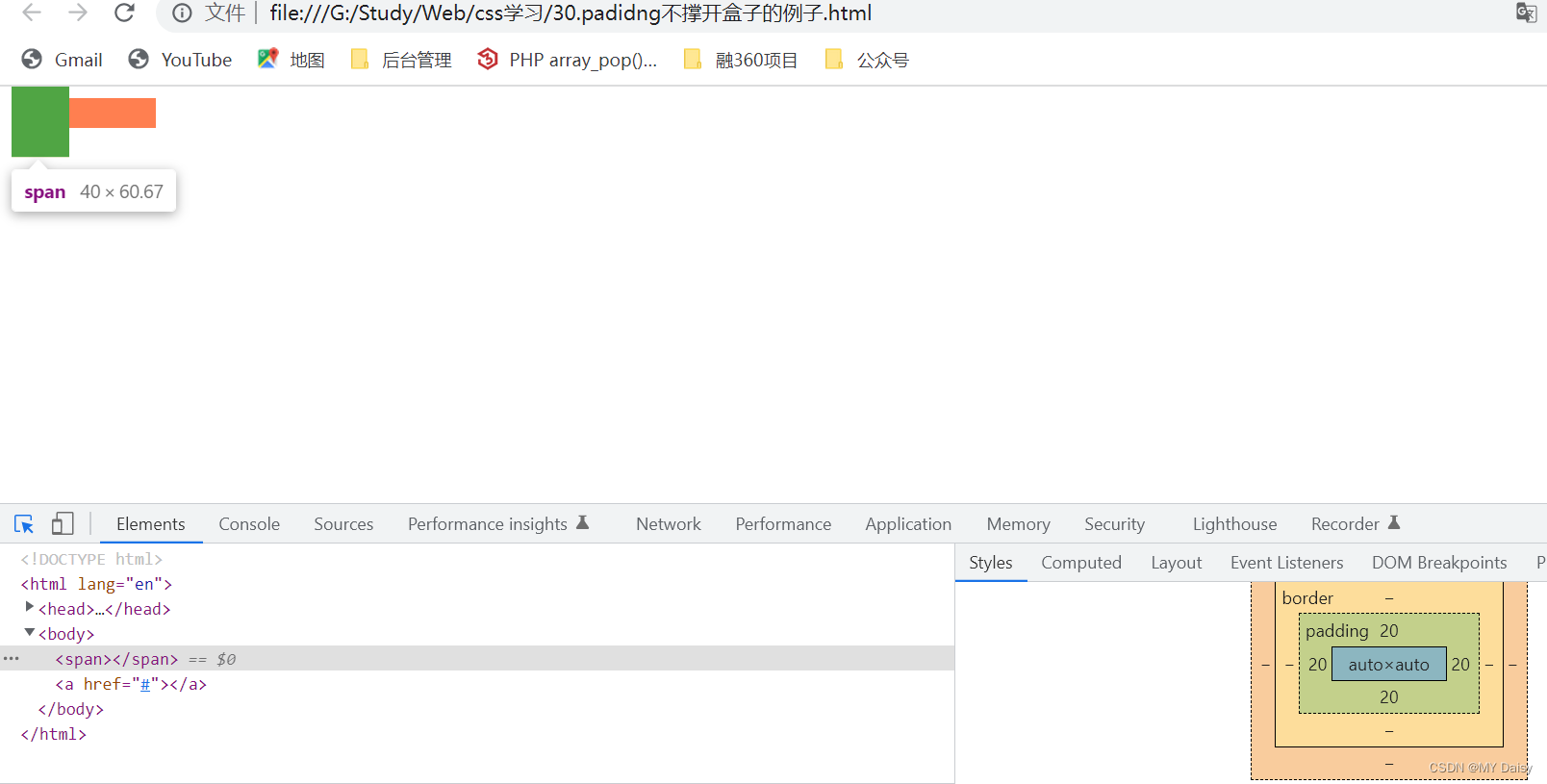
没有内容:
宽度:不受width属性的限制,没有内容时。宽度=padding2
高度:不受height属性的限制,有默认高度,没有设置line-height和font-size时,高度=padding2+默认高度
<!DOCTYPE html>
<html lang="en">
<head><meta charset="UTF-8"><meta http-equiv="X-UA-Compatible" content="IE=edge"><meta name="viewport" content="width=device-width, initial-scale=1.0"><title>Document</title><style>body{width: 500px;height: 500px;}span{padding: 20px;background-color: green;}a{background-color: coral;padding: 0px 30px;}</style>
</head>
<body><span></span><a href="#"></a>
</body>
</html>


![[足式机器人]Part3机构运动微分几何学分析与综合Ch02-3 平面机构离散运动鞍点综合——【读书笔记】](https://img-blog.csdnimg.cn/ee06b6c623684c51a2a7bfc106bb1c61.png)