大家好,我是半夏👴,一个刚刚开始写文的沙雕程序员.如果喜欢我的文章,可以关注➕ 点赞 👍 加我微信:frontendpicker,一起学习交流前端,成为更优秀的工程师~关注公众号:搞前端的半夏,了解更多前端知识! 点我探索新世界!
精通CSS-点击快速学习
前言
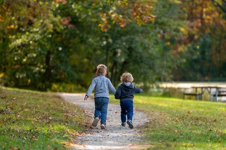
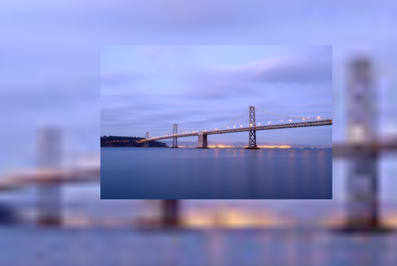
不知道大家有没有经常看到这种设计。
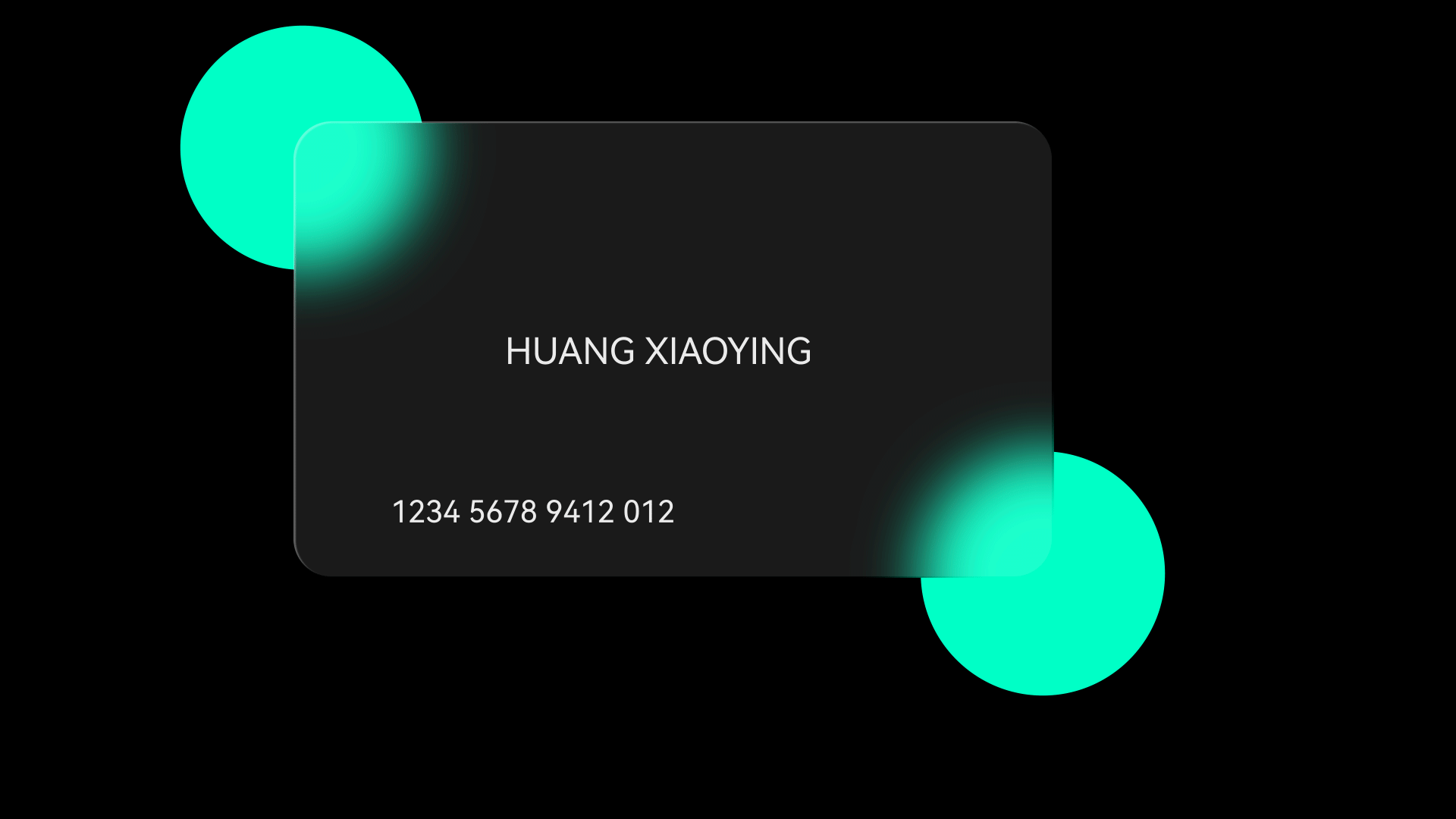
这种效果我们称之为毛玻璃效果。相信使用苹果的同学会很熟悉这种设计。
backdrop-filter 可以说是 CSS 中为毛玻璃量身定制的一个属性了。这也就是我在标题中使用熠熠生“毛”的原因了。
backdrop-filter
在 CSS 中还有一个属性叫 filter,这两个属性在语法层面是相同的。
filter 是将效果用于元素自身,而 backdrop-filter 则是将效果用于元素的背景。
先来看一下 MDN 上介绍的语法:
/* 关键词值 */
backdrop-filter: none;/* 指向 SVG 滤镜的 URL */
backdrop-filter: url(commonfilters.svg#filter);/* <filter-function> 滤镜函数值 */
backdrop-filter: blur(2px);
backdrop-filter: brightness(60%);
backdrop-filter: contrast(40%);
backdrop-filter: drop-shadow(4px 4px 10px blue);
backdrop-filter: grayscale(30%);
backdrop-filter: hue-rotate(120deg);
backdrop-filter: invert(70%);
backdrop-filter: opacity(20%);
backdrop-filter: sepia(90%);
backdrop-filter: saturate(80%);/* 多重滤镜 */
backdrop-filter: url(filters.svg#filter) blur(4px) saturate(150%);/* 全局值 */
backdrop-filter: inherit;
backdrop-filter: initial;
backdrop-filter: unset;
毛玻璃
注意点:必须使元素或其背景至少部分透明。
结构
<div class="container"><div class="card">Life doesn't have to be perfect, but to be wonderful</div>
</div>
容器样式
.container{position: relative;width: 1000px;height: 800px;background: url(./bk.jpg);background-repeat: no-repeat;}卡片式样
使用 blur: backdrop-filter: blur(10px);
.card{position: absolute;top: 50%;left: 50%;height:50px;line-height: 50px;backdrop-filter: blur(10px);transform: translate(-50% ,-50%);padding: 0 20px;}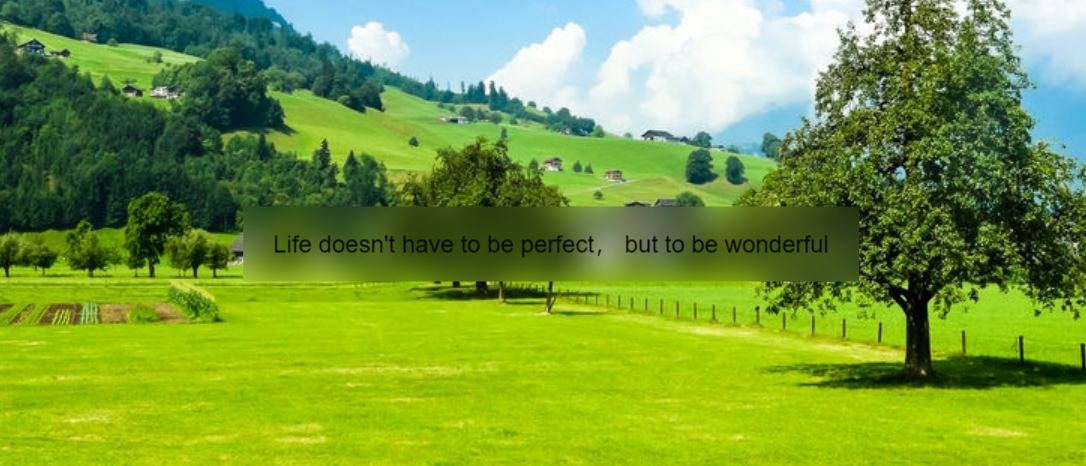
照片背景
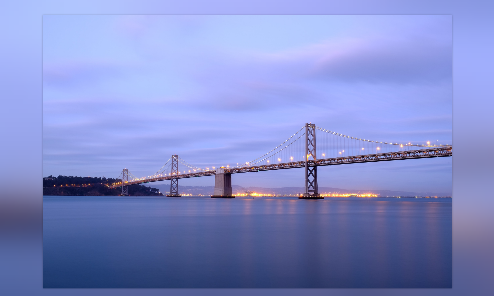
对于下面的这种效果,我们来分析一下。
首先图片在上一层,下层是一个模糊的背景。
<div class="bkImg"><img src="" class="Img"/>
</div>
.bkImg {background-color: #222;align-items: center;display: flex;justify-content: center;height: 100vh;width: 100%;position: relative;background-image: url();background-position: center;background-repeat: no-repeat;background-size: cover;}.Img {position: relative;max-height: 90%;max-width: 90%;z-index: 1;}
现在效果是这样的:
背景并不是我们所期望的,这里我们的背景是一张图片,这张图片跟上面的图片是一张图片。如果我们直接在 div 使用 backdrop-filter 的话,是否可行,答案是不可行。我们在上一个例子中明确指出。元素或者元素背景要透明或者干脆就没背景。
此时我们就考虑在 after 上添加。
.bkImg::after {backdrop-filter: blur(50px);content: "";display: block;height: 100%;left: 0;position: absolute;top: 0;width: 100%;z-index: 0;}
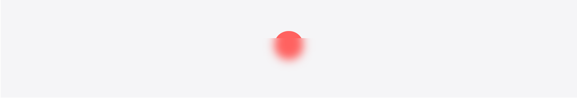
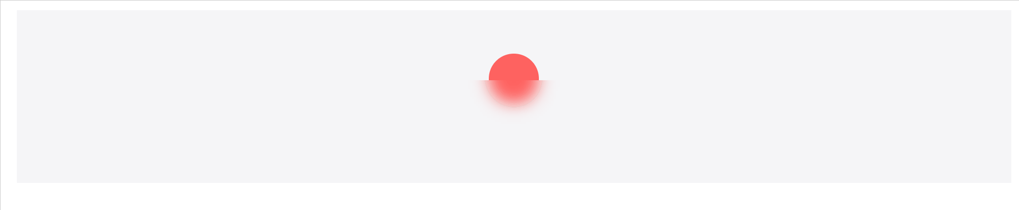
加点动画-日出东方
日出背景
<div class="card">
</div>.card {background-color: #f5f5f7;padding-top:150px;height: 300px;display: flex;flex-direction: column;align-items: center;margin: 64px 94px;position: relative;}
太阳
<div class="card"><div class="sun"></div><div class="bk"></div>
</div>.sun {position: absolute;top: 150px;width: 130px;height: 130px;background-color: #ff6260;border-radius: 50%;animation: sunRise 5S;
}.bk {position: sticky;bottom: 0;width: 100%;background-color: green;padding-top: 64px;padding-bottom: 8px;height: 130px;background-color: transparent;display: flex;align-items: center;justify-content: center;flex-direction: column;margin-top: 32px;backdrop-filter: blur(20px);
}
加上动画
@keyframes sunRise{0%{top:150px}100%{top:0px;}
}
效果
后记
前言中的图片来自站酷,笔者已经用CSS实现,有需要的童鞋,可以在评论区中艾特我获取。