第一个场面
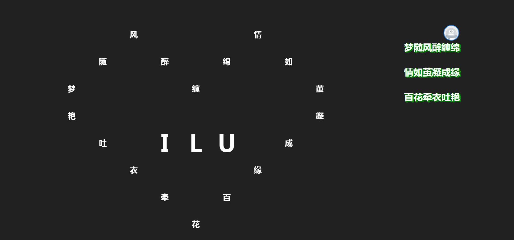
<!doctype html>
<html>
<head>
<meta charset="utf-8">
<title>#三行情书#</title>
<link rel="shortcut icon" href="./logo.ico" type="image/x-icon" />
<link type="text/css" rel="stylesheet" href='http://fonts.googleapis.com/css?family=Ubuntu:300italic,300,700' />
<link rel="stylesheet" type="text/css" href="./css/main.css">
<script type="text/javascript" src="js/jquery-1.8.3.min.js"></script>
<script type="text/javascript" src="main.js"></script>
<style>* {box-sizing: border-box;
}body {padding: 0;margin: 0;background: #212121;overflow: hidden;
}.mosaica {position: fixed;left: 2px;bottom: 2px;padding: 4px 6px;color: #FFFFFF;font-family: "Montserrat";font-size: 11px;letter-spacing: 0.06em;
}
.mosaica a{color: #fff;font-size: 30px;text-decoration: none;margin: 0 0 0 30px;
}
.mosaica a:hover{color: orange;
}
.container {position: absolute;width: 0;height: 0;left: 43%;top: 50%;perspective: 1200px;transform-origin: center center;cursor: move;
}.plane {position: absolute;display: block;width: 900px;height: 700px;border: 0;margin: -350px 0 0 -450px;transform-style: preserve-3d;
}
.plane:before {content: "";position: absolute;left: 0;top: 0;background: url('../img/background.jpg') no-repeat;background-size: 100% 700px;width: 100%;height: 100%;z-index: -1;transform: translateZ(-1px);
}.items {position: relative;transform-style: preserve-3d;
}.item {background-color: pink;position: absolute;overflow: hidden;/*border: 1px solid #2785db;*/
}
.item2,
.item3{position: absolute;left: 0;top:0;overflow: hidden;width: 100%;height: 100%;background:url(../img/heart.png) no-repeat center;background-size: 85px 69.5px;color: #fff;text-align: center;font-size: 75px;line-height: 87.5px;font-family: "微软雅黑","helvetica neue",arial,sans-serif;font-weight: 900;text-shadow:0 1px 0 rgba(0, 0, 0, 0.3);
}@keyframes animate {0% {transform: translate3d(0px, 0px, 0px) rotateX(0deg) rotateY(0deg) rotateZ(0deg) scale3d(1, 1, 1);transform-origin: 50% 50% 0;opacity: 1;} 100% {transform: translate3d(0px, 0px, 1200px) rotateX(180deg) rotateY(360deg) rotateZ(180deg) scale3d(0, 0, 0);transform-origin: 50% 50% 0;opacity: 1;}
}
@keyframes animate3 {0% {transform: translate3d(0px, 0px, 0px) rotateX(0deg) rotateY(0deg) rotateZ(0deg) scale3d(1, 1, 1);transform-origin: 50% 50% 0;font-size: 75px;opacity: 1;}  100% {transform: translate3d(0px, 0px, 1200px) rotateX(0deg) rotateY(0deg) rotateZ(0deg) scale3d(0, 0, 0);transform-origin: 50% 50% 0;font-size: 150px;opacity: 1;color: orange;}
}.item.animate {transform: translate3d(0px, 0px, 0px) rotateX(0deg) rotateY(0deg) rotateZ(0deg) scale3d(1, 1, 1);transform-origin: 50% 50% 0;animation: animate 15s forwards;
}
.item2.animate {transform: translate3d(0px, 0px, 0px) rotateX(0deg) rotateY(0deg) rotateZ(0deg) scale3d(1, 1, 1);transform-origin: 50% 50% 0;animation: animate 10s forwards;
}
.item3.animate {transform: translate3d(0px, 0px, 0px) rotateX(0deg) rotateY(0deg) rotateZ(0deg) scale3d(1, 1, 1);transform-origin: 50% 50% 0;animation: animate3 10s forwards;
}
.poem{position: absolute;top:18%;left: 78%;line-height: 80px;color: #fff;font-size: 30px;font-family: "微软雅黑","helvetica neue",arial,sans-serif;font-weight: 800;text-shadow:1px 0px #009807, 1px 2px #006705, 3px 1px #009807, 2px 3px #006705, 4px 2px #009807, 4px 4px #006705, 5px 3px #009807;
}
</style>
</head>
<body><audio autoplay="autopaly"><source src="song.mp3" type="audio/mp3" /></audio>  <div class="poem">梦随风醉缠绵<br>情如茧凝成缘<br>百花牵衣吐艳</div>
<div class="container"><div id="plane1" class="plane"><div class="items"><!-- 第一行 --><div class="item" style="top: 0px; left: 0px; width: 100px; height: 87.5px; animation-delay: 8.64s;background: url('./img/13.jpg') no-repeat; background-size: 100% 87.5px;"></div><div class="item" style="top: 0px; left: 100px; width: 100px; height: 87.5px; animation-delay: 8.56s; background: url('./img/13.jpg') no-repeat; background-size: 100% 87.5px;"></div><div class="item3" style="top: 0px; left: 200px; width: 100px; height: 87.5px; animation-delay: 14.96s; background: url('./img/12.jpg') no-repeat; background-size: 100% 87.5px;"></div><div class="item" style="top: 0px; left: 300px; width: 100px; height: 87.5px; animation-delay: 9.74s; background: url('./img/13.jpg') no-repeat; background-size: 100% 87.5px;"></div><div class="item" style="top: 0px; left: 400px; width: 100px; height: 87.5px; animation-delay: 8.28s; background: url('./img/13.jpg') no-repeat; background-size: 100% 87.5px;"></div><div class="item" style="top: 0px; left: 500px; width: 100px; height: 87.5px;animation-delay: 8.88s;  background: url('./img/13.jpg') no-repeat; background-size: 100% 87.5px;"></div><div class="item" style="top: 0px; left: 600px; width: 100px; height: 87.5px;animation-delay: 14.96s;  background: url('./img/12.jpg') no-repeat; background-size: 100% 87.5px;"></div><div class="item" style="top: 0px; left: 700px; width: 100px; height: 87.5px; animation-delay: 9.76s; background: url('./img/13.jpg') no-repeat; background-size: 100% 87.5px;"></div><div class="item" style="top: 0px; left: 800px; width: 100px; height: 87.5px; animation-delay: 8.4s; background: url('./img/13.jpg') no-repeat; background-size: 100% 87.5px;"></div><div class="item2" style="top: 0px; left: 200px; width: 100px; height: 87.5px; animation-delay: 1.64s; font-size: 25px;">风</div><div class="item2" style="top: 0px; left: 600px; width: 100px; height: 87.5px; animation-delay: 2.44s;  font-size: 25px;">情</div><!-- 第二行 --><div class="item" style="top: 87.5px; left: 0px; width: 100px; height: 87.5px; animation-delay: 8.12s; background: url('./img/13.jpg') no-repeat; background-size: 100% 87.5px;"></div><div class="item" style="top: 87.5px; left: 100px; width: 100px; height: 87.5px; animation-delay: 14.96s; background: url('./img/12.jpg') no-repeat; background-size: 100% 87.5px;"></div><div class="item3" style="top: 87.5px; left: 200px; width: 100px;height: 87.5px;animation-delay: 15.96s;  background: url('./img/100.jpg') no-repeat; background-size: 100% 87.5px;"></div><div class="item" style="top: 87.5px; left: 300px; width: 100px; height: 87.5px; animation-delay: 14.96s; background: url('./img/12.jpg') no-repeat; background-size: 100% 87.5px;"></div><div class="item" style="top: 87.5px; left: 400px; width: 100px; height: 87.5px; animation-delay: 8.8s; background: url('./img/13.jpg') no-repeat; background-size: 100% 87.5px;"></div><div class="item" style="top: 87.5px; left: 500px; width: 100px; height: 87.5px; animation-delay: 14.96s; background: url('./img/12.jpg') no-repeat; background-size: 100% 87.5px;"></div><div class="item3" style="top: 87.5px; left: 600px; width: 100px;height: 87.5px;animation-delay: 15.96s;  background: url('./img/100.jpg') no-repeat; background-size: 100% 87.5px;"></div><div class="item" style="top: 87.5px; left: 700px; width: 100px;height: 87.5px;animation-delay: 14.96s;  background: url('./img/12.jpg') no-repeat; background-size: 100% 87.5px;"></div><div class="item" style="top: 87.5px; left: 800px; width: 100px; height: 87.5px; animation-delay: 9.48s; background: url('./img/13.jpg') no-repeat; background-size: 100% 87.5px;"></div><div class="item2" style="top: 87.5px; left: 100px; width: 100px; height: 87.5px; animation-delay: 1.24s;font-size: 25px;">随</div><div class="item2" style="top: 87.5px; left: 300px; width: 100px; height: 87.5px; animation-delay: 1.84s;font-size: 25px;">醉</div><div class="item2" style="top: 87.5px; left: 500px; width: 100px; height: 87.5px; animation-delay: 2.24s;font-size: 25px;">绵</div><div class="item2" style="top: 87.5px; left: 700px; width: 100px;height: 87.5px;animation-delay: 2.64s; font-size: 25px;">如</div><!-- 第三行 --><div class="item" style="top: 175px; left: 0px; width: 100px; height: 87.5px; animation-delay: 14.96s; background: url('./img/12.jpg') no-repeat; background-size: 100% 87.5px;"></div><div class="item3" style="top: 175px; left: 100px; width: 100px; height: 87.5px; animation-delay: 15.96s; background: url('./img/100.jpg') no-repeat; background-size: 100% 87.5px;"></div><div class="item3" style="top: 175px; left: 200px; width: 100px; height: 87.5px; animation-delay: 15.96s; background: url('./img/100.jpg') no-repeat; background-size: 100% 87.5px;"> </div><div class="item3" style="top: 175px; left: 300px; width: 100px; height: 87.5px; animation-delay: 15.96s; background: url('./img/100.jpg') no-repeat; background-size: 100% 87.5px;"> </div><div class="item" style="top: 175px; left: 400px; width: 100px; height: 87.5px; animation-delay: 14.96s; background: url('./img/12.jpg') no-repeat; background-size: 100% 87.5px;"> </div><div class="item3" style="top: 175px; left: 500px; width: 100px; height: 87.5px;animation-delay: 15.96s;  background: url('./img/100.jpg') no-repeat; background-size: 100% 87.5px;"> </div><div class="item3" style="top: 175px; left: 600px; width: 100px; height: 87.5px;animation-delay: 15.96s;  background: url('./img/100.jpg') no-repeat; background-size: 100% 87.5px;"> </div><div class="item3" style="top: 175px; left: 700px; width: 100px; height: 87.5px; animation-delay: 15.96s; background: url('./img/100.jpg') no-repeat; background-size: 100% 87.5px;"></div><div class="item" style="top: 175px; left: 800px; width: 100px; height: 87.5px; animation-delay: 14.96s; background: url('./img/12.jpg') no-repeat; background-size: 100% 87.5px;"> </div><div class="item2" style="top: 175px; left: 0px; width: 100px; height: 87.5px; animation-delay: 1.04s;font-size: 25px;">梦</div><div class="item2" style="top: 175px; left: 400px; width: 100px; height: 87.5px; animation-delay: 2.04s;font-size: 25px;">缠 </div><div class="item2" style="top: 175px; left: 800px; width: 100px; height: 87.5px; animation-delay: 2.84s;font-size: 25px;">茧 </div><!-- 第四行 --><div class="item" style="top: 262.5px; left: 0px; width: 100px; height: 87.5px; animation-delay: 14.96s; background: url('./img/12.jpg') no-repeat; background-size: 100% 87.5px;"> </div><div class="item3" style="top: 262.5px; left: 100px; width: 100px; height: 87.5px; animation-delay: 15.96s; background: url('./img/100.jpg') no-repeat; background-size: 100% 87.5px;"> </div><div class="item3" style="top: 262.5px; left: 200px; width: 100px;height: 87.5px;animation-delay: 15.96s;  background: url('./img/100.jpg') no-repeat; background-size: 100% 87.5px;"> </div><div class="item3" style="top: 262.5px; left: 300px; width: 100px; height: 87.5px; animation-delay: 15.96s; background: url('./img/100.jpg') no-repeat; background-size: 100% 87.5px;"></div><div class="item3" style="top: 262.5px; left: 400px; width: 100px; height: 87.5px; animation-delay: 15.96s; background: url('./img/100.jpg') no-repeat; background-size: 100% 87.5px;"> </div><div class="item3" style="top: 262.5px; left: 500px; width: 100px; height: 87.5px; animation-delay: 15.96s; background: url('./img/100.jpg') no-repeat; background-size: 100% 87.5px;"> </div><div class="item3" style="top: 262.5px; left: 600px; width: 100px;height: 87.5px;animation-delay: 15.96s;  background: url('./img/100.jpg') no-repeat; background-size: 100% 87.5px;"> </div><div class="item3" style="top: 262.5px; left: 700px; width: 100px;height: 87.5px;animation-delay: 15.96s;  background: url('./img/100.jpg') no-repeat; background-size: 100% 87.5px;"> </div><div class="item" style="top: 262.5px; left: 800px; width: 100px; height: 87.5px; animation-delay: 14.96s; background: url('./img/12.jpg') no-repeat; background-size: 100% 87.5px;"></div><div class="item2" style="top: 262.5px; left: 0px; width: 100px; height: 87.5px; animation-delay: 4.64s;font-size: 25px;">艳</div><div class="item2" style="top: 262.5px; left: 800px; width: 100px; height: 87.5px; animation-delay: 3.04s;font-size: 25px;"> 凝</div><!-- 第五行 --><div class="item" style="top: 350px; left: 0px; width: 100px; height: 87.5px; animation-delay: 8.04s; background: url('./img/13.jpg') no-repeat; background-size: 100% 87.5px;"></div><div class="item" style="top: 350px; left: 100px; width: 100px; height: 87.5px; animation-delay: 14.96s; background: url('./img/12.jpg') no-repeat; background-size: 100% 87.5px;"></div><div class="item3" style="top: 350px; left: 200px; width: 100px; height: 87.5px; animation-delay: 15.96s; background: url('./img/100.jpg') no-repeat; background-size: 100% 87.5px;"> </div><div class="item3" style="top: 350px; left: 300px; width: 100px; height: 87.5px; animation-delay: 15.96s; background: url('./img/100.jpg') no-repeat; background-size: 100% 87.5px;"> </div><div class="item3" style="top: 350px; left: 400px; width: 100px; height: 87.5px; animation-delay: 15.96s; background: url('./img/100.jpg') no-repeat; background-size: 100% 87.5px;"> </div><div class="item3" style="top: 350px; left: 500px; width: 100px; height: 87.5px;animation-delay: 15.96s;  background: url('./img/100.jpg') no-repeat; background-size: 100% 87.5px;"> </div><div class="item3" style="top: 350px; left: 600px; width: 100px; height: 87.5px;animation-delay: 15.96s;  background: url('./img/100.jpg') no-repeat; background-size: 100% 87.5px;"> </div><div class="item" style="top: 350px; left: 700px; width: 100px; height: 87.5px; animation-delay: 14.96s; background: url('./img/12.jpg') no-repeat; background-size: 100% 87.5px;"></div><div class="item" style="top: 350px; left: 800px; width: 100px; height: 87.5px; animation-delay: 8.4s; background: url('./img/13.jpg') no-repeat; background-size: 100% 87.5px;"> </div><div class="item2" style="top: 350px; left: 100px; width: 100px; height: 87.5px; animation-delay: 4.44s; font-size: 25px;">吐</div><div class="item3" style="top: 350px; left: 300px; width: 100px; height: 87.5px; animation-delay: 5.64s; background:none; "> I</div><div class="item3" style="top: 350px; left: 400px; width: 100px; height: 87.5px; animation-delay: 5.64s; background:none; "> L</div><div class="item3" style="top: 350px; left: 500px; width: 100px; height: 87.5px; animation-delay: 5.64s;  background:none; "> U</div><div class="item2" style="top: 350px; left: 700px; width: 100px; height: 87.5px; animation-delay: 3.24s; font-size: 25px;">成</div><!-- 第六行 --><div class="item" style="top: 437.5px; left: 0px; width: 100px; height: 87.5px; animation-delay: 9.68s; background: url('./img/13.jpg') no-repeat; background-size: 100% 87.5px;"> </div><div class="item" style="top: 437.5px; left: 100px; width: 100px; height: 87.5px; animation-delay: 8.01s; background: url('./img/13.jpg') no-repeat; background-size: 100% 87.5px;"> </div><div class="item" style="top: 437.5px; left: 200px; width: 100px;height: 87.5px;animation-delay: 14.96s;  background: url('./img/12.jpg') no-repeat; background-size: 100% 87.5px;"> </div><div class="item3" style="top: 437.5px; left: 300px; width: 100px; height: 87.5px; animation-delay: 15.96s; background: url('./img/100.jpg') no-repeat; background-size: 100% 87.5px;"></div><div class="item3" style="top: 437.5px; left: 400px; width: 100px; height: 87.5px; animation-delay: 15.96s; background: url('./img/100.jpg') no-repeat; background-size: 100% 87.5px;"> </div><div class="item3" style="top: 437.5px; left: 500px; width: 100px; height: 87.5px; animation-delay: 15.96s; background: url('./img/100.jpg') no-repeat; background-size: 100% 87.5px;"> </div><div class="item" style="top: 437.5px; left: 600px; width: 100px;height: 87.5px;animation-delay: 14.96s;  background: url('./img/12.jpg') no-repeat; background-size: 100% 87.5px;"> </div><div class="item" style="top: 437.5px; left: 700px; width: 100px;height: 87.5px;animation-delay: 8.29s;  background: url('./img/13.jpg') no-repeat; background-size: 100% 87.5px;"> </div><div class="item" style="top: 437.5px; left: 800px; width: 100px; height: 87.5px; animation-delay: 9.2s; background: url('./img/13.jpg') no-repeat; background-size: 100% 87.5px;"></div><div class="item2" style="top: 437.5px; left: 200px; width: 100px; height: 87.5px; animation-delay: 4.24s;font-size: 25px;"> 衣</div><div class="item2" style="top: 437.5px; left: 600px; width: 100px; height: 87.5px;animation-delay: 3.44s; font-size: 25px;"> 缘</div><!-- 第七行 --><div class="item" style="top: 525px; left: 0px; width: 100px; height: 87.5px; animation-delay: 8.98s; background: url('./img/13.jpg') no-repeat; background-size: 100% 87.5px;"> </div><div class="item" style="top: 525px; left: 100px; width: 100px; height: 87.5px; animation-delay: 9.15s; background: url('./img/13.jpg') no-repeat; background-size: 100% 87.5px;"> </div><div class="item" style="top: 525px; left: 200px; width: 100px;height: 87.5px;animation-delay: 8.78s;  background: url('./img/13.jpg') no-repeat; background-size: 100% 87.5px;"> </div><div class="item" style="top: 525px; left: 300px; width: 100px; height: 87.5px; animation-delay: 14.96s; background: url('./img/12.jpg') no-repeat; background-size: 100% 87.5px;"></div><div class="item3" style="top: 525px; left: 400px; width: 100px; height: 87.5px; animation-delay:15.96s; background: url('./img/100.jpg') no-repeat; background-size: 100% 87.5px;"> </div><div class="item" style="top: 525px; left: 500px; width: 100px; height: 87.5px; animation-delay: 14.96s; background: url('./img/12.jpg') no-repeat; background-size: 100% 87.5px;"> </div><div class="item" style="top: 525px; left: 600px; width: 100px;height: 87.5px;animation-delay: 8.12s;  background: url('./img/13.jpg') no-repeat; background-size: 100% 87.5px;"> </div><div class="item" style="top: 525px; left: 700px; width: 100px;height: 87.5px;animation-delay: 8.68s;  background: url('./img/13.jpg') no-repeat; background-size: 100% 87.5px;"> </div><div class="item" style="top: 525px; left: 800px; width: 100px; height: 87.5px; animation-delay: 8.97s; background: url('./img/13.jpg') no-repeat; background-size: 100% 87.5px;"></div><div class="item2" style="top: 525px; left: 300px; width: 100px; height: 87.5px; animation-delay: 4.04s;font-size: 25px;"> 牵</div><div class="item2" style="top: 525px; left: 500px; width: 100px; height: 87.5px;animation-delay: 3.64s; font-size: 25px;"> 百</div><!-- 第八行 --><div class="item" style="top: 612.5px; left: 0px; width: 100px; height: 87.5px; animation-delay: 8.89s; background: url('./img/13.jpg') no-repeat; background-size: 100% 87.5px;"> </div><div class="item" style="top: 612.5px; left: 100px; width: 100px; height: 87.5px; animation-delay: 8.87s; background: url('./img/13.jpg') no-repeat; background-size: 100% 87.5px;"> </div><div class="item" style="top: 612.5px; left: 200px; width: 100px;height: 87.5px;animation-delay: 8.99s;  background: url('./img/13.jpg') no-repeat; background-size: 100% 87.5px;"> </div><div class="item" style="top: 612.5px; left: 300px; width: 100px; height: 87.5px; animation-delay: 8.25s; background: url('./img/13.jpg') no-repeat; background-size: 100% 87.5px;"></div><div class="item" style="top: 612.5px; left: 400px; width: 100px; height: 87.5px; animation-delay:14.96s; background: url('./img/12.jpg') no-repeat; background-size: 100% 87.5px;"> </div><div class="item" style="top: 612.5px; left: 500px; width: 100px; height: 87.5px; animation-delay: 8.97s; background: url('./img/13.jpg') no-repeat; background-size: 100% 87.5px;"> </div><div class="item" style="top: 612.5px; left: 600px; width: 100px;height: 87.5px;animation-delay: 8.9s;  background: url('./img/13.jpg') no-repeat; background-size: 100% 87.5px;"> </div><div class="item" style="top: 612.5px; left: 700px; width: 100px;height: 87.5px;animation-delay: 9s;  background: url('./img/13.jpg') no-repeat; background-size: 100% 87.5px;"> </div><div class="item" style="top: 612.5px; left: 800px; width: 100px; height: 87.5px; animation-delay: 8.5s; background: url('./img/13.jpg') no-repeat; background-size: 100% 87.5px;"></div><div class="item2" style="top: 612.5px; left: 400px; width: 100px; height: 87.5px; animation-delay: 3.84s;font-size: 25px;">花 </div></div></div>
</div>
</body>
</html>
第二个场面,动态心砰砰动
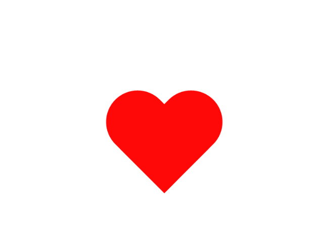
<!DOCTYPE HTML>
<html>
<head>
<meta charset="UTF-8"/>
<title>myHeart</title>
<style type="text/css">
*{
margin: 0;
padding: 0;
}
.heart{
position:absolute;
left: 50%;
top:50%;
margin-left: -150px;
margin-top: -135px;
width: 300px;
height:270px;
background: transparent;
/*box-shadow: 2px 2px 5px #000;*/
filter:drop-shadow(0px 0px 20px rgb(255,20,20));
animation: test 1s linear infinite;
}
.heart:before,
.heart:after{
content: "";
position: absolute;
left: 150px;
width: 150px;
height: 240px;
background: rgb(255,0,0);
border-radius: 150px 150px 0 0;
transform:rotate(-45deg);
transform-origin: 0 100%;
}
.heart:after{
left: 0;
transform:rotate(45deg);
transform-origin: 100% 100%;
}
@keyframes test{
0%{
transform: scale(0.8,0.8);
opacity: 1;
}
25%{
transform: scale(1,1);
opacity: 0.8;
}
100%{
transform: scale(0.8,0.8);
opacity: 1;
}
}
</style>
</head>
<body>
<div class="heart"></div>
<script>
// alert(window.navigator.userAgent);
</script>
</body>
</html>
第三个场景,画出一个心

<!DOCTYPE html>
<html>
<head>
<title>Draw Heart</title>
<style type="text/css">
* {
margin: 0;
padding: 0;
} html {
height: 100%;
margin: 0;
} body {
height: 100%;
background-color:white;
} #canvasZone {
width: 100%;
height: 100%;
text-align: center;
background-color: black;
} #myCanvas {
height:100%;
display: block;
/*background-color:aqua;*/
}
</style>
<script type="text/javascript">
var arr = [];//保存所有的XY坐标,只为验证。实际程序中可删除。
var r = 4;
var radian;//弧度
var i;
var radianDecrement;//弧度增量
var time = 10;//每个点之间的时间间隔
var intervalId;
var num = 360;//分割为 360 个点
var startRadian = Math.PI;
var ctx;
window.onload = function () {
startAnimation();
}
function startAnimation() {
ctx = document.getElementById("myCanvas").getContext("2d");
//让画布撑满整个屏幕,-20是滚动条的位置,需留出。如滚动条出现则会挤压画布。
WINDOW_HEIGHT=document.documentElement.clientHeight-20;
WINDOW_WIDTH=document.documentElement.clientWidth-20;
ctx.width = WINDOW_WIDTH;
ctx.heigh = WINDOW_HEIGHT;
drawHeart();
} function drawHeart() { ctx.strokeStyle = "red";
ctx.lineWidth = 1;//设置线的宽度
radian = startRadian;//弧度设为初始弧度
radianDecrement = Math.PI / num * 2;
ctx.moveTo(getX(radian), getY(radian));//移动到初始点
i = 0;
intervalId = setInterval("printHeart()", time);
}
//x = 16 sin^3 t, y = (13 cos t - 5 cos 2t - 2 cos 3t - cos 4t)
function printHeart() {
radian += radianDecrement;
ctx.lineTo(getX(radian), getY(radian));//在旧点和新点之间连线
//arr.push("X:" + getX(radian) + "<br/>Y:" + getY(radian) + "<br/>");
i++;
ctx.stroke();//画线
if (i >= num) {
clearInterval(intervalId);
//document.getElementById("bs").innerHTML = arr.join("");//打印所有的XY坐标点。
}
}
function getX(t) {//由弧度得到 X 坐标
return 100 + r * (16 * Math.pow(Math.sin(t), 3));
} function getY(t) {//由弧度得到 Y 坐标
return 50 - r * (13 * Math.cos(t) - 5 * Math.cos(2 * t) - 2 * Math.cos(3 * t) - Math.cos(4 * t));
}
</script>
</head>
<body>
<div id="canvasZone">
<canvas id="myCanvas"></canvas>
</div>
<div id="bs">
</div>
</body>
</html>