第014个
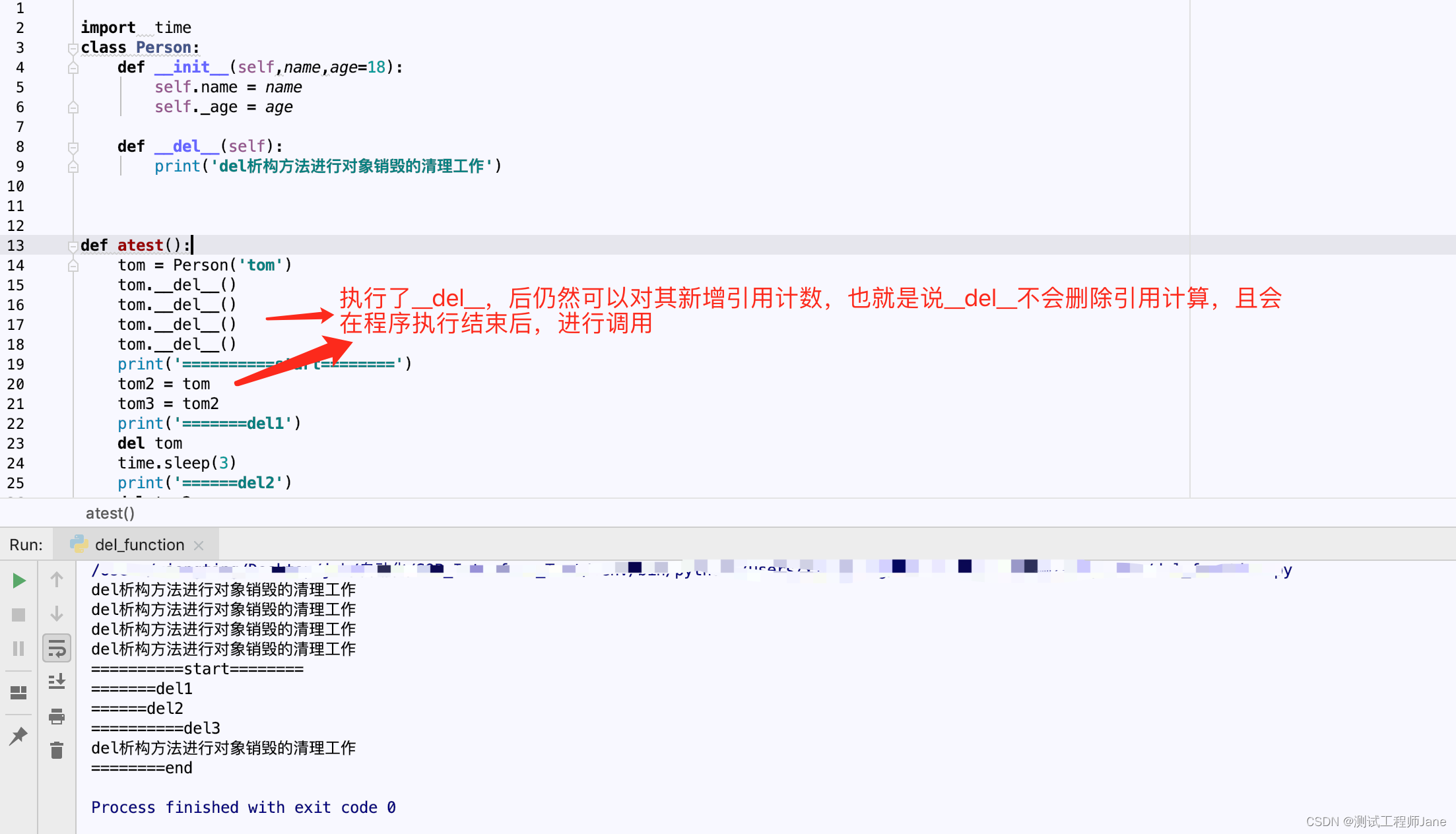
上一篇文章我们讲到了如何设置拐点大小,图形类型,旋转角度,缩放同比,位置偏移等,这篇文章介绍如何设置拐点的颜色、边框大小颜色等样式。hover轴线时候,拐点的填充颜色改变
文章目录
- 示例效果
- 示例源代码(共150行)
- 相关资料参考
- 拐点大小等设置
- 专栏介绍
示例效果

示例源代码(共150行)
/*
* @Author: 还是大剑师兰特(CSDN)
* @下面源代码版权归还是大剑师兰特所有,可供学习或商业项目中借鉴,未经授权,不得重复地发表到博客、论坛,问答,git等公共空间或网站中。
* @Email: 2909222303@qq.com
* @First published in CSDN
* @First published time: 2023-02-13
*/
<template><div class="container"><h3>vue+echarts:设置折线拐点的颜色,边框等样式</h3><p>大剑师兰特,还是大剑师兰特</p><div id="vue-echarts" ref="refEcharts"> </div></div>
</template><script>import * as echarts from 'echarts'; //局部引用,如果采用全局模式,这里不写export default {name: 'cuclife',data() {return {}},methods: {initCharts() {let myChart = echarts.init(this.$refs.refEcharts);myChart.setOption({title: {text: '标题:ECharts示例'},tooltip:{					show: true ,trigger: 'axis' ,},xAxis: {type: 'category',data: ['cuclife', 'openlayers', 'cesium', 'echarts', 'leaflet']},yAxis: {type: 'value',name: '技术技能值', //坐标轴名称nameLocation: 'middle', //坐标轴的位置nameTextStyle: {color: '#ff00ff',//align:'left',},nameGap: 50, //坐标轴名称与轴线之间的距离nameRotate: 90, //坐标轴名字旋转角度值,axisLine: {lineStyle: {color: '#ff00ff'},symbol: ['none', 'arrow'], //轴线两边的箭头symbolSize: [8, 12]},axisTick: {inside: false, //标轴刻度是否朝内,默认朝外},axisLabel: {show: true,inside: false,formatter: '{value}'},splitArea: {show: true,color: ['rgba(250,250,250,0.3)', 'rgba(200,200,200,0.3)'],}},grid: {x:50, y:55, x2:25, y2:20, containLabel: true },series: [{type: 'line',						//设置拐点大小,图形类型,旋转角度,缩放同比,位置偏移,是否显示symbol :'arrow',// 'circle', 'rect', 'roundRect', 'triangle', 'diamond', 'pin', 'arrow', 'none', emptyCirclesymbolSize : 20,symbolRotate: 180,symbolKeepAspect:true,symbolOffset:[0, 0],showSymbol :true, //false, tooltip hover时候才显示出来//设置拐点的颜色,边框等样式itemStyle:{color:'red',//拐点颜色borderColor:'#0000ff',//拐点边框颜色borderWidth:2,//拐点边框大小emphasis: {color: '#00ff00'//hover拐点颜色定义}},data: [15, 36, 10, 10, 20],						lineStyle: {//静态时显示状态//type:'dotted', //设置折线类型 width:5,  //设置折线粗细opacity:0.8, //设置透明度type: [5, 5],	 //设置折线类型 					dashOffset: 1,color: new echarts.graphic.LinearGradient(// (x1,y1) 点到点 (x2,y2) 之间进行渐变0, 0, 1, 0,[{offset: 0,color: '#ff00ff'}, // 0 起始颜色{offset: 0.5,color: '#ffff00'}, // 0 起始颜色{offset: 1,color: '#ff0000'} // 1 结束颜色]),//    shadowColor: 'rgba(0, 0, 0, 0.8)', //阴影颜色//    shadowBlur: 10,  //阴影的模糊大小。// shadowOffsetX:20, // 阴影水平方向上的偏移距离// shadowOffsetY:10,  // 阴影垂直方向上的偏移距离							},		}]});}},mounted() {this.initCharts();}}
</script>
<style scoped>.container {width: 840px;height: 580px;margin: 50px auto 0;border: 1px solid rgb(228, 57, 97);}#vue-echarts {width: 800px;height: 460px;border: 1px solid #d8d;margin: 0 auto;}
</style>
相关资料参考
https://echarts.apache.org/zh/option.html#series-line.symbol
https://echarts.apache.org/zh/option.html#series-line.itemStyle
拐点大小等设置
| 属性名称 | 默认值 | 参数说明 |
|---|---|---|
| symbol | emptyCircle | ‘rect’,‘circle’, ‘rect’, ‘roundRect’, ‘triangle’, ‘diamond’, ‘pin’, ‘arrow’, ‘none’, |
| symbolSize | 4 | 可以设置成诸如 10 这样单一的数字,也可以用数组分开表示宽和高,例如 [20, 10] 表示标记宽为20,高为10 |
| symbolRotate: | 0 | 标记的旋转角度(而非弧度)。正值表示逆时针旋转。注意在 markLine 中当 symbol 为 ‘arrow’ 时会忽略 symbolRotate 强制设置为切线的角度。 |
| symbolKeepAspect: | true | 如果 symbol 是 path:// 的形式,是否在缩放时保持该图形的长宽比 |
| symbolOffset | [0, 0] | 标记相对于原本位置的偏移。默认情况下,标记会居中置放在数据对应的位置,但是如果 symbol 是自定义的矢量路径或者图片,就有可能不希望 symbol 居中。这时候可以使用该配置项配置 symbol 相对于原本居中的偏移,可以是绝对的像素值,也可以是相对的百分比。例如 [0, ‘-50%’] 就是把自己向上移动了一半的位置,在 symbol 图形是气泡的时候可以让图形下端的箭头对准数据点。 |
| showSymbol | true | 是否显示 symbol, 如果 false 则只有在 tooltip hover 的时候显示。 |
专栏介绍
在vue和echarts联合技术栈的操控下,本专栏提供行之有效的源代码示例。这里既包括样式的修改,又包括常用bug的解决。
(1)提供title示例:展示控制标题的颜色、位置、子标题,连接等
(2)提供legend示例:展示控制图例的类型、宽度、高度、位置、间隙,边框、阴影、透明度、偏移,字体、颜色,提示语等
(3)提供grid示例:展示控制绘图网格的位置、宽度、高度、边框、阴影等
(4)提供xAxis示例:展示控制x 轴的位置、类型、名称、字体、对齐方式、边框、阴影、宽度、高度等
(5)提供yAxis示例:展示控制y 轴的位置、类型、名称、字体、对齐方式、边框、阴影、宽度、高度等
(6)提供dataZoom示例:展示控制区域缩放的类型、位置、filterMode等
(7)提供tooltip示例:展示控制提示框组件的触发方式、位置、样式,标签、动画、内容格式器等
(8)提供地理坐标系示例:展示控制地理坐标的经纬度、放缩、位置,距离、字体、边框等
(9)提供animation示例:展示控制动画的持续时间、延迟时间、动画方式,连接等
(10)提供其他示例:展示series等组件的信息内容。