由浅到深,多种方式搭建网站首页,实现轮播图
- 写在前面
- 1. 网站首页
- 2. 通过 HTML 搭建网站
- 3. 通过 DIV+CSS 来优化网站首页
- 4. JavaScript 实现图片轮播图
- 5. Bootstrap 框架完成响应式网站首页及轮播图
- 结束语
写在前面
- 本篇主要是能使前端知识有较好的应用和掌握,学习完零散的知识点后需要应用到实际案例才能有更好的理解和掌握。
- 应用HTML超文本标记语言 CSS样式 JavaScript脚本语言 Bootstrap框架来一步步搭建网站首页,应用不同的技术实现同一个网页,能更好的理解和区别前端知识。
1. 网站首页
<1> 首页展示
- 以下画面是我们本篇文章要实现的网站首页,最终效果是通过 Bootstrap 前端框架来实现,以达到最好的用户体验效果。
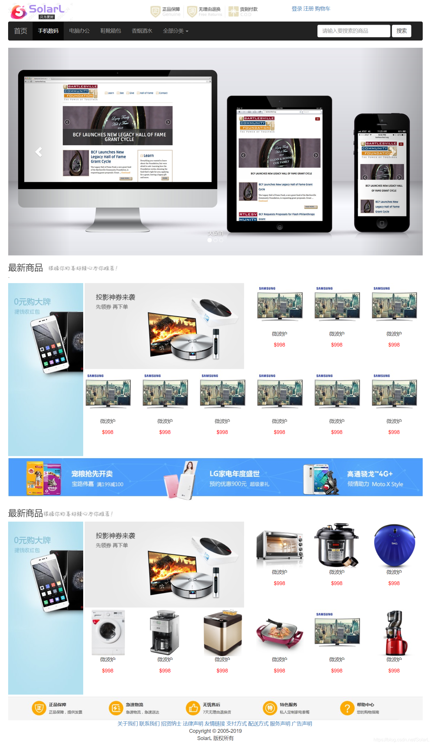
<2> 搭建网站分析 - 要想一次性搭建出来像上面这样的画面或许不太容易,但是通过我们细心观察,不难发现,上面的画面可划分为八个部分进行,通过这样的思路,我们就能更好的搭建简单的网站首页。
- 第一部分: LOGO部分
第二部分: 导航栏部分 : 放置5个超链接
第三部分: 轮播图
第四部分: 嵌套实现
第五部分: 直接放一张图片
第六部分: 抄第四部分的
第七部分: 放置一张图片
第八部分: 放一堆超链接
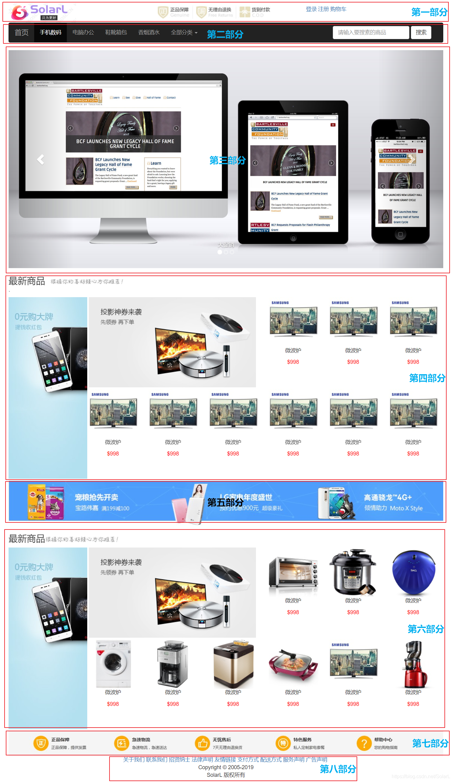
- 之后的多种搭建方式均是按照这八部分的分布思路展开,通过不同的方式来实现。
2. 通过 HTML 搭建网站
- HTML 超文本标记语言: 用于设计网页,决定了网页的结构。
<1> table 表格标签
- 常用的属性
bgcolor : 背景色
width : 宽度
height : 高度
align : 对齐方式
border=“1px” 表格框线
tr 行标签 th 表头标签
td 列标签 - 合并单元格
colspan : 跨列操作
rowspan : 跨行操作
注意: 跨行或者跨列操作之后,被占掉的格子需要删除掉 - 表格的嵌套
在td中可以嵌套一个表格
<2> 通过 table 表格标签布局分析
- 创建一个8行1列的表格
- 第一部分: LOGO部分: 嵌套一个1行3列的表格
- 第二部分: 导航栏部分 : 放置5个超链接
- 第三部分: 轮播图 (仅通过HTML方式中无法实现轮播,暂时插入一张图片)
- 第四部分: 嵌套一个3行7列表格
- 第五部分: 直接放一张图片
- 第六部分: 同第四部分的
- 第七部分: 放置一张图片
- 第八部分: 放一堆超链接
<3>进一步分析第四部分(第六部分)
- 详细分析
第四部分中,我们可以再次进行划分,将第四部分分为三部分,这一行嵌套一个3行7列的表格。
第一行:
将第一行7列合并成一列,进行列合并 colspan=“7” ,删除第一行剩余的6列,第一行只保留一个 td 标签,插入h 标签,之后紧跟一张图片。
第二行、第三行:
将第二行第2、3、4三列进行合并,列合并 colspan=“3”,删除第二行3个 td 标签,横着放置一张图片;
将第二行和第三行的第一列合并成一列,行合并 rowspan=“2”,删除第三行的第一列 td 标签,左边竖着放置图片一张,其余 td 列标签均放置商品图片及信息即可。
<!-- 5.第四部分:嵌套一个3行7列的表格--><tr><td><table width="100%"><tr><td colspan="7" width="100%"><h3>最新商品<img src="..."/></h3></td></tr><tr align="center"><td rowspan="2"><img src="..." height="100%" width="100%"/></td><td colspan="3"><img src="..." height="100%" width="100%"/></td><td><img src="..."/><p>洗衣机</p><p><font color="red">$998</font></p></td><td><img src="..."/><p>洗衣机</p><p><font color="red">$998</font></p></td><td><img src="..."/><p>洗衣机</p><p><font color="red">$998</font></p></td></tr><tr align="center"><td><img src="..."/><p>洗衣机</p><p><font color="red">$998</font></p></td><td><img src="..."/><p>洗衣机</p><p><font color="red">$998</font></p></td><td><img src="..."/><p>洗衣机</p><p><font color="red">$998</font></p></td><td><img src="..."/><p>洗衣机</p><p><font color="red">$998</font></p></td><td><img src="..."/><p>洗衣机</p><p><font color="red">$998</font></p></td><td><img src="..."/><p>洗衣机</p><p><font color="red">$998</font></p></td></tr></table></td></tr>
<4> 网页完整代码实现
当然,第一次进行布局的时候,我们可以在每个table 标签中添加 border="1px"属性展示表格的框线,这样可以更好的呈现出整个页面的布局。
<table width="100%" border="1px"><tr><td></td></tr>
</table>
<!DOCTYPE html>
<html lang="en">
<head><meta charset="UTF-8"><title>网站首页table布局</title>
</head>
<body><!-- 1.创建一个8行1列的表格-->
<table width="100%"><!--2.第一部分:logo:嵌套一个1行3列表格--><tr><td><table width="100%"><tr><td><img src="..."/></td><td><img src="..."/></td><td><a href="https://blog.csdn.net/SolarL/article/details/89852420">登录</a><a href="https://blog.csdn.net/SolarL/article/details/89852420">注册</a><a href="https://blog.csdn.net/SolarL/article/details/89852420">购物车</a></td></tr></table></td></tr><!--  3.第二部分:导航页首部放置5个超链接--><tr bgcolor="black"><td height="50px"><a href="https://blog.csdn.net/SolarL/article/details/89852420"><font color="white">首页</font></a><a href="https://blog.csdn.net/SolarL/article/details/89852420"><font color="white">手机数码</font></a><a href="https://blog.csdn.net/SolarL/article/details/89852420"><font color="white">电脑办公</font></a><a href="https://blog.csdn.net/SolarL/article/details/89852420"><font color="white">美肤美容</font></a><a href="https://blog.csdn.net/SolarL/article/details/89852420"><font color="white">鞋靴皮箱</font></a></td></tr><!--  4.第三部分:轮播图(仅通过HTML方式中无法实现轮播,暂时插入一张图片)--><tr><td><img src="..." width="100%"/></td></tr><!--  5.第四部分:嵌套一个3行7列的表格--><tr><td><table width="100%"><tr><td colspan="7" width="100%"><h3>最新商品<img src="..."/></h3></td></tr><tr align="center"><td rowspan="2"><img src="..." height="100%" width="100%"/></td><td colspan="3"><img src="..." height="100%" width="100%"/></td><td><img src="..."/><p>洗衣机</p><p><font color="red">$998</font></p></td><td><img src="..."/><p>洗衣机</p><p><font color="red">$998</font></p></td><td><img src="..."/><p>洗衣机</p><p><font color="red">$998</font></p></td></tr><tr align="center"><td><img src="..."/><p>洗衣机</p><p><font color="red">$998</font></p></td><td><img src="..."/><p>洗衣机</p><p><font color="red">$998</font></p></td><td><img src="..."/><p>洗衣机</p><p><font color="red">$998</font></p></td><td><img src="..."/><p>洗衣机</p><p><font color="red">$998</font></p></td><td><img src="..."/><p>洗衣机</p><p><font color="red">$998</font></p></td><td><img src="..."/><p>洗衣机</p><p><font color="red">$998</font></p></td></tr></table></td></tr><!--  6.第五部分:插入一张图片--><tr><td><img src="..." height="100%" width="100%"/></td></tr><!--  7.第六部分:同第四部分-->
<tr><td><table width="100%"><tr><td colspan="7" width="100%"><h3>最新商品<img src="..."/></h3></td></tr><tr align="center"><td rowspan="2"><img src="..." height="100%" width="100%"/></td><td colspan="3"><img src="..." height="100%" width="100%"/></td><td><img src="..."/><p>洗衣机</p><p><font color="red">$998</font></p></td><td><img src="..."/><p>洗衣机</p><p><font color="red">$998</font></p></td><td><img src="..."/><p>洗衣机</p><p><font color="red">$998</font></p></td></tr><tr align="center"><td><img src="..."/><p>洗衣机</p><p><font color="red">$998</font></p></td><td><img src="..."/><p>洗衣机</p><p><font color="red">$998</font></p></td><td><img src="..."/><p>洗衣机</p><p><font color="red">$998</font></p></td><td><img src="..."/><p>洗衣机</p><p><font color="red">$998</font></p></td><td><img src="..."/><p>洗衣机</p><p><font color="red">$998</font></p></td><td><img src="..."/><p>洗衣机</p><p><font color="red">$998</font></p></td></tr></table></td></tr><!--  8.第七部分:放置一张图片--><tr><td><img src="..." height="100%" width="100%"/></td></tr><!--  9.第八部分:放一堆超链接--><tr><td align="center"><a href="https://blog.csdn.net/SolarL/article/details/89852420">关于我们</a><a href="https://blog.csdn.net/SolarL/article/details/89852420">联系我们</a><a href="https://blog.csdn.net/SolarL/article/details/89852420https://blog.csdn.net/SolarL/article/details/89852420">招贤纳士</a><a href="https://blog.csdn.net/SolarL/article/details/89852420">法律声明</a><a href="https://blog.csdn.net/SolarL/article/details/89852420">友情链接</a><a href="https://blog.csdn.net/SolarL/article/details/89852420">支付方式</a><a href="https://blog.csdn.net/SolarL/article/details/89852420">配送方式</a><a href="https://blog.csdn.net/SolarL/article/details/89852420">服务声明</a><a href="https://blog.csdn.net/SolarL/article/details/89852420">广告声明</a><br/>Copyright © 2005-2019 版权所有</td></tr></table>
</body>
</html>
3. 通过 DIV+CSS 来优化网站首页
<1> DIV+CSS
- 表格布局的缺陷
i:嵌套层级太多, 一旦出现嵌套顺序错乱, 整个页面达不到预期效果;
ii:采用表格布局,页面不够灵活, 动其中某一块,整个表格布局的结构全都要变。 - HTML的块标签
div标签: 默认占一行,自动换行
span标签: 内容显示在同一行 - CSS概述
Cascading Style Sheets : 层叠样式表
主要是用来美化页面, 将美化和HTML代码进行分离,提高代码复用性 - CSS的简单语法
在一个style标签中,去编写CSS内容,最好将style标签写在这个head标签中
<style>选择器{属性名称:属性的值;属性名称2: 属性的值2;}
</style>
<2> 通过 DIV+CSS 布局分析
- 创建一个最外层div
- 第一部份: LOGO部分: 嵌套三个div
- 第二部分: 导航栏部分 : 放置5个超链接
- 第三部分: 轮播图(未实现)
- 第四部分: CSS浮动
- 第五部分: 直接放一张图片
- 第六部分: 同第四部分的
- 第七部分: 放置一张图片
- 第八部分: 放一堆超链接
<3>进一步分析第四部分(第六部分)
- CSS浮动
浮动的元素会脱离正常的文档流,在正常的文档流中不占空间(流式布局)
float属性:leftrightclear属性: 清除浮动both : 两边都不允许浮动left: 左边不允许浮动right : 右边不允许浮动流式布局
将整个第四部分的布局可分为,左侧占 width: 15% height: 480px,右侧左上角部分height: 240px; width: 50%,剩余50%放置 width:16%的图片三张,下一行放置6张即可布满整个区域。

<4> 完整代码实现
<!DOCTYPE html>
<html>
<head><meta charset="UTF-8"><title>网站首页DIV+CSS优化</title><!--从外部引入CSS样式-->//<link rel="stylesheet" type="text/css" href="../css/main.css"/><style>.logo{float: left;width: 33%;/*border-width: 1px;border-style: solid;border-color: red;*/height: 60px;line-height: 60px;/*		border: 1px solid red;*/}.amenu{color: white;text-decoration: none;height: 50px;line-height: 50px;}.product{float: left;text-align: center;width: 16%;height: 240px;}</style>
</head>
<body>
<div><!--2. 第一部份: LOGO部分: 嵌套三个div--><div><div class="logo"><img src="..." height="50px" width="303px"/></div><div class="logo"><img src="..."/></div><div class="logo"><a href="https://blog.csdn.net/SolarL/article/details/89852420">登录</a><a href="https://blog.csdn.net/SolarL/article/details/89852420">注册</a><a href="https://blog.csdn.net/SolarL/article/details/89852420">购物车</a></div></div><!--清除浮动--><div style="clear: both;"></div><!--3. 第二部分: 导航栏部分 : 放置5个超链接--><div style="background-color: black; height: 50px;"><a href="https://blog.csdn.net/SolarL/article/details/89852420" class="amenu">首页</a><a href="https://blog.csdn.net/SolarL/article/details/89852420" class="amenu">手机数码</a><a href="https://blog.csdn.net/SolarL/article/details/89852420" class="amenu">电脑办公</a><a href="https://blog.csdn.net/SolarL/article/details/89852420" class="amenu">鞋靴箱包</a><a href="https://blog.csdn.net/SolarL/article/details/89852420" class="amenu">香烟酒水</a></div><!--4. 第三部分: 轮播图(未实现)--><div><img src="..." width="100%"/></div><!--5. 第四部分:--><div><div><h2>最新商品<img src="..."/></h2></div><!--左侧广告图--><div style="width: 15%; height: 480px;  float: left;"><img src="..." width="100%" height="100%"/></div><!--右侧商品--><div style="width: 84%; height: 480px;float: left;"><div style="height: 240px; width: 50%; float: left;"><img src="..." height="100%" width="100%"/></div><div class="product"><img src="..."/><p>高压锅</p><p style="color: red;">$998</p></div><div class="product"><img src="..."/><p>高压锅</p><p style="color: red;">$998</p></div><div class="product"><img src="..."/><p>高压锅</p><p style="color: red;">$998</p></div><div class="product"><img src="..."/><p>高压锅</p><p style="color: red;">$998</p></div><div class="product"><img src="..."/><p>高压锅</p><p style="color: red;">$998</p></div><div class="product"><img src="..."/><p>高压锅</p><p style="color: red;">$998</p></div><div class="product"><img src="..."/><p>高压锅</p><p style="color: red;">$998</p></div><div class="product"><img src="..."/><p>高压锅</p><p style="color: red;">$998</p></div><div class="product"><img src="..."/><p>高压锅</p><p style="color: red;">$998</p></div></div></div><!--6. 第五部分: 直接放一张图片--><div><img src="..." width="100%"/></div><!--7. 第六部分: 第四部分的--><div><div><h2>最新商品<img src="..."/></h2></div><!--左侧广告图--><div style="width: 15%; height: 480px;  float: left;"><img src="..." width="100%" height="100%"/></div><!--右侧商品--><div style="width: 84%; height: 480px;float: left;"><div style="height: 240px; width: 50%; float: left;"><img src="..." height="100%" width="100%"/></div><div class="product"><img src="..."/><p>高压锅</p><p style="color: red;">$998</p></div><div class="product"><img src="..."/><p>高压锅</p><p style="color: red;">$998</p></div><div class="product"><img src="..."/><p>高压锅</p><p style="color: red;">$998</p></div><div class="product"><img src="..."/><p>高压锅</p><p style="color: red;">$998</p></div><div class="product"><img src="..."/><p>高压锅</p><p style="color: red;">$998</p></div><div class="product"><img src="..."/><p>高压锅</p><p style="color: red;">$998</p></div><div class="product"><img src="..."/><p>高压锅</p><p style="color: red;">$998</p></div><div class="product"><img src="..."/><p>高压锅</p><p style="color: red;">$998</p></div><div class="product"><img src="..."/><p>高压锅</p><p style="color: red;">$998</p></div></div></div><!--8. 第七部分: 放置一张图片--><div><img src="..." width="100%"/></div><!--9. 第八部分: 放一堆超链接--><div style="text-align: center;"><a href="https://blog.csdn.net/SolarL/article/details/89852420">关于我们</a><a href="https://blog.csdn.net/SolarL/article/details/89852420">联系我们</a><a href="https://blog.csdn.net/SolarL/article/details/89852420">招贤纳士</a><a href="https://blog.csdn.net/SolarL/article/details/89852420">法律声明</a><a href="https://blog.csdn.net/SolarL/article/details/89852420">友情链接</a><a href="https://blog.csdn.net/SolarL/article/details/89852420">支付方式</a><a href="https://blog.csdn.net/SolarL/article/details/89852420">配送方式</a><a href="https://blog.csdn.net/SolarL/article/details/89852420">服务声明</a><a href="https://blog.csdn.net/SolarL/article/details/89852420">广告声明</a><br/>Copyright © 2005-2019 SolarL 版权所有</div>
</div>
</body>
</html>
4. JavaScript 实现图片轮播图
- 在我们的网站首页,通常需要有一块区域,用来显示广告,但是这块区域如果仅仅显示一张图片肯定是不够的, 故我们需要采用动态循环播放我们所有的广告。
- 将需要进行轮播的图片重命名为 1.jpg 2.jpg 3.jpg ,便于操作。
<1> JS 开发
- 确定事件
- 通常事件都会触发一个函数
- 函数里面通常都会去操作页面元素,做一些交互动作
<2> 实现分析
- 文档加载完成事件onload ,触发定时器 setInterval(“changeAd()”,3000),绑定 changeAd() 函数完成图片的切换。
<!DOCTYPE html>
<html lang="en">
<head><meta charset="UTF-8"><title>图片轮播</title><script>/* 当页面加载完成的时候, 动态切换图片1.确定事件:2.事件所要触发的函数*/var index = 1;//切换图片function changeAd() {//获取要操作的imgvar img = document.getElementById("imgAd");img.src = "../img/"+(index%3+1)+".JPG";index++;}function init() {//启动定时器setInterval("changeAd()",3000);}</script>
</head>
<body onload="init()">
<img src="../img/1.JPG" id="imgAd"/></body>
</html>
- 显然,用 JS 实现的轮播图看上去缺乏美观性和用户体验感较差,通过 Bootstrap 框架来完成将会达到预期效果。
5. Bootstrap 框架完成响应式网站首页及轮播图
<1> BootStrap 结构
- BootStrap 是最受欢迎的 HTML、CSS 和 JS 框架,用于开发响应式布局、移动设备优先的 WEB 项目。
- 全局CSS
Bootstrap 中已经定义好了一套CSS的样式表
对页面中的元素进行定义
列表元素,表单,按钮,图片… - 组件
Bootstrap 定义的一套按钮,导航条等组件 - JS插件
Bootstrap定义了一套JS的插件,这些插件已经默认实现了很多种效果 - 什么是响应式页面?
适应不同的分辨率显示不同样式,提高用户的体验. - BootStrap的中文网 http://www.bootcss.com
<2> Bootstrap 栅格系统
- 将屏幕划分成12个格子,12列组成
- class=‘row’ 当前是行
- 行里面放的是列 col-屏幕分辨率-数字 (每一种分辨率后的数字总和必须是等于12,如果超过12,另起一行)
- col-lg-数字: 在超宽屏幕上使用,设备分辨率大于1200
- col-md-数字: 在中等屏幕上,PC电脑,设备分辨率大于992 < 1200
- col-sm-数字: 在平板电脑上,设备分辨率大于768 < 992
- col-xs-数字: 在手机上,设备分辨率小于768
- 工作原理
- “行(row)”必须包含在
.container(固定宽度)或.container-fluid(100% 宽度)中,以便为其赋予合适的排列(aligment)和内补(padding)。 - 通过“行(row)”在水平方向创建一组“列(column)”。
- 你的内容应当放置于“列(column)”内,并且,只有“列(column)”可以作为行(row)”的直接子元素。
- 类似
.row和.col-xs-4这种预定义的类,可以用来快速创建栅格布局。Bootstrap 源码中定义的 mixin 也可以用来创建语义化的布局。 - 通过为“列(column)”设置
padding属性,从而创建列与列之间的间隔(gutter)。通过为.row元素设置负值margin从而抵消掉为.container元素设置的padding,也就间接为“行(row)”所包含的“列(column)”抵消掉了padding
<2> Bootstrap 的入门开发
- 引入相关的头文件
<!-- 最新版本的 Bootstrap 核心 CSS 文件 --><link rel="stylesheet" href="../css/bootstrap.css" /><!--需要引入JQuery--><script type="text/javascript" src="../js/jquery-1.11.0.js" ></script><!-- 最新的 Bootstrap 核心 JavaScript 文件 --><script type="text/javascript" src="../js/bootstrap.js" ></script><meta name="viewport" content="width=device-width, initial-scale=1">
- BootStrap的布局容器
.container 类用于固定宽度并支持响应式布局的容器。
<div class="container">...
</div>
.container-fluid` 类用于 100% 宽度,占据全部视口(viewport)的容器。
<div class="container-fluid">...
</div>
<3> Bootstrap框架实现响应式网站首页及轮播图
- Bootstrap框架实现大部分是通过查阅 Bootstrap 中文文档复制粘贴实现,故实现过程不做过多的解释和分析。
<!DOCTYPE html>
<html lang="en">
<head><meta charset="UTF-8"><title>响应式网站首页</title><!--准备工作:<meta name='viewport'>1.导入bootstrap css文件2.导入JQuery3.bootstrap.js4.写一个div class = container 支持响应式的布局容器--><!-- 最新版本的 Bootstrap 核心 CSS 文件 --><link href="../css/bootstrap.css" rel="stylesheet"><!--jQuery文件。务必在bootstrap.js 之前引入--><script src="../js/jquery-1.11.0.js" type="text/javascript"></script><!-- 最新的 Bootstrap 核心 JavaScript 文件 --><script src="../js/bootstrap.js" type="text/javascript"></script><meta name="viewport" content="width=device-width, initial-scale=1"></head>
<body>
<div class="container"><!--第一部分:标题栏--><div class="row"><div class="col-md-4 col-sm-6 col-xs-6"><img src="../img/logos.png" height="60px"/></div><div class="col-md-4 hidden-sm hidden-xs"><img src="../img/header.png"/></div><div class="col-md-4 col-sm-6 col-xs-6" style="line-height: 50px;height: 50px;"><a href="https://blog.csdn.net/SolarL/article/details/89852420">登录</a><a href="https://blog.csdn.net/SolarL/article/details/89852420">注册</a><a href="https://blog.csdn.net/SolarL/article/details/89852420">购物车</a></div></div><!--第二部分:导航栏部分--><nav class="navbar navbar-inverse" role="navigation"><div class="container-fluid"><!-- Brand and toggle get grouped for better mobile display --><div class="navbar-header"><button type="button" class="navbar-toggle collapsed" data-toggle="collapse"data-target="#bs-example-navbar-collapse-1"><span class="s r-only">Toggle navigation</span><span class="icon-bar"></span><span class="icon-bar"></span><span class="icon-bar"></span></button><a class="navbar-brand" href="https://blog.csdn.net/SolarL/article/details/89852420">首页</a></div><!-- Collect the nav links, forms, and other content for toggling --><div class="collapse navbar-collapse" id="bs-example-navbar-collapse-1"><ul class="nav navbar-nav"><li class="active"><a href="https://blog.csdn.net/SolarL/article/details/89852420">手机数码<span class="sr-only">(current)</span></a></li><li><a href="https://blog.csdn.net/SolarL/article/details/89852420">电脑办公</a></li><li><a href="https://blog.csdn.net/SolarL/article/details/89852420">鞋靴箱包</a></li><li><a href="https://blog.csdn.net/SolarL/article/details/89852420">香烟酒水</a></li><li class="dropdown"><a href="https://blog.csdn.net/SolarL/article/details/89852420" class="dropdown-toggle" data-toggle="dropdown" role="button" aria-expanded="false">全部分类<span class="caret"></span></a><ul class="dropdown-menu" role="menu"><li><a href="https://blog.csdn.net/SolarL/article/details/89852420">手机数码</a></li><li><a href="https://blog.csdn.net/SolarL/article/details/89852420">电脑办公</a></li><li><a href="https://blog.csdn.net/SolarL/article/details/89852420">鞋靴皮箱</a></li><li class="divider"></li><li><a href="https://blog.csdn.net/SolarL/article/details/89852420">香烟酒水</a></li><li class="divider"></li><li><a href="https://blog.csdn.net/SolarL/article/details/89852420">其他分类</a></li></ul></li></ul><form class="navbar-form navbar-right" role="search"><div class="form-group"><input type="text" class="form-control" placeholder="请输入要搜素的商品"></div><button type="submit" class="btn btn-default">搜索</button></form></div><!-- /.navbar-collapse --></div><!-- /.container-fluid --></nav>
<!--第三部分:轮播图--><div id="carousel-example-generic" class="carousel slide" data-ride="carousel" data-interval="2000"><!-- Indicators --><ol class="carousel-indicators"><li data-target="#carousel-example-generic" data-slide-to="0" class="active"></li><li data-target="#carousel-example-generic" data-slide-to="1"></li><li data-target="#carousel-example-generic" data-slide-to="2"></li></ol><!-- Wrapper for slides --><div class="carousel-inner" role="listbox"><div class="item active"><img src="../img/1.jpg" alt="..."><div class="carousel-caption">大促销</div></div><div class="item"><img src="../img/2.jpg" alt="..."><div class="carousel-caption">大促销</div></div><div class="item"><img src="../img/3.jpg" alt="..."><div class="carousel-caption">大促销</div></div></div><!-- Controls --><a class="left carousel-control" href="#carousel-example-generic" role="button" data-slide="prev"><span class="glyphicon glyphicon-chevron-left" aria-hidden="true"></span><span class="sr-only">Previous</span></a><a class="right carousel-control" href="#carousel-example-generic" role="button" data-slide="next"><span class="glyphicon glyphicon-chevron-right" aria-hidden="true"></span><span class="sr-only">Next</span></a></div><!--第四部分:最新商品--><div class="row"><div class="col-md-12"><h3>最新商品 <img src="../img/title2.jpg"/></h3></div></div><!--商品部分 -->`<div class="row"><!--左边div--><div class="col-md-2 hidden-sm hidden-xs" style="height: 480px"><img src="../img/big01.jpg"/></div><!--右边div--><div class="col-md-10"><!--上面部分--><div class="col-md-6 hidden-sm hidden-xs" style="height: 240px"><img src="../img/middle01.jpg"/></div><div class="col-md-2 col-sm-4 col-xs-6" style="text-align: center;height: 240px"><img src="../img/small02.jpg"/><p>微波炉</p><p style="color: red;">$998</p></div><div class="col-md-2 col-sm-4 col-xs-6" style="text-align: center;height: 240px"><img src="../img/small02.jpg"/><p>微波炉</p><p style="color: red;">$998</p></div><div class="col-md-2 col-sm-4 col-xs-6" style="text-align: center;height: 240px"><img src="../img/small02.jpg"/><p>微波炉</p><p style="color: red;">$998</p></div><div class="col-md-2 col-sm-4 col-xs-6" style="text-align: center;height: 240px"><img src="../img/small02.jpg"/><p>微波炉</p><p style="color: red;">$998</p></div><div class="col-md-2 col-sm-4 col-xs-6" style="text-align: center;height: 240px"><img src="../img/small02.jpg"/><p>微波炉</p><p style="color: red;">$998</p></div><div class="col-md-2 col-sm-4 col-xs-6" style="text-align: center;height: 240px"><img src="../img/small02.jpg"/><p>微波炉</p><p style="color: red;">$998</p></div><div class="col-md-2 col-sm-4 col-xs-6" style="text-align: center;height: 240px"><img src="../img/small02.jpg"/><p>微波炉</p><p style="color: red;">$998</p></div><div class="col-md-2 col-sm-4 col-xs-6" style="text-align: center;height: 240px"><img src="../img/small02.jpg"/><p>微波炉</p><p style="color: red;">$998</p></div><div class="col-md-2 col-sm-4 col-xs-6" style="text-align: center;height: 240px"><img src="../img/small02.jpg"/><p>微波炉</p><p style="color: red;">$998</p></div></div></div><!--第五部分:--><div class="row"><div class="col-md-12"><img src="../img/ad.jpg" width="100%"/></div></div><!--第六部分:同第四部分--><div class="row"><div class="col-md-12"><h3>最新商品<img src="../img/title2.jpg"/></h3></div></div><!--商品部分--><div class="row"><!--左边大图部分--><div class="col-md-2 hidden-sm hidden-xs" style="height: 480px;"><img src="../img/big01.jpg"/></div><!--右边商品项部分--><div class="col-md-10"><!--投影神券来袭--><div class="col-md-6 hidden-sm hidden-xs" style="height: 240px;"><img src="../img/middle01.jpg"/></div><div class="col-md-2 col-sm-4 col-xs-6" style="text-align: center;height: 240px;"><img src="../img/small09.jpg"/><p>微波炉</p><p style="color: red;">$998</p></div><div class="col-md-2 col-sm-4 col-xs-6" style="text-align: center;height: 240px;"><img src="../img/small08.jpg"/><p>微波炉</p><p style="color: red;">$998</p></div><div class="col-md-2 col-sm-4 col-xs-6" style="text-align: center;height: 240px;"><img src="../img/small07.jpg"/><p>微波炉</p><p style="color: red;">$998</p></div><div class="col-md-2 col-sm-4 col-xs-6" style="text-align: center;height: 240px;"><img src="../img/small06.jpg"/><p>微波炉</p><p style="color: red;">$998</p></div><div class="col-md-2 col-sm-4 col-xs-6" style="text-align: center;height: 240px;"><img src="../img/small05.jpg"/><p>微波炉</p><p style="color: red;">$998</p></div><div class="col-md-2 col-sm-4 col-xs-6" style="text-align: center;height: 240px;"><img src="../img/small04.jpg"/><p>微波炉</p><p style="color: red;">$998</p></div><div class="col-md-2 col-sm-4 col-xs-6" style="text-align: center;height: 240px;"><img src="../img/small03.jpg"/><p>微波炉</p><p style="color: red;">$998</p></div><div class="col-md-2 col-sm-4 col-xs-6" style="text-align: center;height: 240px;"><img src="../img/small02.jpg"/><p>微波炉</p><p style="color: red;">$998</p></div><div class="col-md-2 col-sm-4 col-xs-6" style="text-align: center;height: 240px;"><img src="../img/small01.jpg"/><p>微波炉</p><p style="color: red;">$998</p></div></div></div><!--第七部分:--><div class="row"><div class="col-md-12"><img src="../img/footer.jpg" width="100%"/></div></div><!--9. 第八部分: 放一堆超链接--><div style="text-align: center;"><a href="https://blog.csdn.net/SolarL/article/details/89852420">关于我们</a><a href="https://blog.csdn.net/SolarL/article/details/89852420">联系我们</a><a href="https://blog.csdn.net/SolarL/article/details/89852420">招贤纳士</a><a href="https://blog.csdn.net/SolarL/article/details/89852420">法律声明</a><a href="https://blog.csdn.net/SolarL/article/details/89852420">友情链接</a><a href="https://blog.csdn.net/SolarL/article/details/89852420">支付方式</a><a href="https://blog.csdn.net/SolarL/article/details/89852420">配送方式</a><a href="https://blog.csdn.net/SolarL/article/details/89852420">服务声明</a><a href="https://blog.csdn.net/SolarL/article/details/89852420">广告声明</a><br/>Copyright © 2005-2019<p>SolarL 版权所有</p></div></div>
</body>
</html>
结束语
- HTML CSS JavaScript JQuery Bootstrap 的相关知识在本片中介绍远远不足,需要大家自行学习后再阅读本篇文章,这样才会达到更好的学习效果。
- 以上网站首页的实现图片如若资源读者有需要可联系我,后期我将会上传至GitHub ,方便大家下载和提出更多建议。
- 小哥哥,小姐姐们,觉得文章还不错就给我点个赞吧,鼓励一下我吧,哈哈哈哈哈…


