之前一直用 VUE 写后台管理界面,对前端 CSS 这块一直是半知半解,为了巩固这方便知识,抽空写一些基础页面来巩固一下
今天带来的是一个简单的网站首页,源于《深入解析CSS》中的案例,首页做了简单的自适应,但没有涉及移动端适配 (不是不想做,奈何自己这块还是不太懂),但涵盖知识点相对也比较多,包含Flex布局,内外边距,浮动等知识点。
网页HTML 如下
<!DOCTYPE html>
<html lang="en">
<head><meta charset="UTF-8"><meta http-equiv="X-UA-Compatible" content="IE=edge"><meta name="viewport" content="width=device-width, initial-scale=1.0"><title>章节12.1 对比很重要</title><link rel="stylesheet" href="style.css">
</head>
<body><nav class="nav-container"><div class="nav-container__inner"><a class="home-link" href="/">Ink</a><ul class="top-nav"><li><a href="#">Featers</a></li><li><a href="#">Pic</a></li><li><a href="#">Support</a></li><li class="top-nav__featured"><a href="#">Login</a></li></ul></div></nav><div class="hero"><div class="hero__inner"><!-- 主图 --><h2>Team collaboration done right</h2><a href="/sign-up" class="button button--cta">Get Started</a></div></div><div class="container"><div class="tile-row"><div class="tile"><h4>Title A</h4><P>设计师一样思考,完成页面视觉稿,并将其转化为代码。本章将重点关注间距和颜色,还将强调一些设计师可能会考虑的因素。目标是在你学了这部分内容后,可以一定程度上将其应用到实际项目设计中,甚至不需要设计师参与也能进行项目工作。为了达到这一目的</P><ul class="tag-list"><li>Web</li><li>IOS</li><li>Android</li><li>Window</li></ul><a href="#" class="button">Read More</a></div><div class="tile"><h4>Title A</h4><P>设计师一样思考,完成页面视觉稿,并将其转化为代码。本章将重点关注间距和颜色,还将强调一些设计师可能会考虑的因素。目标是在你学了这部分内容后,可以一定程度上将其应用到实际项目设计中,甚至不需要设计师参与也能进行项目工作。为了达到这一目的</P><a href="#" class="button">Read More</a></div><div class="tile"><h4>Title A</h4><P>设计师一样思考,完成页面视觉稿,并将其转化为代码。本章将重点关注间距和颜色,还将强调一些设计师可能会考虑的因素。目标是在你学了这部分内容后,可以一定程度上将其应用到实际项目设计中,甚至不需要设计师参与也能进行项目工作。为了达到这一目的</P><a href="#" class="button">Read More</a></div></div></div></body>
</html>
CSS 代码
html {--brand-green: #076448;--dark-greee:#099268;--medium-green: #20c997;--text-color: #212529;
}* {box-sizing: border-box;margin: 0;margin: 0;
}body {font-family: Arial, Helvetica, sans-serif;background-color: #f8f8f8;
}h1,h2,h3,h4 {font-family: Georgia,serif;
}li {list-style: none;
}ul {margin: 0px;padding: 0px;
}.nav-container {background-color:var(--medium-green);
}.nav-container__inner {display: flex;justify-content: space-between;max-width: 1080px;margin: 0 auto;padding: 0.625em 0;align-items: center;}.home-link {color: black;font-weight: bold;font-family: Georgia,serif;text-decoration: none;font-size: 1.5em;
}.top-nav{display: flex;list-style-type: none;text-transform: uppercase;letter-spacing: 0.03em;
}.top-nav li a{display: block;padding: 0.3em 1.25em;color: white;background: var(--brand-green);text-decoration: none;border-radius: 3px;}.top-nav li:not(:last-child){margin-right:30px;}.top-nav li a {color: white;text-decoration: none;padding: 10px 20px;background-color: #2a6048;
}
.hero {margin-bottom: 2.5rem;background: url(xbox.jpg) no-repeat;background-size: cover;}.hero__inner {max-width: 1080px;margin: 0 auto;color: white;padding: 50px 0px 200px;text-align: right;
}.hero h2 {font-size: 1.95rem;margin-bottom: 5px;
}.button {display:inline-block;padding: 0.4em 1em;color:#5fc69a;border: 2px solid #5fc69a;;text-decoration: none;font-size: 0.8rem;
}.button:hover{background-color: #5fc69a;color: white;
}/* .button--cta {padding: 0.6em 1em;background-color: #5fc69a;border: none;color: white
} */.container {margin: 0 auto;max-width: 1080px;}.tile-row {display: flex;margin-top: 2.5em;}.tile-row > * {flex: 1;
}.tile-row .tile:not(:last-child){margin-right: 1.5625em;
}.tile {background-color: rgba(242, 169, 59,0.3);border-radius: 0.3em;padding: 20px;
}.tile p {margin-top: 10px;
}.tag-list {/* margin: 10px 0;display: flex;justify-content: space-between;flex-wrap: wrap; */
}.tag-list li {display: inline;border: 1px solid #5fc69a;background-color: rgba(122, 196, 157,0.7);padding: 5px 10px;border-radius: 0.2rem;line-height: 2.6;
}.tile a {margin-top: 20px;
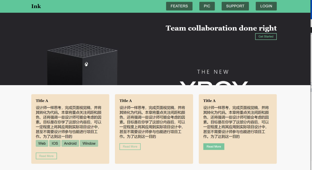
}最终效果如下:
案例完整源码,公号【小张Python】后台回复关键字【FONT_CASE】 即可获取~


![[Python爬虫]模拟登陆**查网站](https://img-blog.csdn.net/20180921171042868?watermark/2/text/aHR0cHM6Ly9ibG9nLmNzZG4ubmV0L0FzaGVyMTE3/font/5a6L5L2T/fontsize/400/fill/I0JBQkFCMA==/dissolve/70)