【写在前面】
其实好早之前我就想写这篇文章了,也有些网友还会私信我,说有时候公司要求登录页面的改造,问我能不能出一期关于登录页的文章,于是乎我也是拖到这个时候才整理出来,其实每篇文章的效果内容我都是自己亲自去测试的,也是为了给大家提供一个真实有效的代码环境,既然出品必出精品,炫酷高级的登录界面分享与你。
【涉及知识点】
好看大气的登录页面,高级炫酷登录界面,5款登录界面源码分享,web登录页面制作,如何实现高级登录页面,如何设置透明遮罩,div实现水平垂直居中,CSS动画效果,登录动态切换效果,高科技登录按钮,动态炫酷登录界面实现,animation实现动态登录按钮效果。
【效果展示】
还是不多说以下五款主题,我们直接上效果,觉得不喜欢的可以直接跳过哈!
- 樱粉登录界面
- 星空登录界面
- 渐变紫登录界面
- 高级科技登录界面
- 大气切换登录界面
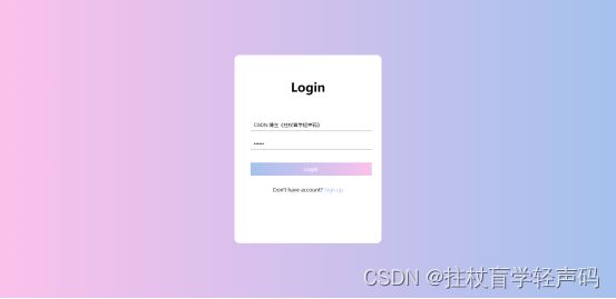
樱粉渐变登录界面:
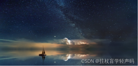
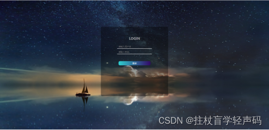
星空登录界面:
渐变紫登录界面:
高级科技登录界面(第4节有动效图):
大气山河登录界面(第5节有动效图):
版权声明:原创于CSDN博主-拄杖盲学轻声码,有疑惑可去留言私信哟!
目录
- 1、樱粉登录界面(尾部有完整代码)
- A、背景线性渐变
- B、登录框水平垂直居中
- C、完整代码段
- Html完整代码
- Css完整代码
- 2、星空登录界面
- A、设置背景图片
- B、设置登录透明
- C、完整代码
- Html代码
- CSS代码
- 3、渐变紫登录界面
- A、背景线性渐变
- B、登录区线性渐变及左右模块
- C、完整代码
- Html代码
- Css代码
- 4、高级科技登录界面
- A、背景深色系渐变
- B、按钮炫酷动画
- C、完整代码
- Html代码
- Css代码
- 5、高端大气动态登录界面
- A、登录注册来回切换动态效果实现
- B、完整代码
- Html代码
- Css代码
- 6、写在后面与彩蛋
- 【写在后面】
- 【彩蛋区】
其实风格实现都是差不多的,我们平时缺的可能就是这设计灵感,具体实现代码及思路如下:
1、樱粉登录界面(尾部有完整代码)
A、背景线性渐变
首先我们做的背景色要比较的好看,核心在于样式的设置,我针对背景色设置了linear-gradient线性渐变,其中核心样式代码如下:
background-image: linear-gradient(to right, #fbc2eb, #a6c1ee);
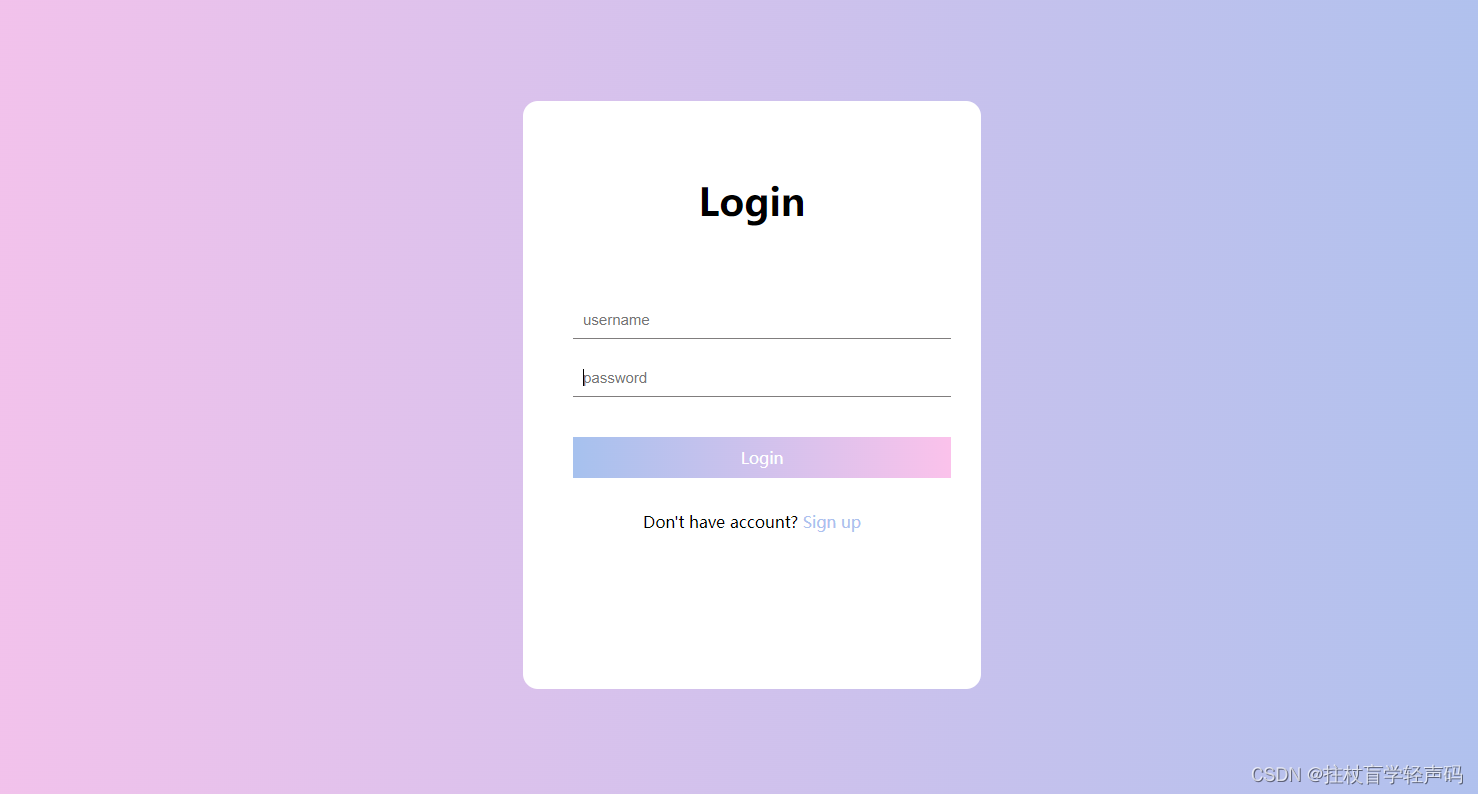
设置完整体效果如下:
B、登录框水平垂直居中
设置完背景之后我们就要创建一个登录区域,核心在于位置是水平垂直居中,其核心样式代码如下:
left: 50%; top: 50%; transform: translate(-50%, -50%);
如下所示水平垂直居中效果:
后面的input和啥的可以自己加哈:
C、完整代码段
Html完整代码
<div class="container"><div class="login-wrapper"><div class="header">Login</div><div class="form-wrapper"><input type="text" name="username" placeholder="username" class="input-item"><input type="password" name="password" placeholder="password" class="input-item"><div class="btn">Login</div></div><div class="msg">Don't have account?<a href="#">Sign up</a></div></div></div>
Css完整代码
/* 更多请关注CSDN博主-拄杖盲学轻声码 */
* {margin: 0;padding: 0;}html {height: 100%;}body {height: 100%;}.container {height: 100%;background-image: linear-gradient(to right, #fbc2eb, #a6c1ee);}.login-wrapper {background-color: #fff;width: 358px;height: 588px;border-radius: 15px;padding: 0 50px;position: relative;left: 50%;top: 50%;transform: translate(-50%, -50%);}.header {font-size: 38px;font-weight: bold;text-align: center;line-height: 200px;}.input-item {display: block;width: 100%;margin-bottom: 20px;border: 0;padding: 10px;border-bottom: 1px solid rgb(128, 125, 125);font-size: 15px;outline: none;}.input-item:placeholder {text-transform: uppercase;}.btn {text-align: center;padding: 10px;width: 100%;margin-top: 40px;background-image: linear-gradient(to right, #a6c1ee, #fbc2eb);color: #fff;}.msg {text-align: center;line-height: 88px;}a {text-decoration-line: none;color: #abc1ee;}
整体效果:
2、星空登录界面
A、设置背景图片
我这边是针对body进行了background-image的属性设置,这块你们可以随意调整成自己的背景图,图片一换就是你自己的风格了。
核心代码块(我是基于本地图片加载的):
background: url('img/bgimg.jpg') no-repeat;
background-size: 100% 100%;
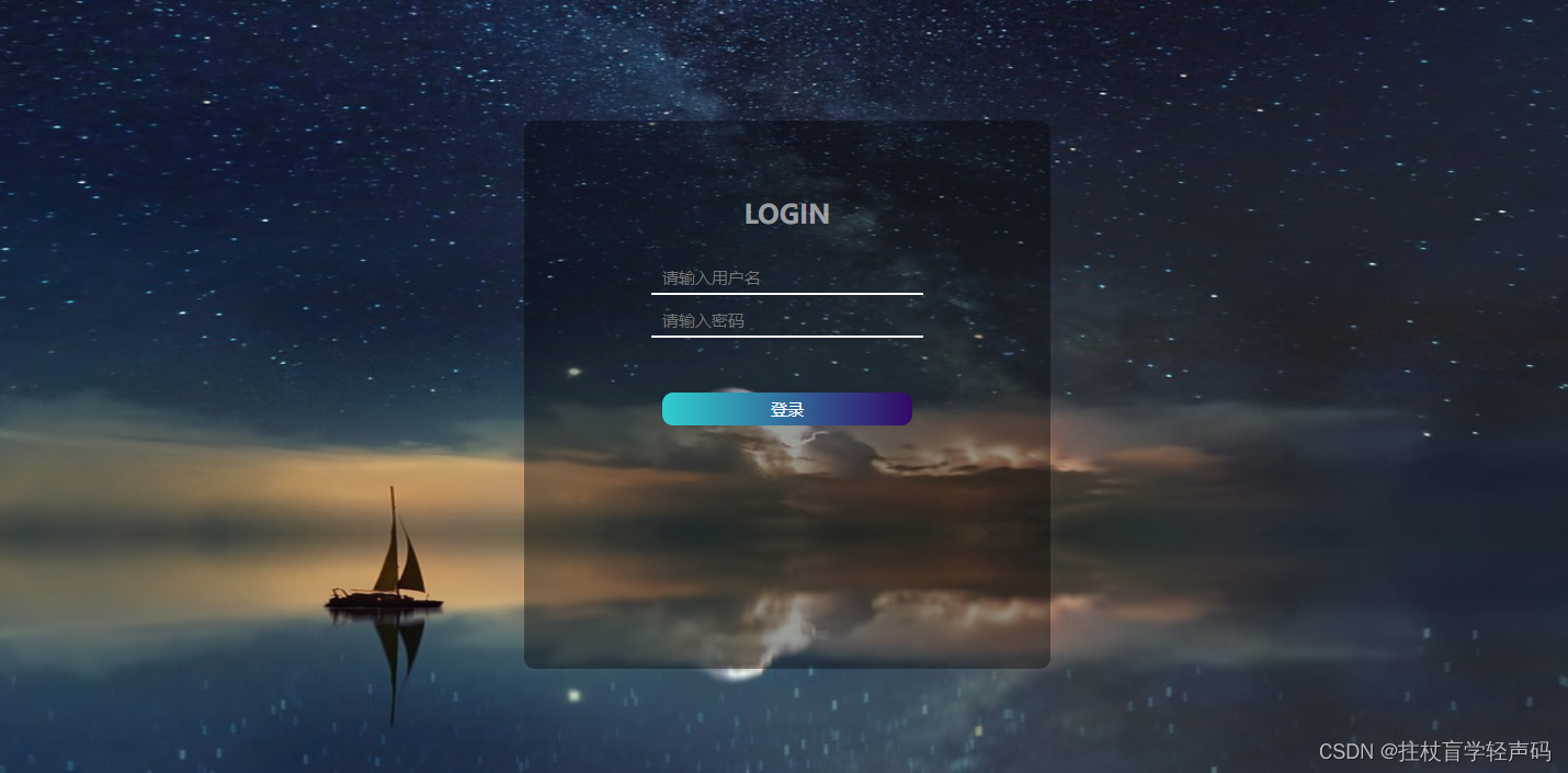
效果如下所示:
B、设置登录透明
其实很多人知道设置透明遮罩background有一个rgba设置属性,但是今天我还要介绍另一种方式的哈,就是background-color的#颜色设置8位,其中前六位为颜色,后两位表示透明度的百分比;
background: rgba(0, 0, 0, 0.6);	/*rgba设置透明层*/
background-color: #00000060;	/*八位颜色位设置透明层*/
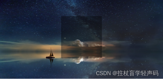
其中上面的两种设置效果是一样的,如下图所示:
C、完整代码
Html代码
<div id="login_box"><h2>LOGIN</h2><div id="input_box"><input type="text" placeholder="请输入用户名"></div><div class="input_box"><input type="password" placeholder="请输入密码"></div><button>登录</button><br></div>
CSS代码
/* 更多请关注CSDN博主-拄杖盲学轻声码 */body {background: url('img/bgimg.jpg') no-repeat;background-size: 100% 140%;}#login_box {width: 20%;height: 400px;background: rgba(0, 0, 0, 0.6);/*rgba设置透明层*/background-color: #00000060;/*八位颜色位设置透明层*/margin: auto;margin-top: 10%;text-align: center;border-radius: 10px;padding: 50px 50px;}h2 {color: #ffffff90;margin-top: 5%;}#input-box {margin-top: 5%;}span {color: #fff;}input {border: 0;width: 60%;font-size: 15px;color: #fff;background: transparent;border-bottom: 2px solid #fff;padding: 5px 10px;outline: none;margin-top: 10px;}button {margin-top: 50px;width: 60%;height: 30px;border-radius: 10px;border: 0;color: #fff;text-align: center;line-height: 30px;font-size: 15px;background-image: linear-gradient(to right, #30cfd0, #330867);}#sign_up {margin-top: 45%;margin-left: 60%;}a {color: #b94648;}
最终效果如下所示:
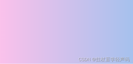
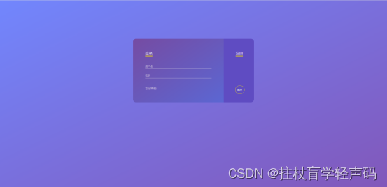
3、渐变紫登录界面
A、背景线性渐变
这个和第一个有点像,主要还是配色的好看,我采用body设置线性渐变
Body背景渐变设置
background-image: linear-gradient(to bottom right, rgb(114, 135, 254), rgb(130, 88, 186));
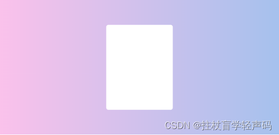
B、登录区线性渐变及左右模块
先设置大的背景色为紫色,然后设置登录左边模块背景渐变:
background-image: linear-gradient(to bottom right, rgb(118, 76, 163), rgb(92, 103, 211));
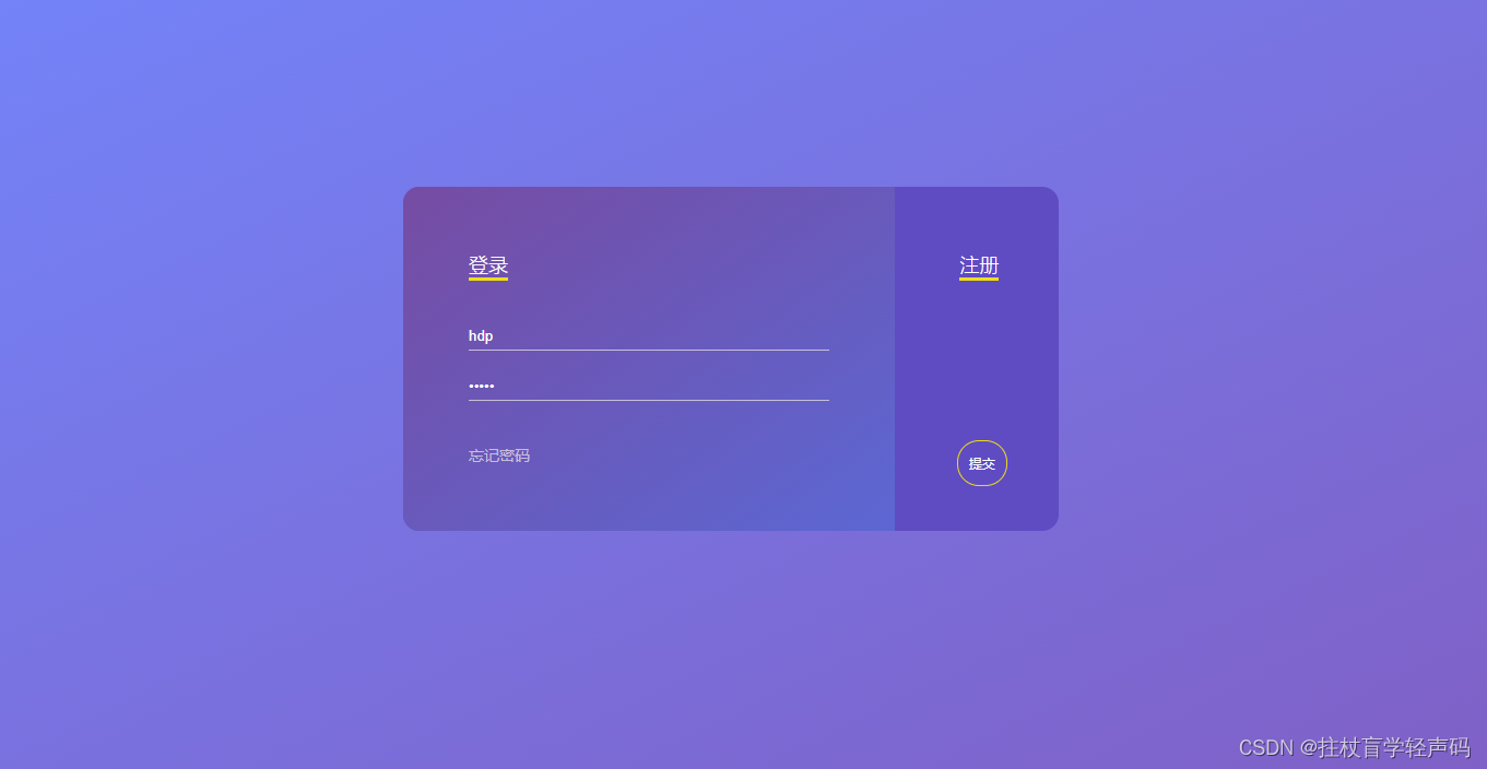
设置完A/B之后如下图:
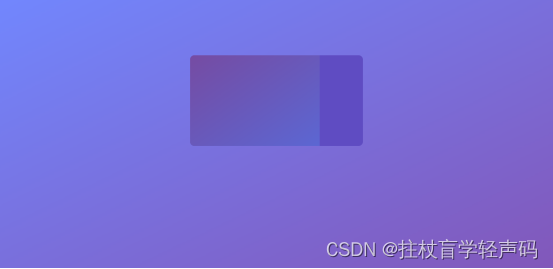
细心的网友会发现不垂直居中嘛,所以可以自己设置哈。
C、完整代码
Html代码
<body><div class="login-container"><div class="left-container"><div class="title"><span>登录</span></div><div class="input-container"><input type="text" name="username" placeholder="用户名"><input type="password" name="password" placeholder="密码"></div><div class="message-container"><span>忘记密码</span></div></div><div class="right-container"><div class="regist-container"><span class="regist">注册</span></div><div class="action-container"><span>提交</span></div></div></div>
</body>
Css代码
/* 更多请关注CSDN博主-拄杖盲学轻声码 */* {padding: 0;margin: 0;}html {height: 100%;}body {background-image: linear-gradient(to bottom right, rgb(114, 135, 254), rgb(130, 88, 186));}.login-container {width: 600px;height: 315px;margin: 0 auto;margin-top: 10%;border-radius: 15px;box-shadow: 0 10px 50px 0px rbg(59, 45, 159);background-color: rgb(95, 76, 194);}.left-container {display: inline-block;width: 330px;height: calc(100% - 120px);border-top-left-radius: 15px;border-bottom-left-radius: 15px;padding: 60px;background-image: linear-gradient(to bottom right, rgb(118, 76, 163), rgb(92, 103, 211));}.title {color: #fff;font-size: 18px;font-weight: 200;}.title span {border-bottom: 3px solid rgb(237, 221, 22);}.input-container {padding: 20px 0;}input {border: 0;background: none;outline: none;color: #fff;margin: 20px 0;display: block;width: 100%;padding: 5px 0;transition: .2s;border-bottom: 1px solid rgb(199, 191, 219);}input:hover {border-bottom-color: #fff;}::-webkit-input-placeholder {color: rgb(199, 191, 219);}.message-container {font-size: 14px;transition: .2s;color: rgb(199, 191, 219);cursor: pointer;}.message-container:hover {color: #fff;}.right-container {width: 145px;display: inline-block;height: calc(100% - 120px);vertical-align: top;padding: 60px 0;}.regist-container {text-align: center;color: #fff;font-size: 18px;font-weight: 200;}.regist-container span {border-bottom: 3px solid rgb(237, 221, 22);}.action-container {font-size: 10px;color: #fff;text-align: center;position: relative;top: 200px;}.action-container span {border: 1px solid rgb(237, 221, 22);padding: 10px;display: inline;line-height: 20px;border-radius: 20px;position: absolute;bottom: 10px;left: calc(72px - 20px);transition: .2s;cursor: pointer;}.action-container span:hover {background-color: rgb(237, 221, 22);color: rgb(95, 76, 194);}
最终效果如下:
版权声明:原创于CSDN博主-拄杖盲学轻声码,有疑惑可去留言私信哟!
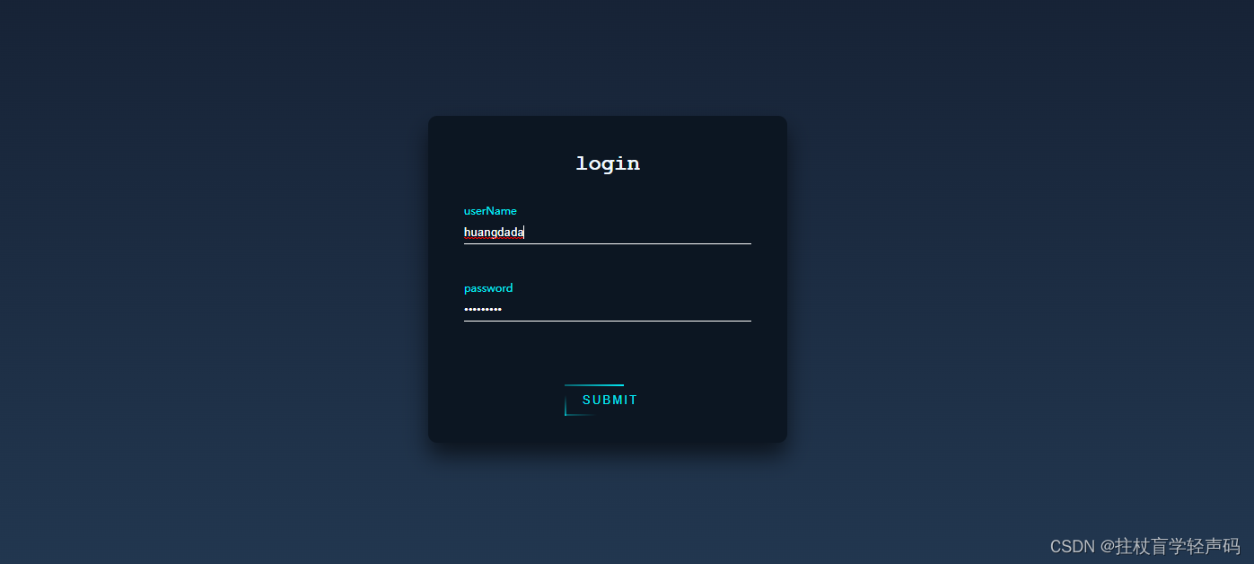
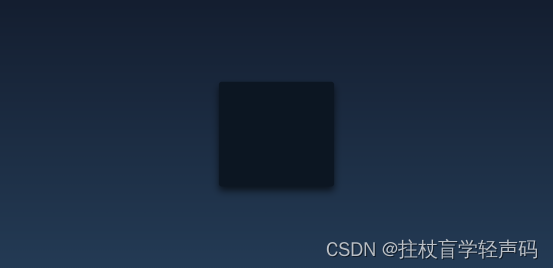
4、高级科技登录界面
A、背景深色系渐变
这块其实我把颜色给调深了,然后登录模块设置了一个背景色+阴影效果,核心代码如下:
主体Body:
background: linear-gradient(#141e30, #243b55);
登录模块:
background-color: #0c1622;
margin: 100px auto;
border-radius: 10px;
box-shadow: 0 15px 25px 0 rgba(0, 0, 0, .6);
设置完效果如下所示:
B、按钮炫酷动画
其实这套登录皮肤的灵魂就是这个动态的按钮效果,主要是应用了css的animation动画效果,其实说句实话,都知道有这个动画属性,就是不会用起来,没有别人用的那么炫酷,那么这个时候你就要去多看看别人的设计思想了,所以我还是特别喜欢和大家分享一些思路和方法,代码只是为了让你更好的消化和理解。
在这边的思想其实就是我设置了四个标签,每个标签都设置了动画属性,然后给他们一个等间隔的时间差,这样四个动画一起跑就会形成一个动画转圈的效果,你可以拿着这个核心代码去试试看效果就知道了,核心代码如下:
.btn>span {position: absolute;}.btn>span:nth-child(1) {width: 100%;height: 2px;background: -webkit-linear-gradient(left, transparent, #03e9f4);left: -100%;top: 0px;animation: line1 1s linear infinite;}@keyframes line1 {50%,100% {left: 100%;}}.btn>span:nth-child(2) {width: 2px;height: 100%;background: -webkit-linear-gradient(top, transparent, #03e9f4);right: 0px;top: -100%;animation: line2 1s 0.25s linear infinite;}@keyframes line2 {50%,100% {top: 100%;}}.btn>span:nth-child(3) {width: 100%;height: 2px;background: -webkit-linear-gradient(left, #03e9f4, transparent);left: 100%;bottom: 0px;animation: line3 1s 0.75s linear infinite;}@keyframes line3 {50%,100% {left: -100%;}}.btn>span:nth-child(4) {width: 2px;height: 100%;background: -webkit-linear-gradient(top, transparent, #03e9f4);left: 0px;top: 100%;animation: line4 1s 1s linear infinite;}@keyframes line4 {50%,100% {top: -100%;}}
C、完整代码
Html代码
<div class="loginBox"><h2>login</h2><form action=""><div class="item"><input type="text" required><label for="">userName</label></div><div class="item"><input type="password" required><label for="">password</label></div><button class="btn">submit<span></span><span></span><span></span><span></span></button></form></div>
Css代码
/* 更多特效请关注CSDN博主-拄杖盲学轻声码 */* {margin: 0;padding: 0;}a {text-decoration: none;}input,button {background: transparent;border: 0;outline: none;}body {height: 100vh;background: linear-gradient(#141e30, #243b55);display: flex;justify-content: center;align-items: center;font-size: 16px;color: #03e9f4;}.loginBox {width: 400px;height: 364px;background-color: #0c1622;margin: 100px auto;border-radius: 10px;box-shadow: 0 15px 25px 0 rgba(0, 0, 0, .6);padding: 40px;box-sizing: border-box;}h2 {text-align: center;color: aliceblue;margin-bottom: 30px;font-family: 'Courier New', Courier, monospace;}.item {height: 45px;border-bottom: 1px solid #fff;margin-bottom: 40px;position: relative;}.item input {width: 100%;height: 100%;color: #fff;padding-top: 20px;box-sizing: border-box;}.item input:focus+label,.item input:valid+label {top: 0px;font-size: 2px;}.item label {position: absolute;left: 0;top: 12px;transition: all 0.5s linear;}.btn {padding: 10px 20px;margin-top: 30px;color: #03e9f4;position: relative;overflow: hidden;text-transform: uppercase;letter-spacing: 2px;left: 35%;}.btn:hover {border-radius: 5px;color: #fff;background: #03e9f4;box-shadow: 0 0 5px 0 #03e9f4,0 0 25px 0 #03e9f4,0 0 50px 0 #03e9f4,0 0 100px 0 #03e9f4;transition: all 1s linear;}.btn>span {position: absolute;}.btn>span:nth-child(1) {width: 100%;height: 2px;background: -webkit-linear-gradient(left, transparent, #03e9f4);left: -100%;top: 0px;animation: line1 1s linear infinite;}@keyframes line1 {50%,100% {left: 100%;}}.btn>span:nth-child(2) {width: 2px;height: 100%;background: -webkit-linear-gradient(top, transparent, #03e9f4);right: 0px;top: -100%;animation: line2 1s 0.25s linear infinite;}@keyframes line2 {50%,100% {top: 100%;}}.btn>span:nth-child(3) {width: 100%;height: 2px;background: -webkit-linear-gradient(left, #03e9f4, transparent);left: 100%;bottom: 0px;animation: line3 1s 0.75s linear infinite;}@keyframes line3 {50%,100% {left: -100%;}}.btn>span:nth-child(4) {width: 2px;height: 100%;background: -webkit-linear-gradient(top, transparent, #03e9f4);left: 0px;top: 100%;animation: line4 1s 1s linear infinite;}@keyframes line4 {50%,100% {top: -100%;}}
整体实现效果:

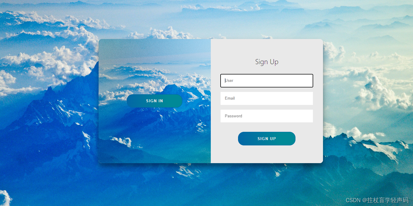
5、高端大气动态登录界面
其实这个登录框我只是想和大家分享一下登录区域其实可以将大的背景色设置为局部的,给人感觉有放大的气势,也不失为一种视觉效果,这个实现过程其实和之前的差不多,我就不做过多的讲解,但是我要讲的是切换效果,点击登录和注册之间的切换。
A、登录注册来回切换动态效果实现
这个里面其实我主要是写了两套,然后通过click点击事件,给页面的元素添加或移除样式属性,核心JS代码如下:
const signInBtn = document.getElementById("signIn");const signUpBtn = document.getElementById("signUp");const fistForm = document.getElementById("form1");const secondForm = document.getElementById("form2");const container = document.querySelector(".container");signInBtn.addEventListener("click", () => {container.classList.remove("right-panel-active");});signUpBtn.addEventListener("click", () => {container.classList.add("right-panel-active");});fistForm.addEventListener("submit", (e) => e.preventDefault());secondForm.addEventListener("submit", (e) => e.preventDefault());
实现效果如下:

B、完整代码
Html代码
<div class="container right-panel-active"><!-- Sign Up --><div class="container__form container--signup"><form action="#" class="form" id="form1"><h2 class="form__title">Sign Up</h2><input type="text" placeholder="User" class="input" /><input type="email" placeholder="Email" class="input" /><input type="password" placeholder="Password" class="input" /><button class="btn">Sign Up</button></form></div><!-- Sign In --><div class="container__form container--signin"><form action="#" class="form" id="form2"><h2 class="form__title">Sign In</h2><input type="email" placeholder="Email" class="input" /><input type="password" placeholder="Password" class="input" /><a href="#" class="link">Forgot your password?</a><button class="btn">Sign In</button></form></div><!-- Overlay --><div class="container__overlay"><div class="overlay"><div class="overlay__panel overlay--left"><button class="btn" id="signIn">Sign In</button></div><div class="overlay__panel overlay--right"><button class="btn" id="signUp">Sign Up</button></div></div></div></div>
Css代码
/* 更多特效请关注CSDN博主-拄杖盲学轻声码 */:root {/* COLORS */--white: #e9e9e9;--gray: #333;--blue: #0367a6;--lightblue: #008997;/* RADII */--button-radius: 0.7rem;/* SIZES */--max-width: 758px;--max-height: 420px;font-size: 16px;font-family: -apple-system, BlinkMacSystemFont, "Segoe UI", Roboto, Oxygen,Ubuntu, Cantarell, "Open Sans", "Helvetica Neue", sans-serif;}body {align-items: center;background-color: var(--white);background: url("img/bgimg3.jpg");background-attachment: fixed;background-position: center;background-repeat: no-repeat;background-size: cover;display: grid;height: 100vh;place-items: center;}.form__title {font-weight: 300;margin: 0;margin-bottom: 1.25rem;}.link {color: var(--gray);font-size: 0.9rem;margin: 1.5rem 0;text-decoration: none;}.container {background-color: var(--white);border-radius: var(--button-radius);box-shadow: 0 0.9rem 1.7rem rgba(0, 0, 0, 0.25),0 0.7rem 0.7rem rgba(0, 0, 0, 0.22);height: var(--max-height);max-width: var(--max-width);overflow: hidden;position: relative;width: 100%;}.container__form {height: 100%;position: absolute;top: 0;transition: all 0.6s ease-in-out;}.container--signin {left: 0;width: 50%;z-index: 2;}.container.right-panel-active .container--signin {transform: translateX(100%);}.container--signup {left: 0;opacity: 0;width: 50%;z-index: 1;}.container.right-panel-active .container--signup {animation: show 0.6s;opacity: 1;transform: translateX(100%);z-index: 5;}.container__overlay {height: 100%;left: 50%;overflow: hidden;position: absolute;top: 0;transition: transform 0.6s ease-in-out;width: 50%;z-index: 100;}.container.right-panel-active .container__overlay {transform: translateX(-100%);}.overlay {background-color: var(--lightblue);background: url("img/bgimg3.jpg");background-attachment: fixed;background-position: center;background-repeat: no-repeat;background-size: cover;height: 100%;left: -100%;position: relative;transform: translateX(0);transition: transform 0.6s ease-in-out;width: 200%;}.container.right-panel-active .overlay {transform: translateX(50%);}.overlay__panel {align-items: center;display: flex;flex-direction: column;height: 100%;justify-content: center;position: absolute;text-align: center;top: 0;transform: translateX(0);transition: transform 0.6s ease-in-out;width: 50%;}.overlay--left {transform: translateX(-20%);}.container.right-panel-active .overlay--left {transform: translateX(0);}.overlay--right {right: 0;transform: translateX(0);}.container.right-panel-active .overlay--right {transform: translateX(20%);}.btn {background-color: var(--blue);background-image: linear-gradient(90deg, var(--blue) 0%, var(--lightblue) 74%);border-radius: 20px;border: 1px solid var(--blue);color: var(--white);cursor: pointer;font-size: 0.8rem;font-weight: bold;letter-spacing: 0.1rem;padding: 0.9rem 4rem;text-transform: uppercase;transition: transform 80ms ease-in;}.form>.btn {margin-top: 1.5rem;}.btn:active {transform: scale(0.95);}.btn:focus {outline: none;}.form {background-color: var(--white);display: flex;align-items: center;justify-content: center;flex-direction: column;padding: 0 3rem;height: 100%;text-align: center;}.input {background-color: #fff;border: none;padding: 0.9rem 0.9rem;margin: 0.5rem 0;width: 100%;}@keyframes show {0%,49.99% {opacity: 0;z-index: 1;}50%,100% {opacity: 1;z-index: 5;}}
JS代码
const signInBtn = document.getElementById("signIn");const signUpBtn = document.getElementById("signUp");const fistForm = document.getElementById("form1");const secondForm = document.getElementById("form2");const container = document.querySelector(".container");signInBtn.addEventListener("click", () => {container.classList.remove("right-panel-active");});signUpBtn.addEventListener("click", () => {container.classList.add("right-panel-active");});fistForm.addEventListener("submit", (e) => e.preventDefault());secondForm.addEventListener("submit", (e) => e.preventDefault());
整体实现效果上面已经给出动态图。
还有什么想要了解的大家都可以留言哈,博主尽量在能力范围内给你们安排上哈!!!
版权声明:原创于CSDN博主-拄杖盲学轻声码,有疑惑可去留言私信哟!
6、写在后面与彩蛋
【写在后面】
最终呈现出来给大家的效果如上图所示的,这个也是博主精心整理出来的文章,喜欢的话可以在彩蛋区给博主一些小小的支持,爱你们哟!。
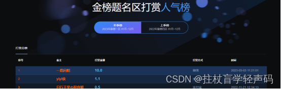
【彩蛋区】
希望我写的文章能给您带来启发,如果觉得博主的东西对您有帮助的话,期待您的支持与谅解,童叟无欺,创作不易,欢迎您来打榜!!!皇榜入口点击此处(已联网备案)
皇榜效果如下:
时光不弃,有我有你,2023年我们一起加油哈!!!

![Axios和Spring MVC[前端和后端的请求和响应处理]](https://img-blog.csdnimg.cn/68598cee28404cbc83dfbfcc1879ff9d.png)