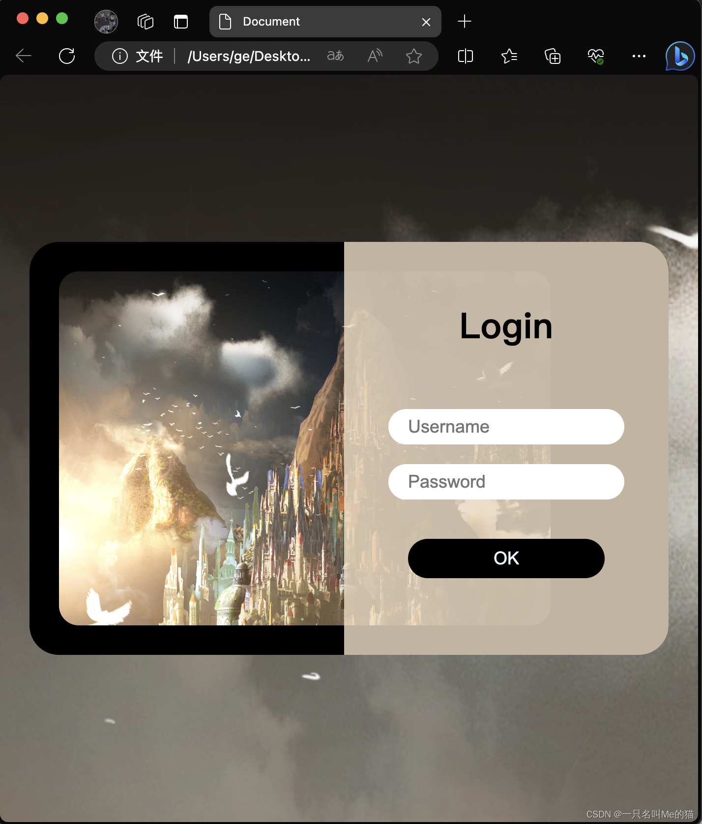
day2 知道了动态响应设计的概念,在原先登录界面的基础上进行升级
动态响应
由于前端页面需要在不同大小和分辨率的屏幕上显示,所以需要它具有动态适应的特性。
常用的方式是在 css 文件中用 @media 动态查询,同时使用 flex 弹性布局。
例如:本文中
@media screen and (max-width: 600px) {
.content {
background: url(./background.jpg) no-repeat;
display: flex;
}规定了在手机屏幕大小下的背景
login_responsive_simple.html
<!DOCTYPE html>
<html lang="en"><head><meta http-equiv="X-UA-Compatible" content="IE=edge" /><meta name="viewport" content="width=device-width, initial-scale=1.0" /><title>Document</title><link rel="stylesheet" href="login_responsive_simple.css" /></head><body><div class="content"><div class="login"><a href="" class="banner-box"></a><div class="login-box"><h1>Login</h1><input type="text" placeholder="Username" /><input type="text" placeholder="Password" /><button class="login-btn">OK</button></div></div></div></body>
</html>
login_responsive_simple.css
* {margin: 0;padding: 0;
}.content {width: 100vw;height: 100vh;background: url(./background.jpg) no-repeat;display: flex;justify-content: center;align-items: center;
}.login {width: 800px;height: 360px;position: relative;background-color: black;border-radius: 30px;padding: 30px;
}.banner-box {display: inline-block;width: 500px;height: 100%;background: url(./background.jpg) no-repeat;background-size: cover;border-radius: 20px 0 0 20px;
}.login-box {width: 330px;height: 100%;background-color: rgb(244, 224, 198);position: absolute;top: 0;right: 0;border-radius: 0 30px 30px 0;display: flex;flex-direction: column;align-items: center;
}.login-box > h1 {font-size: 36px;margin: 60px 0;color: black;
}.login-box > input {font-size: 18px;margin-bottom: 20px;width: 200px;height: 36px;padding: 0 20px;border-radius: 36px;border: none;outline: none;
}.login-btn {margin-top: 20px;width: 200px;height: 40px;background-color: black;border: none;border-radius: 40px;color: aliceblue;font-size: 18px;
}@media screen and (max-width: 900px) {.login {margin: 0 30px;}.banner-box {border-radius: 20px;}.login-box {background-color: rgba(244, 224, 198, 0.8);}
}@media screen and (max-width: 600px) {.content {background: url(./background.jpg) no-repeat;display: flex;}.login {background-color: rgba(244, 224, 198, 0.8);}.banner-box {display: none;}.login-box {position: initial;margin: 0 auto;background-color: rgba(244, 224, 198, 0);}
}
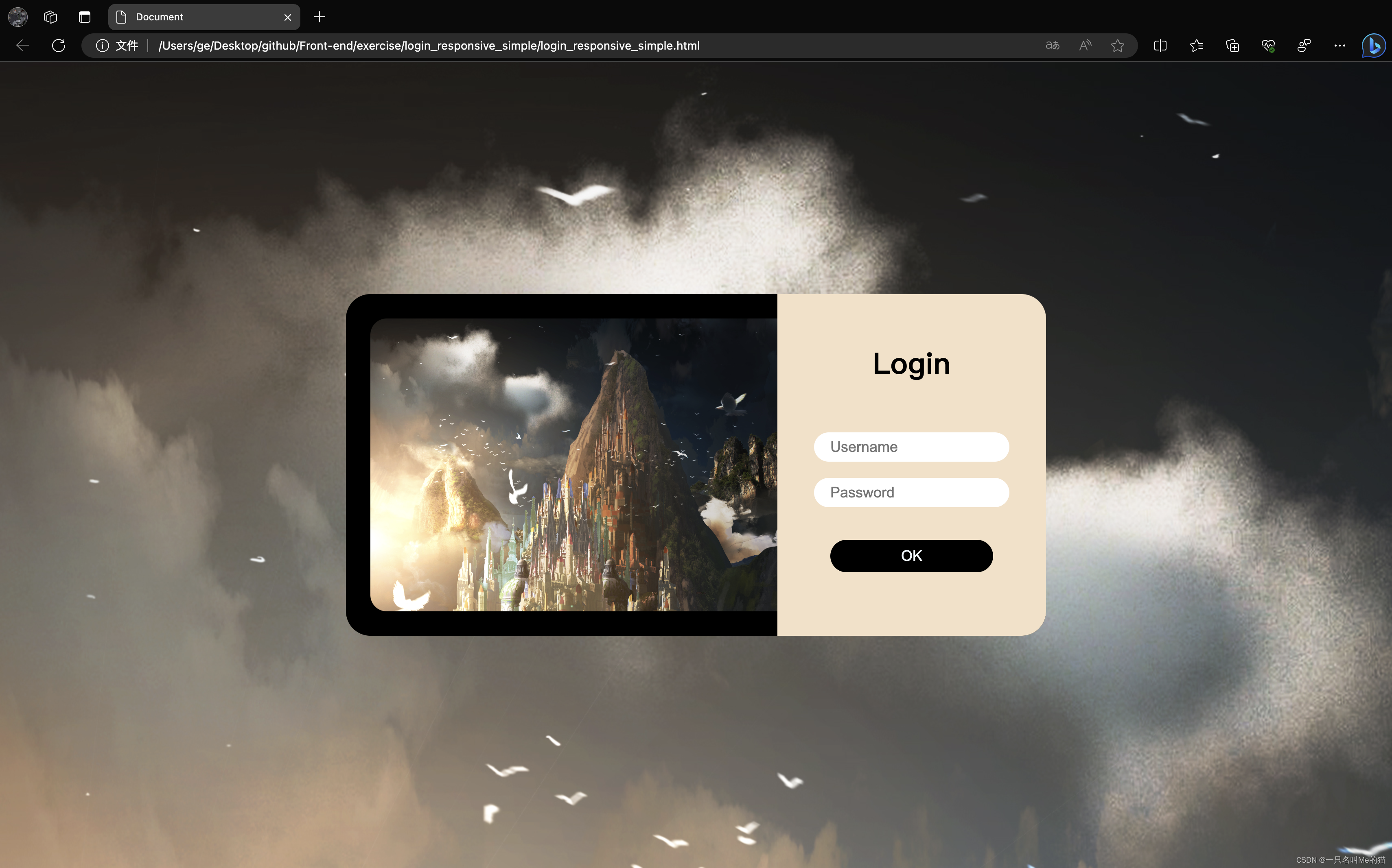
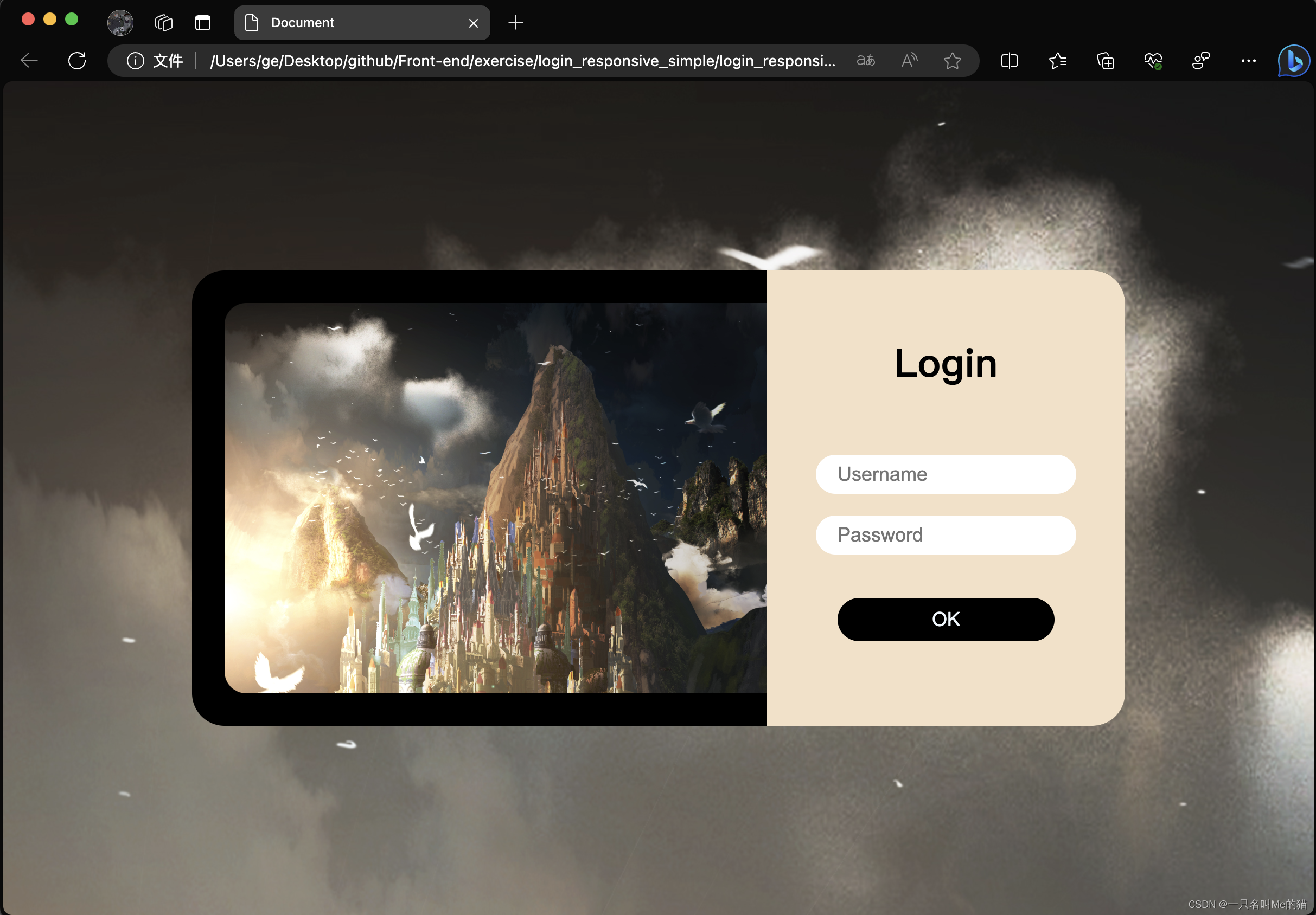
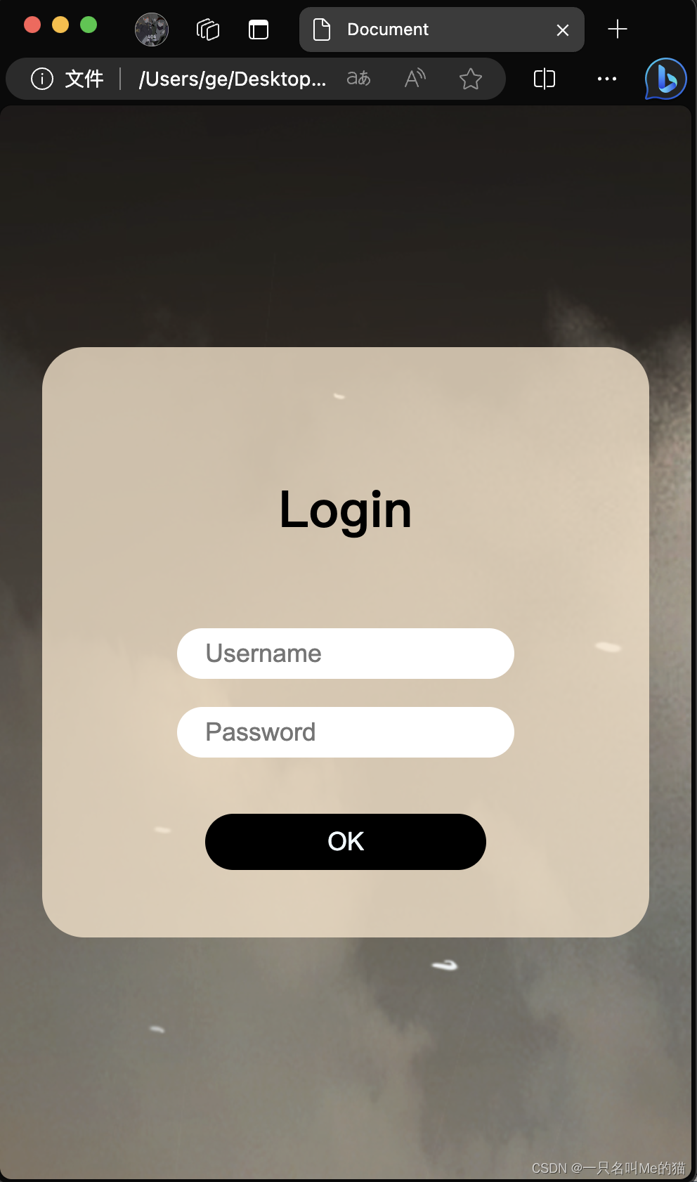
最终效果
1. 笔记本屏幕
2. ipad屏幕
3. 手机屏幕
4. 屏幕大小变化时的过渡效果