组件view
普通视图区域
类似于html中的div是一个块级元素
.wxml代码+
<view class="container1" ><view>温度</view><view>湿度</view> <view>光照强度</view> </view>.wxss代码——
.container1 view{width: 100px;height: 100px;text-align: center;line-height: 100px;
}.container1 view:nth-child(1){background-color: lightgreen;
}
.container1 view:nth-child(2){background-color: lightblue;
}
.container1 view:nth-child(3){background-color: lightcoral;
}   .container1{display: flex;justify-content: space-around;
}
scroll-view
可滚动的视图区域
常用来实现滚动列表效果
.wxml代码
<scroll-view class="container1" scroll-y><view>温度</view><view>湿度</view><view>光照强度</view> </scroll-view> .wxss代码
.container1 view{width: 100px;height: 100px;text-align: center;line-height: 100px;
}.container1 view:nth-child(1){background-color: lightgreen;
}
.container1 view:nth-child(2){background-color: lightblue;
}
.container1 view:nth-child(3){background-color: lightcoral;
} .container1{border: 1px solid red;width: 100px;height: 120px;
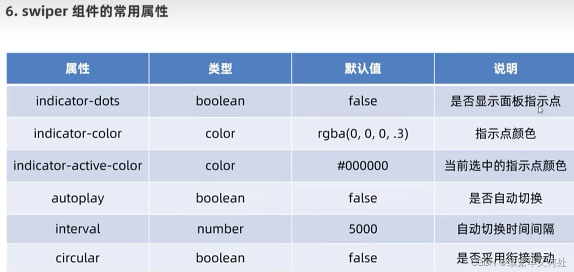
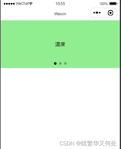
} swiper和swiper-item
轮播图容器组件 和 轮播图item 组件
.wxml代码
<swiper class="swiper-container" indicator-dots ><!-- 第一项 --><swiper-item><view class="item">温度</view></swiper-item><!-- 第二项 --><swiper-item><view class="item">湿度</view></swiper-item><!-- 第三项 --><swiper-item><view class="item">光照强度</view></swiper-item>
</swiper>
.wxss代码
.swiper-container{height: 150px;
}.item{height: 100%;line-height: 150px;/* 水平居中 */text-align: center;
}
/* .item前面有一个空格 */
swiper-item:nth-child(1) .item{background-color: lightgreen;
}
swiper-item:nth-child(2) .item{background-color: lightblue;
}
swiper-item:nth-child(3) .item{background-color: lightpink;
}
结果如下
text
文本组件
类似于heml中span 标签是一个行内元素
rich-text
富文本结构
支持把html字符串渲染为wxml结构
代码如下:
<view>手机号支持长按选中效果<text selectable>182000000000</text>
</view><rich-text nodes="<h1 style='color:red'> 标题</h1>"></rich-text>
效果如下

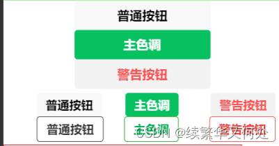
button
按钮组件
功能比html中的button按钮丰富
通过open-type属性可以调用微信提供的各种功能(客服,转发获取用户授权,获取用户信息)
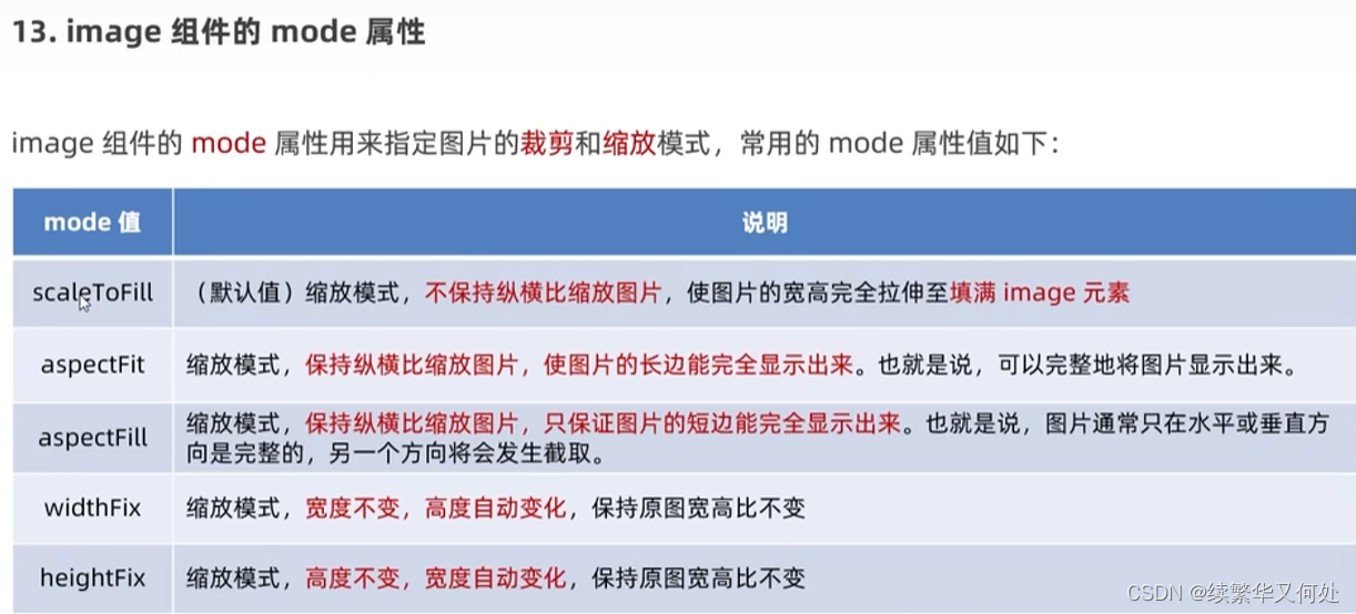
image
图片组件
image组件默认宽度300px,高度240px
代码如下
<!-- 通过type属性指定按钮颜色类型 -->
<button>普通按钮</button>
<button type="primary">主色调</button>
<button type="warn">警告按钮</button>
<!-- size="mini" 小尺寸按钮 -->
<button size="mini" style="position: relative; left: 90rpx; top: 8rpx">普通按钮</button>
<button type="primary" size="mini" style="position: relative; left: 154rpx; top: 8rpx">主色调</button>
<button type="warn" size="mini" style="position: relative; left: 240rpx; top: 8rpx">警告按钮</button>
<!-- 镂空按钮 -->
<button size="mini" plain style="position: relative; left: -406rpx; top: 76rpx">普通按钮</button>
<button type="primary" size="mini" plain style="position: relative; left: 326rpx; top: 0rpx">主色调</button>
<button type="warn" size="mini" plain style="position: relative; left: 409rpx; top: 0rpx">警告按钮</button>
<!-- image图片组件 mode属性-->
<image></image>
<image src="/images/1.png"></image>效果如下
mode属性


![机器人地面站-[QGroundControl源码解析]-[7]-[api]](https://img-blog.csdnimg.cn/ac22f8138e1f4ed99568854ed5e31556.png)