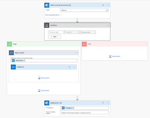
目录
- 1、动态气泡背景
- 2、创意文字
- 3、旋转立方体
1、动态气泡背景
<!DOCTYPE html>
<html>
<head><title>Bubble Background</title><style>body {margin: 0;padding: 0;height: 100vh;background: #222;display: flex;flex-direction: column;align-items: center;justify-content: center;overflow: hidden;}canvas {position: absolute;top: 0;left: 0;width: 100%;height: 100%;}h1 {color: white;font-size: 4rem;z-index: 1;}</style>
</head>
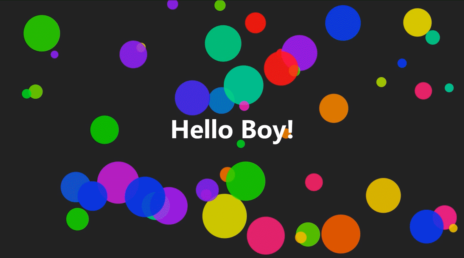
<body><canvas id="canvas"></canvas><h1>Hello Boy!</h1><script>const canvas = document.getElementById("canvas");const ctx = canvas.getContext("2d");canvas.width = window.innerWidth;canvas.height = window.innerHeight;class Bubble {constructor(x, y, radius, color) {this.x = x;this.y = y;this.radius = radius;this.color = color;this.dx = Math.random() - 0.5;this.dy = Math.random() - 0.5;this.speed = Math.random() * 5 + 1;}draw() {ctx.beginPath();ctx.arc(this.x, this.y, this.radius, 0, Math.PI * 2);ctx.fillStyle = this.color;ctx.fill();}update() {if (this.x + this.radius > canvas.width || this.x - this.radius < 0) {this.dx = -this.dx;}if (this.y + this.radius > canvas.height || this.y - this.radius < 0) {this.dy = -this.dy;}this.x += this.dx * this.speed;this.y += this.dy * this.speed;}}const bubbles = [];function init() {for (let i = 0; i < 50; i++) {const radius = Math.random() * 50 + 10;const x = Math.random() * (canvas.width - radius * 2) + radius;const y = Math.random() * (canvas.height - radius * 2) + radius;const color = `hsla(${Math.random() * 360}, 100%, 50%, 0.8)`;bubbles.push(new Bubble(x, y, radius, color));}}function animate() {requestAnimationFrame(animate);ctx.clearRect(0, 0, canvas.width, canvas.height);bubbles.forEach((bubble) => {bubble.draw();bubble.update();});}init();animate();</script>
</body>
</html>
这个代码使用了 Canvas 技术,创建了一个随机生成的气泡背景并且让气泡动态漂浮,形成了一个很有趣的效果。你可以在这个基础上尝试进行一些自己的创意,比如修改气泡的数量、大小、颜色,以及运动的方式等等。
2、创意文字
<!DOCTYPE html>
<html>
<head><title>Rainbow Text</title><style>body {background: black;color: white;font-family: 'Open Sans', sans-serif;text-align: center;height: 100%;display: flex;flex-direction: column;justify-content: center;}h1 {font-size: 8em;margin: 100px auto;animation: rainbow 5s ease-in-out infinite;}@keyframes rainbow {0% {color: #ff0000;text-shadow: 0 0 10px #ff0000, 0 0 20px #ff0000, 0 0 30px #ff0000;}25% {color: #ff8000;text-shadow: 0 0 10px #ff8000, 0 0 20px #ff8000, 0 0 30px #ff8000;}50% {color: #ffff00;text-shadow: 0 0 10px #ffff00, 0 0 20px #ffff00, 0 0 30px #ffff00;}75% {color: #00ff00;text-shadow: 0 0 10px #00ff00, 0 0 20px #00ff00, 0 0 30px #00ff00;}100% {color: #0000ff;text-shadow: 0 0 10px #0000ff, 0 0 20px #0000ff, 0 0 30px #0000ff;}}</style>
</head>
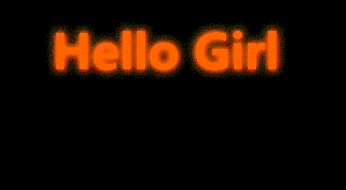
<body><h1>Hello Girl</h1>
</body>
</html>这个代码使用了 CSS 的动画和阴影特效,让页面中的文字在红、橙、黄、绿、蓝五种颜色之间不断变化,形成了一个很有趣的效果。你可以在这个基础上尝试进行一些自己的创意,比如修改文字的大小、样式、颜色,以及变化的频率和方式等等。
3、旋转立方体
<!DOCTYPE html>
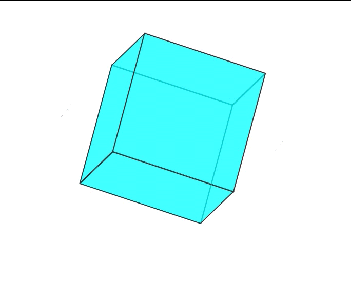
<html><head><meta charset="UTF-8"><title>旋转立方体</title><style>#cube {width: 200px;height: 200px;position: relative;transform-style: preserve-3d;animation: rotate 6s infinite linear;margin: 100px auto;}#cube div {position: absolute;width: 200px;height: 200px;background-color: rgba(0, 255, 255, 0.5);border: 2px solid #333;}#cube .front {transform: translateZ(100px);}#cube .back {transform: rotateY(180deg) translateZ(100px);}#cube .right {transform: rotateY(90deg) translateZ(100px);}#cube .left {transform: rotateY(-90deg) translateZ(100px);}#cube .top {transform: rotateX(90deg) translateZ(100px);}#cube .bottom {transform: rotateX(-90deg) translateZ(100px);}@keyframes rotate {0% {transform: rotateX(0) rotateY(0) rotateZ(0);}100% {transform: rotateX(360deg) rotateY(360deg) rotateZ(360deg);}}</style></head><body><div id="cube"><div class="front"></div><div class="back"></div><div class="right"></div><div class="left"></div><div class="top"></div><div class="bottom"></div></div><script>const cube = document.querySelector('#cube');let isPaused = false;cube.addEventListener('mouseover', () => {isPaused = true;cube.style.animationPlayState = 'paused';});cube.addEventListener('mouseout', () => {isPaused = false;cube.style.animationPlayState = 'running';});setInterval(() => {if (!isPaused) {cube.style.animationPlayState = 'running';}}, 1000);</script></body>
</html>
该示例中,我们使用了 transform-style: preserve-3d 属性来创建 3D 空间通过对立方体不同面的旋转实现了立方体的旋转效果。我们还使用了 CSS 动来实现无限循环的旋转效果,并使用 JavaScript 实现了当鼠标悬停在立方体上时暂停动画的交互效果。