今天我们要复现的是一篇SCI文章的配对连线箱线图,配对箱线图、或者说配对连线图我们之前有写过(ggplot做分组配对连线图、ggplot2|ggpubr配对箱线图绘制与配对检验、复现NC图表-配对小提琴的绘制(理解绘图函数内部底层机制)),但是有一个细节没有处理,那就是使用抖动点。这次的复现让你加深印象,帮助对同类图形作图的理解。当然还有很多细节问题,能让你学到ggplot2作图技巧和处理方式,相关注释代码及数据已上传群文件!
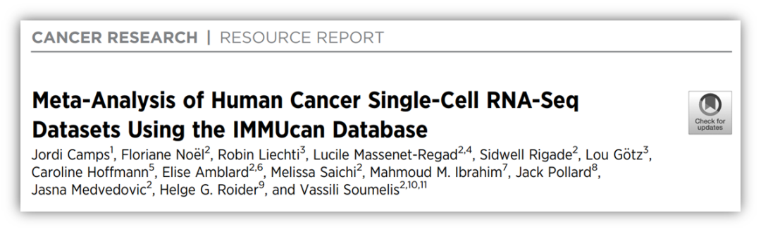
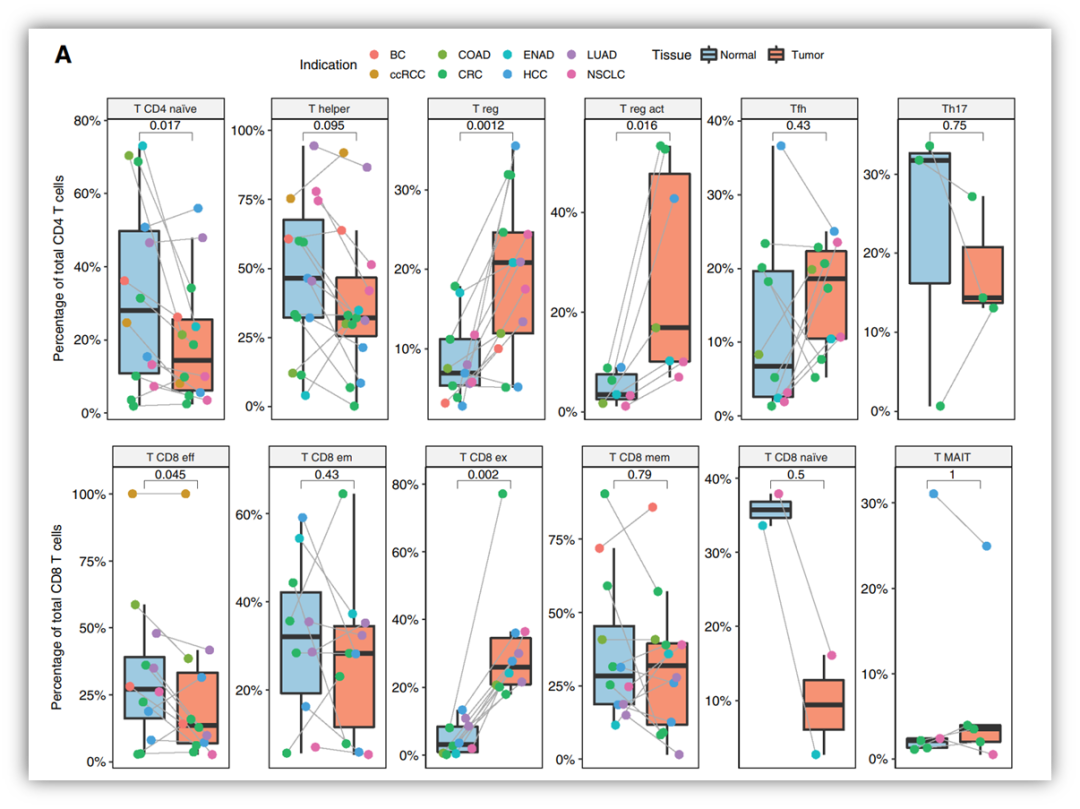
第一步,加载数据,完成一个普通的散点箱线图:
setwd('D:/KS项目/配对箱线图颜色配对')
df <-read.csv('df.csv', header = T)library(ggplot2)
library(ggpubr)
#1ggplot(data=df,aes(x = Disease.state,y = Richness,color=Disease.state)) +geom_boxplot(alpha =0.5,size=1,outlier.shape = NA)+scale_color_manual(limits=c("Patient","Relative"), values=c("#E29827","#922927"))+stat_compare_means(method = "t.test",paired = TRUE,comparisons=list(c("Patient", "Relative")))+geom_jitter(alpha = 0.3,size=3,aes(fill=indi),shape=21)+scale_y_continuous(expand = expansion(mult = c(0.05,0.1)))+facet_wrap(~sample, scales = "free_y")+theme_bw() + theme(panel.grid =element_blank(),axis.text = element_text(size = 10,colour = "black"),axis.text.x = element_blank(),axis.title.x = element_blank(),axis.ticks.x = element_blank(),legend.position = 'top')+labs(y='Expression')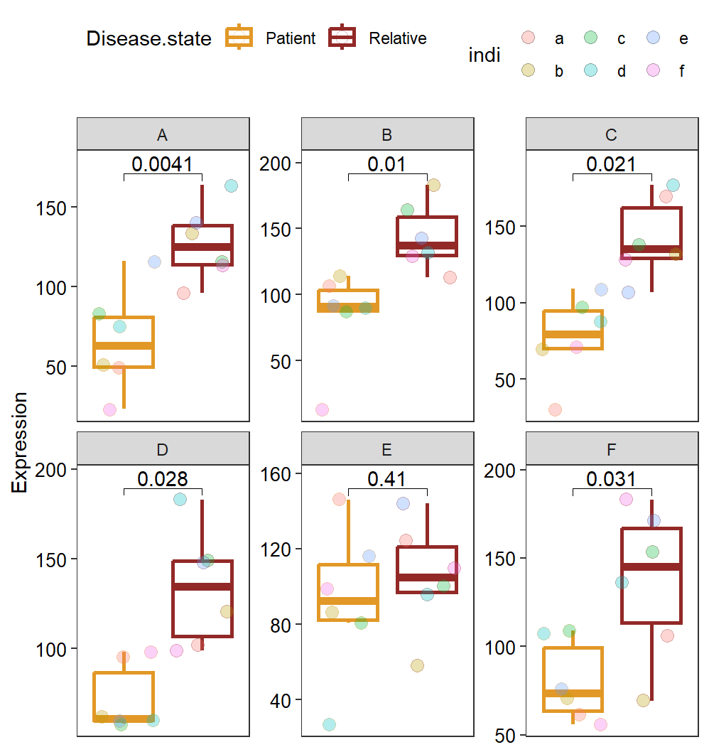
第二步,geom_line添加连线,但是有问题:
ggplot(data=df, aes(x = Disease.state, y = Richness,color=Disease.state)) +geom_boxplot(alpha =0.5,size=1,outlier.shape = NA)+scale_color_manual(limits=c("Patient","Relative"), values=c("#E29827","#922927"))+stat_compare_means(method = "t.test",paired = TRUE, comparisons=list(c("Patient", "Relative")))+geom_jitter(alpha = 0.3,size=3, aes(fill=indi),shape=21)+geom_line(aes(group = Family.ID), color = 'grey40', lwd = 0.5)+scale_y_continuous(expand = expansion(mult = c(0.05, 0.1)))+facet_wrap(~sample, scales = "free_y")+theme_bw() + theme(panel.grid =element_blank(),axis.text = element_text(size = 10,colour = "black"),axis.text.x = element_blank(),axis.title.x = element_blank(),axis.ticks.x = element_blank(),legend.position = 'top')+labs(y='Expression')
第三步,抖动点和连线设置一致的位置,就完成了。
ggplot(data=df, aes(x = Disease.state, y = Richness,color=Disease.state)) +geom_boxplot(alpha =0.5,size=1,outlier.shape = NA)+scale_color_manual(limits=c("Patient","Relative"), values=c("#E29827","#922927"))+stat_compare_means(method = "t.test",paired = TRUE, comparisons=list(c("Patient", "Relative")))+geom_jitter(size=3, aes(fill=indi),shape=21,position = position_dodge(0.5))+geom_line(aes(group = Family.ID), color = 'grey40', lwd = 0.5,position = position_dodge(0.5))+ #添加连线scale_y_continuous(expand = expansion(mult = c(0.05, 0.1)))+facet_wrap(~sample, scales = "free_y")+theme_bw() + theme(panel.grid =element_blank(),axis.text = element_text(size = 10,colour = "black"),axis.text.x = element_blank(),axis.title.x = element_blank(),axis.ticks.x = element_blank(),legend.position = 'top')+labs(y='Expression')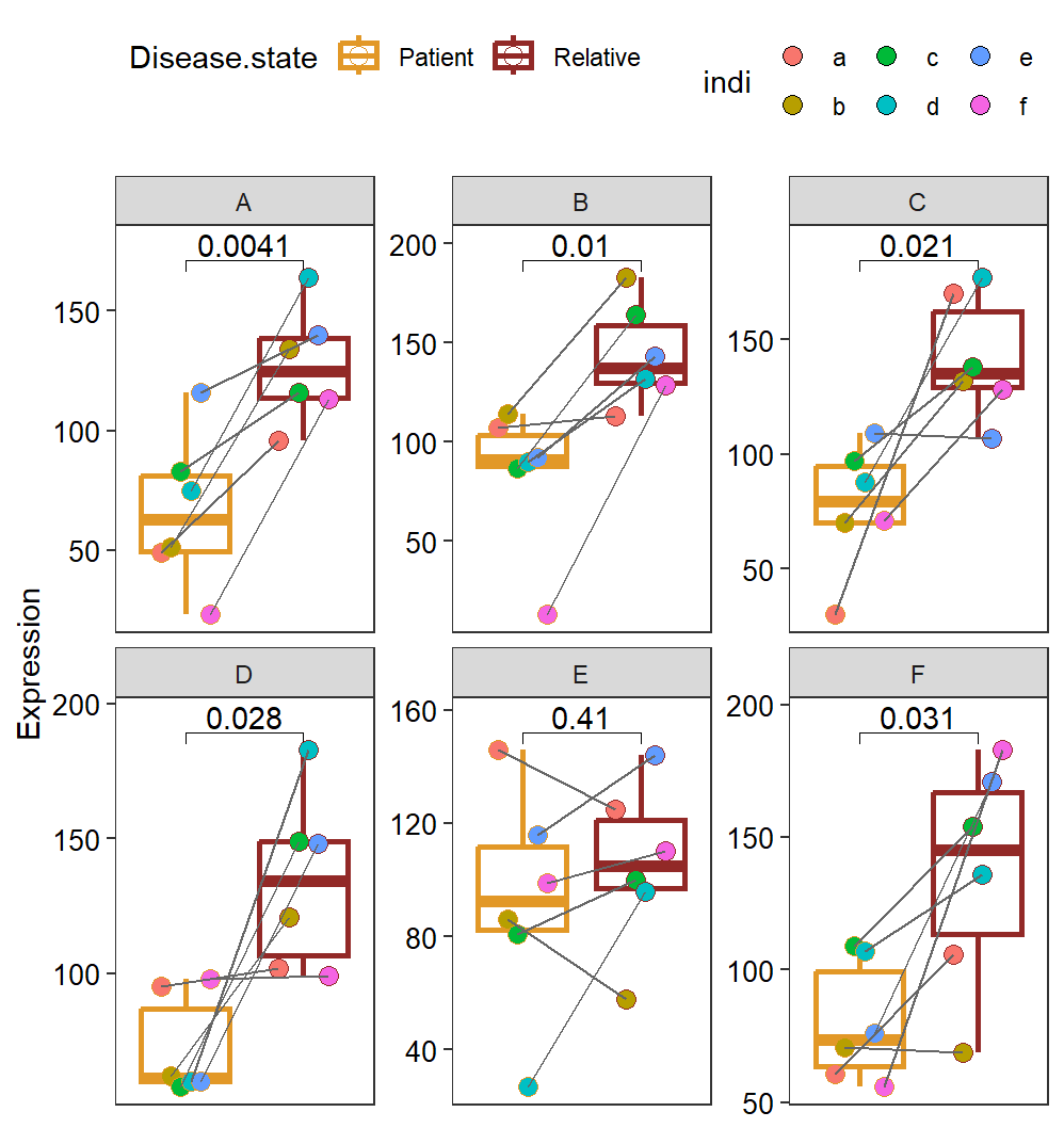
效果很好,可以应用到配对数据的可视化和分析。觉得分享有用的,点个赞、分享一下再走呗!!!